GeMarkt Blog · Practical guide
Black and White Art Prints: Engravings and Etchings
Choose monochrome art by line, light and paper tone. Compare Piranesi, Dürer and Rembrandt, then judge reproduction detail, mats, frames and room placement.

Black-and-white art is not all equally simple or neutral. A pale architectural view, a dense engraving and a print with a large dark field can have very different effects on a wall. Choose by the amount of detail and contrast you want to see, not only by the absence of bright colour.
Engravings and etchings are especially rewarding because lines can create stone, cloth, skin, sky and shadow. Modern reproductions can bring those images into a room, but it helps to understand what is being reproduced and how the paper tone, margins and fine marks have been handled.
Know what kind of print you are buying
The word “print” can describe both a historical impression and a modern reproduction of it. An impression is a sheet printed from a prepared surface such as a metal plate. A digital reproduction is a new image of that sheet, commonly made by a different printing process. A reproduction of an engraving is not therefore an original engraving by the historical artist.
The Met’s guides distinguish engraving, where a tool cuts lines into a plate, from etching, where acid bites lines exposed through a protective ground. In both, the recessed marks can hold ink for printing. Artists also combined techniques, so a single label may not tell the whole story.
For an ordinary reproduction purchase, you do not need to become a print specialist. You do need a clear description of the object being sold: its maker, production method, image source, dimensions and any altered border or crop. If you are buying a historical impression rather than a modern print, edition, state, condition and provenance require a different level of specialist checking.
Piranesi gives a wall an architectural view
Giovanni Battista Piranesi’s Views of Rome: The Pantheon combines etching and engraving. Cleveland dates the design to 1761 and identifies this impression as Hind 60, state V/V. That state information belongs to this example, not automatically to every reproduction labelled “Piranesi Pantheon.”
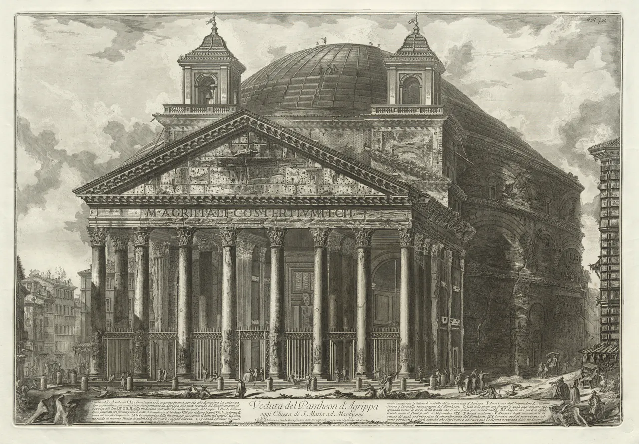
The main building remains readable before you inspect every person. The columns make strong verticals, while the curved wall and dome carry your eye towards the right. The pale sky and foreground keep the dense architecture from filling every part of the sheet.
That makes it a useful starting point for a wall seen from several distances. Across a room, you get the building; close up, you find figures, stonework and writing. Test a reproduction large enough to preserve that second level without assuming the biggest available format will have the sharpest detail.
You could place it near modern furniture with simple lines without trying to imitate an eighteenth-century study. The relationship might be architectural rather than historical: a cabinet’s straight edges beside a building made from columns and curves. It does not require a matching classical object on the cabinet.
Dürer rewards a closer place to look
Albrecht Dürer’s Melencolia I, 1514, is an engraving dense with objects and marks. A winged figure sits among tools and geometric forms. The Met relates its subject to the Renaissance association between melancholy and artistic creativity; it is not simply a cheerful collection of useful equipment.
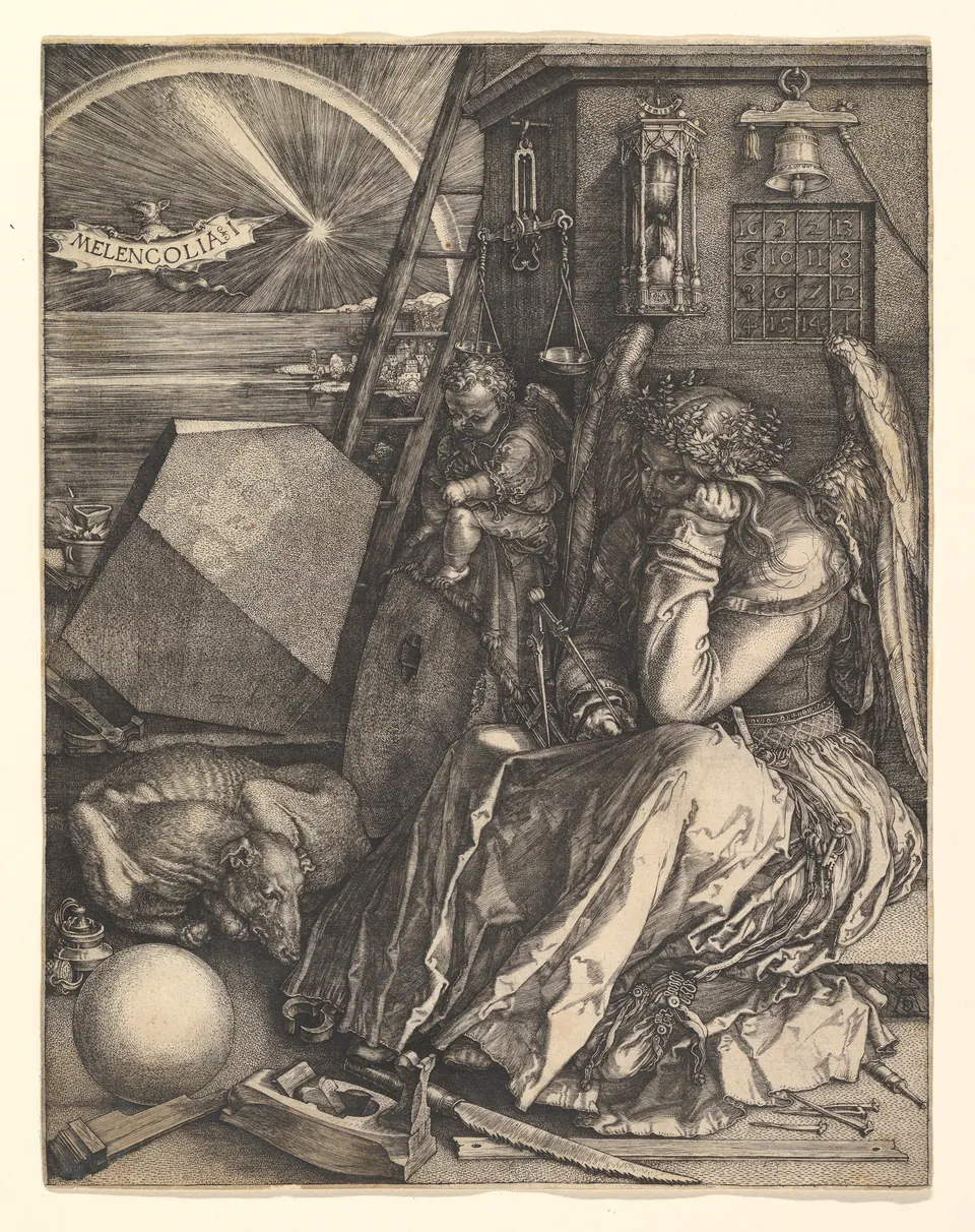
The robe contains many changing lines, the large solid at the left has clear angled faces, and small dark marks give the sleeping dog its texture. These differences reward a close view. Seen only from the far end of a room, much of that interest may merge into a single patterned rectangle.
I would test it beside a desk or seat where approaching is easy. That is a recommendation about viewing, not a requirement that a thoughtful subject belongs only in a study. Choose the work if you enjoy its complexity and emotional tone; do not select it merely because an intricate black-and-white image seems automatically sophisticated.
Rembrandt uses darkness as well as line
Rembrandt’s The Hundred Guilder Print, 1648, combines etching, engraving and drypoint. The Met’s sheet is the second of two states. Its subject brings together episodes from Matthew 19 around the central figure of Christ.
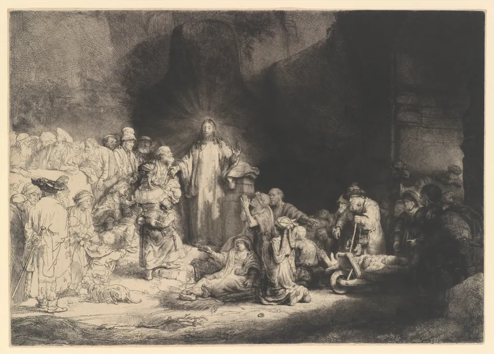
Compare it with Piranesi before choosing a pair. Rembrandt’s broad darkness carries much more visual weight on one side, while the figures at the left are drawn with relatively light lines. Two works can share an ink colour and still be far from interchangeable in a wall arrangement.
If the religious subject is right for your home, check a reproduction for details inside that dark area. A strong black field alone is not proof of a good result. Look for faces and folds that remain distinguishable, and for the lighter marks that should not vanish at the other end of the tonal range.
Preserve the paper tone and the important edges
Many historical sheets look cream, grey or warm beige rather than brilliant white. The file also records the particular paper, its condition and the way it was photographed. “Black and white” on a shop filter does not necessarily mean neutral black ink against a pure white rectangle.
Compare the reproduction with its named source. A brightened background might be a disclosed editorial choice, but it should not silently erase pale lines, writing or edges. Equally, a heavily yellowed effect added to make a picture look “vintage” is not evidence of the historical sheet’s appearance.
Decide whether the image includes the whole sheet, the printed image only or a detail. Piranesi’s lower inscription, for example, is visible here. Hiding it under the mat changes what is shown. You may choose a detail, but do so intentionally rather than discovering the missing text after framing.
Match the frame to the image not just the room
A black frame can make a firm outline, but it is not compulsory for monochrome art. Wood or a quieter painted finish may relate better to a warm paper tone. Compare samples beside the actual print rather than matching the frame only to a door handle across the room.
The mat deserves the same attention. Brilliant white beside a cream-coloured sheet can make the sheet look more yellow; you may prefer that separation or find it distracting. Try a softer off-white before deciding. A mat should not cover marks that you want to keep visible.
For historical or valuable sheets, suitable framing materials and separation from glazing matter more than the decorative match. The Canadian Conservation Institute’s paper-care guidance is a useful starting point; ask a qualified framer about the actual object. Do not assume the absence of coloured ink removes all sensitivity to light or poor handling.
Compare the final size before making a group
Measure the outside dimensions of the frames and test them with paper templates. For example, two finished frames 35 cm wide, separated by 8 cm, make a 78 cm-wide group. That is only a worked layout example, not a preferred spacing for every room.
Stand back, then approach. Is the grouping clear from across the room, and can you still enjoy its fine detail nearby? If three dense images compete, try two or give one a wall of its own. Monochrome does not have to mean filling every gap with a coordinated set.
For more historical examples, see engravings and etchings. For the room decision, keep the priority straightforward: choose the subject you want, preserve the marks that make it interesting, and place the print where those marks can actually be seen.
Editorial record
About this article
- Author
- Publisher
- GeMarkt
- Published
- Reviewed
- Internal source & rights check. Conducted by GeMarkt Research Review. This is an internal editorial check—not independent peer review.
- Source standard
- Buying guide source standardSeparates measured or first-hand evidence from general guidance and keeps practical limits visible.
Found a claim that needs checking? Report a factual error.