GeMarkt Blog · Practical guide
Seascapes and Ocean Art
Compare Manet’s quiet water, Hokusai’s wave and Homer’s dangerous sea. Choose an ocean print by subject, composition, scale and the view from your room.

Choose a seascape for what happens in it, then decide where it belongs. A harbour full of boats, a curling wave and a person stranded at sea may share blue paint, but they do not offer the same company on a wall. Looking at the subject closely is more useful than searching only for a colour that matches the sofa.
This guide compares three very different sea images and shows how to judge their shape, detail and placement as modern reproductions. A seaside house is not required. Nor does an ocean picture automatically make a room peaceful: you should enjoy the particular scene, not just the idea of water.
Choose the sea before the colour
Start with the experience you want to see. You might prefer a distant horizon, a working harbour, stormy weather or a close view of surf. Each offers a different balance between open space and incident. Write down two or three qualities you actually want before opening a large catalogue.
For example, “boats, daylight and room to see the sky” is a more useful brief than “coastal.” It can rule out a dramatic shipwreck even when the colours are perfect. Conversely, someone fascinated by maritime history may enjoy a difficult scene that would be a poor choice for another person’s holiday memories.
Check people and animals as carefully as the water. A tiny figure in a preview may be struggling, working or being rescued. That need not disqualify the picture, but it should be a conscious choice for a shared room. If the household disagrees about the subject, compare another image rather than trying to make the concern disappear under a matching frame.
Manet’s calm water still has activity
Édouard Manet’s Sea View, Calm Weather, 1864, is an oil painting in the Art Institute of Chicago. It gives much of the lower picture to turquoise water, interrupted by dark sails and a steamer’s wake.
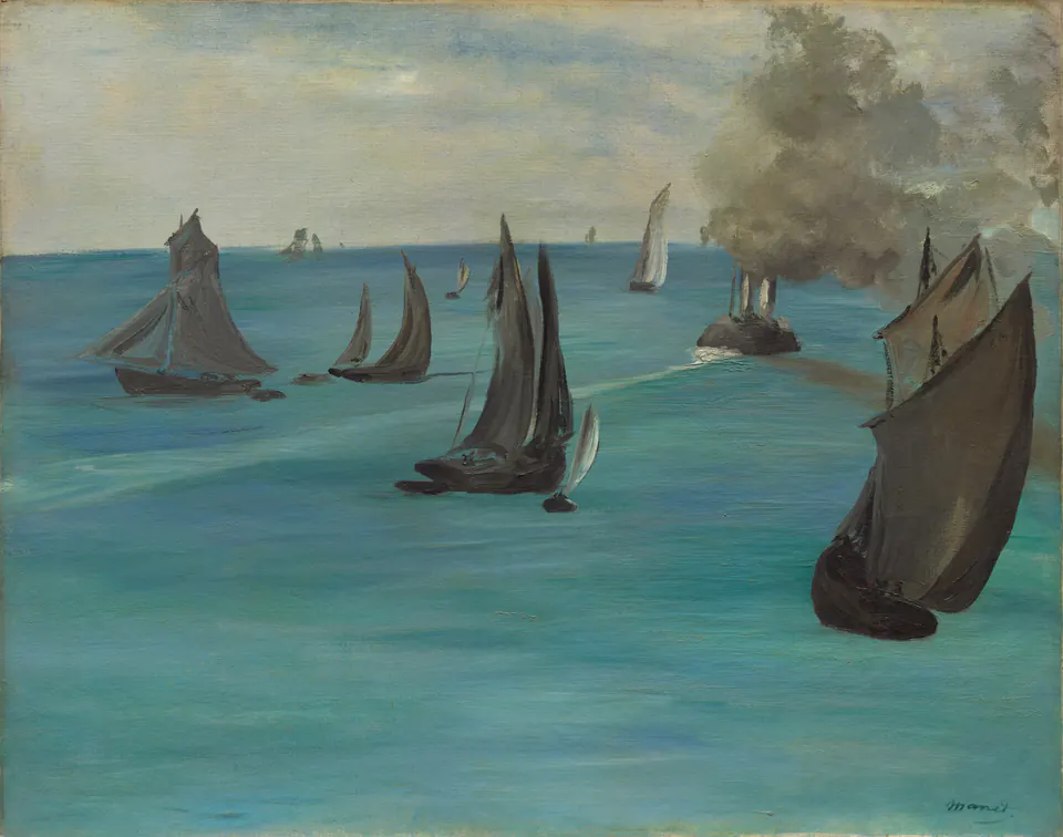
The boats vary in size and angle. Some look almost like dark cut-out shapes; smaller sails carry the view towards the horizon. The smoke occupies a substantial patch of sky, so this is not an untouched expanse of blue. It contains travel, movement and vessels sharing the water.
For decorating, notice that the strongest forms are readable before every small detail is clear. I would test a reproduction across a modest sitting room, then move closer to see whether the smaller boats remain worth looking at. A busy patterned curtain beside it may compete with the sails; a relatively plain stretch of wall lets their shapes do more of the work.
Do not assume the word “calm” in the title prescribes your reaction. If the smoke dominates your view or the closest sail feels too heavy, another marine painting may suit you better. The title identifies the work; it does not choose your room for you.
Hokusai’s wave needs its surroundings
Hokusai’s Under the Wave off Kanagawa, usually called The Great Wave, is a colour woodblock print. This is the Met’s impression JP1847, dated about 1830–32, from Thirty-six Views of Mount Fuji.
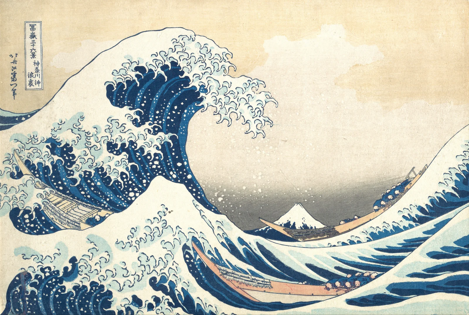
The curling crest is memorable, but the space around it matters. The small mountain, long boats and broad pale sky give the wave its scale. Cropping down to the foam alone creates a different image, even if the cropped portion is attractive.
Before buying a reproduction, compare its preview with the full composition. Can you still see the boats near the bottom, the inscription at the left and the sky to the right? A listing that offers a detail should say so. A stretched image that makes the wave narrower or taller is not a faithful fit to a new frame size.
The broad pale area can be useful beside darker furniture because the picture does not fill every part of its rectangle with dense blue. Try an off-white mat and a simple dark frame, then compare a wood frame. Those are styling options, not requirements for Japanese art. You do not need to build the whole room around the print’s national origin.
Homer’s sea is not a holiday scene
Winslow Homer’s The Gulf Stream dates to 1899 and was reworked by 1906. A Black man is stranded in a damaged boat; sharks and a distant waterspout make the danger explicit. The Met also connects its sugarcane and Atlantic setting with the histories of empire and slavery.
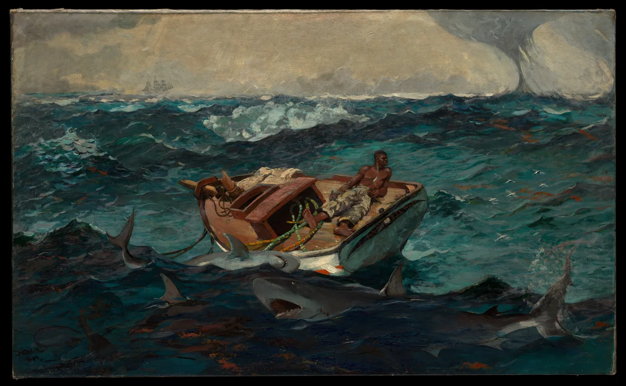
This is a good reminder that a beautiful sea painting may be a demanding companion. Its greens and blues could match a room wonderfully while its subject is wrong for the person living there. If you do want it, choose it for that subject as well as the paint.
The long boat, the waves and the small distant ship need space across the image. I would keep the whole composition and avoid placing tall objects in front of its lower section. A lamp or vase blocking the sharks would remove part of what makes the picture legible, not merely an expendable foreground.
Find the shape that fits without cropping
A wide wall does not require an extra-wide picture. Many seascapes are only moderately horizontal. Choose the image first, then measure the finished framed size, including the mat and moulding. Do not treat a print’s sheet size as its visible image size.
Here is a simple example, not a product specification. A hypothetical image 60 cm wide and 40 cm high has a 3:2 ratio. Preserving it on a 70 × 50 cm sheet, centred, leaves a 5 cm border on all four sides. Filling that sheet edge to edge instead would require a crop or altered proportions. Ask which arrangement the actual listing supplies.
Use paper outlines to compare a single picture with two smaller ones. If you choose a pair, similar subjects alone may not connect them: one may have a high horizon and dense waves while the other is mostly sky. That contrast can work, but see the two previews together before ordering.
Use a seascape without a nautical theme
One ocean picture can belong among ordinary furniture, books and plants. You do not need rope, anchors or several shades of blue to explain it. Repeating one small colour from the painting may be enough, and even that is optional.
For a room already facing water, consider whether another large horizon adds something you want. A closer scene with boats or people may offer a different kind of attention beside the real view. Inland, a seascape can simply be a place you like looking towards.
Avoid treating image editing as colour coordination. Turning every grey into turquoise or warming every cloud changes the painting. It is usually better to choose a different work, or adjust the frame and neighbouring objects, than to force a historical image into the room’s palette.
Make the final test from your seat
Look at the intended wall from the positions you use every day. Can you see the picture past a pendant, a chair back or a reflection? Is the main action still clear at that distance? Check your normal evening lighting as well as daylight.
Our coastal art guide offers three further ways to compare a seaside subject, while portrait or landscape helps with the wall’s shape. Keep the final decision simple: choose a sea you want to spend time with, preserve what makes that picture distinctive, and give it a view that is not continually obstructed.
Editorial record
About this article
- Author
- Publisher
- GeMarkt
- Published
- Reviewed
- Internal source & rights check. Conducted by GeMarkt Research Review. This is an internal editorial check—not independent peer review.
- Source standard
- Buying guide source standardSeparates measured or first-hand evidence from general guidance and keeps practical limits visible.
Found a claim that needs checking? Report a factual error.