GeMarkt Blog · Practical guide
Coastal Art: Sorolla, Homer and Aivazovsky
Choose a seaside picture for its light, activity and composition, not blue alone. Compare Sorolla's beach, Homer's fishermen and Aivazovsky's moonlit shore.

Coastal art does not have to mean a pale-blue horizon in every room. Sorolla can bring you close to a busy beach; Homer can make you notice the labour of fishing; Aivazovsky can offer a dark sea crossed by moonlight. Choose the scene you want to live with before matching it to cushions.
All three examples below contain water, but they ask for different kinds of attention. One centres on a small human encounter, another on two people working together, and the third gives much of its space to sky and sea. Their differences are more useful for decorating than treating “coastal” as a single colour scheme.
Choose which kind of sea you want
Think about your connection to the coast. Is it swimming, walking in winter, watching boats or remembering a particular place? A picture does not have to document your own beach to be meaningful, but knowing what draws you to the subject helps narrow the choices.
Then consider the room’s use. A busy painting might reward looking near a dining table. A broad scene with a few clear shapes may remain legible across the living room. Those are possibilities to test, not rules that every bedroom needs calm water or every blue picture will make someone feel relaxed.
Look beyond the small preview. Is there a shipwreck, an injury or dangerous work in the scene? It is fine to choose a serious subject for home, but choose it knowingly. An attractive patch of blue is not the whole painting.
Sorolla brings you close to the beach
In Sorolla’s The Wounded Foot, dated 1909, two children lean together at the edge of the water. One attends to the other’s foot while bathers continue behind them. The straw hat, bare shoulder and bright hand give you points to follow among the moving colours.
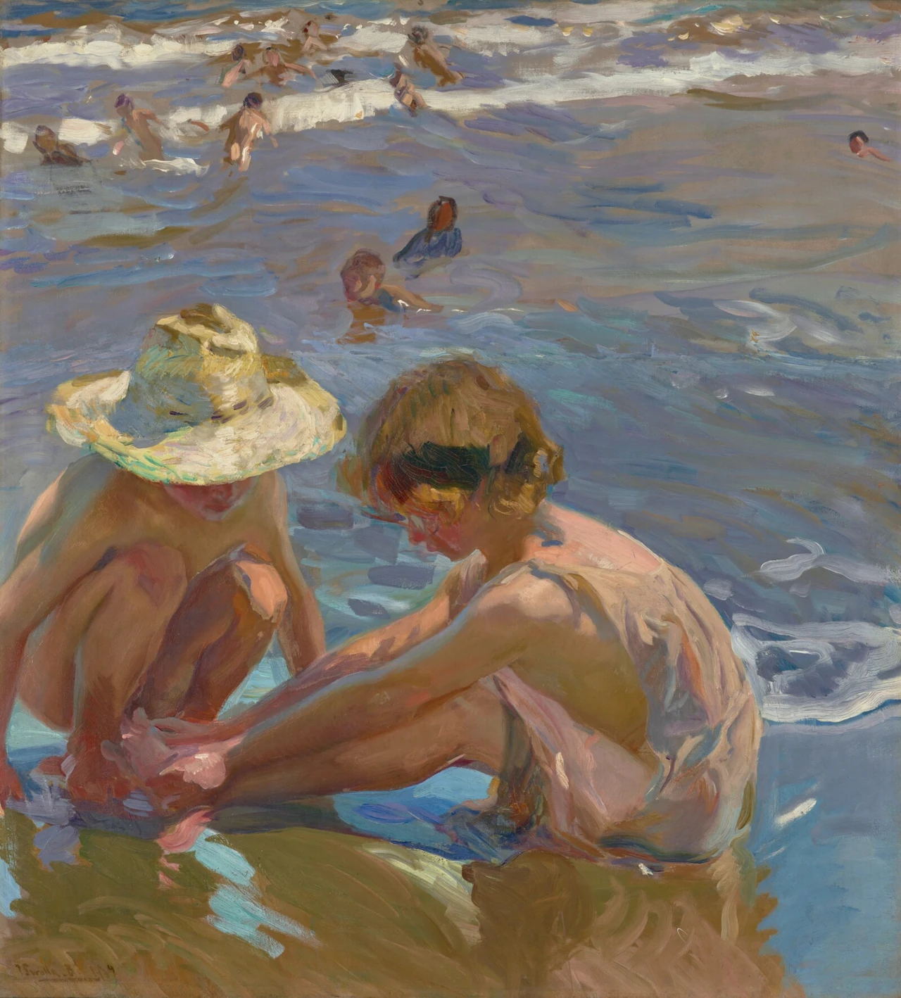
The foreground figures are large enough to make this more than distant scenery. I would try a reproduction where the hands and faces can be noticed, perhaps near a seat or along a passage rather than high over a wide doorway.
Its water includes violet, green and grey as well as blue. You could connect a room to one of those quieter colours, leaving the warm skin and straw hat to provide contrast. Avoid choosing a print with an exaggerated turquoise treatment merely because it looks more conventionally seaside. That would change the balance you liked in the painting.
Homer makes the sea a place of work
Homer’s The Herring Net, painted in 1885, shows fishermen handling a heavy catch in a small boat. The Art Institute’s account describes their coordinated work as one hauls and the other unloads while they keep the boat steady. This is not an empty sea waiting to become a holiday backdrop.
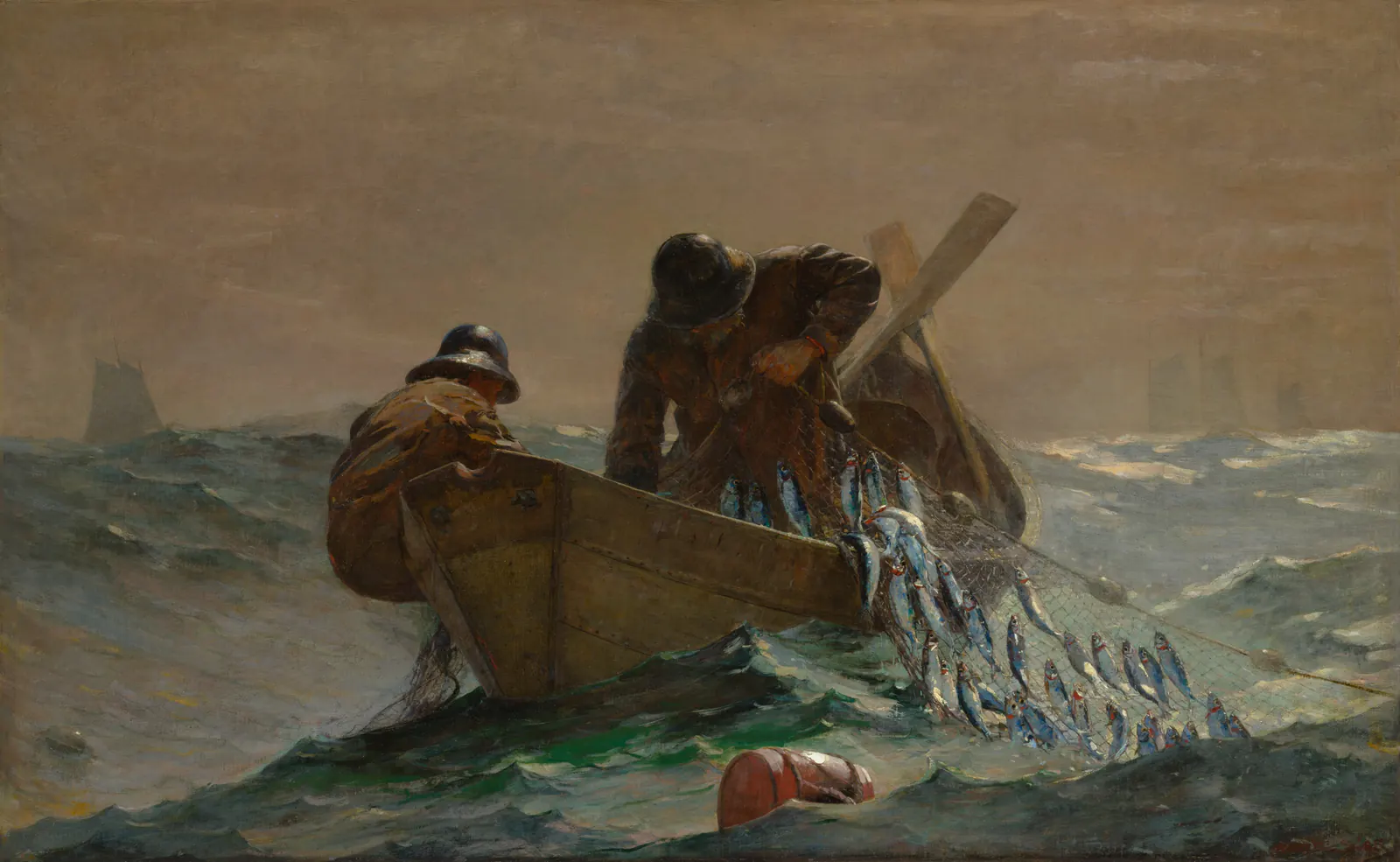
The boat makes a firm brown shape across the centre. The net pulls your eye down towards the foreground; small distant sails make the water feel extensive. In a reproduction, cutting the lower edge tightly would reduce the space occupied by that net and the immediate waves.
I would try it with plain wood, muted textiles or a wall that leaves the figures clear. It can connect to a coastal room without needing a white frame, rope accessories or blue stripes. If you want an image of leisure rather than work, choose another picture instead of relying on a decorative title to change what this one shows.
Aivazovsky offers a darker shore
The Met’s Ship by Moonlight is a small oil painting by Ivan Aivazovsky, also known as Hovhannes Aivazian. The museum identifies the vessel as a steamship. Its current record gives no creation date, so an exact year should not be invented for a reproduction label.
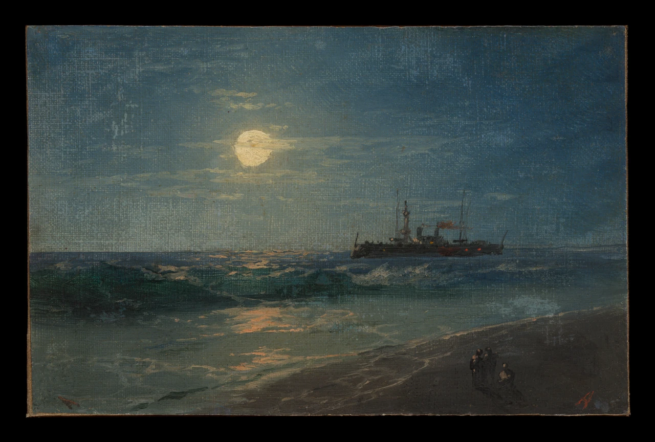
Look at how little of the moon’s colour reaches the ship. Much of the picture stays dark, with a few glints joining the sky, water and shore. This could suit a room where you want a quieter area of colour, but only if you can still see those distinctions under the lighting you actually use.
A large enlargement is not automatically better for a small original. Inspect a physical print sample or an accurate detail preview for the intended size. The visible canvas texture and dark outer area in the museum photograph are part of that source image, not a frame or finish included with a product.
Let the composition choose its wall
Sorolla’s almost-square vertical image and the wider Homer offer different starting shapes. Do not force every sea picture into a panoramic opening. A narrow wall beside a chair may suit a taller image; a broad cabinet may offer room for a horizontal one.
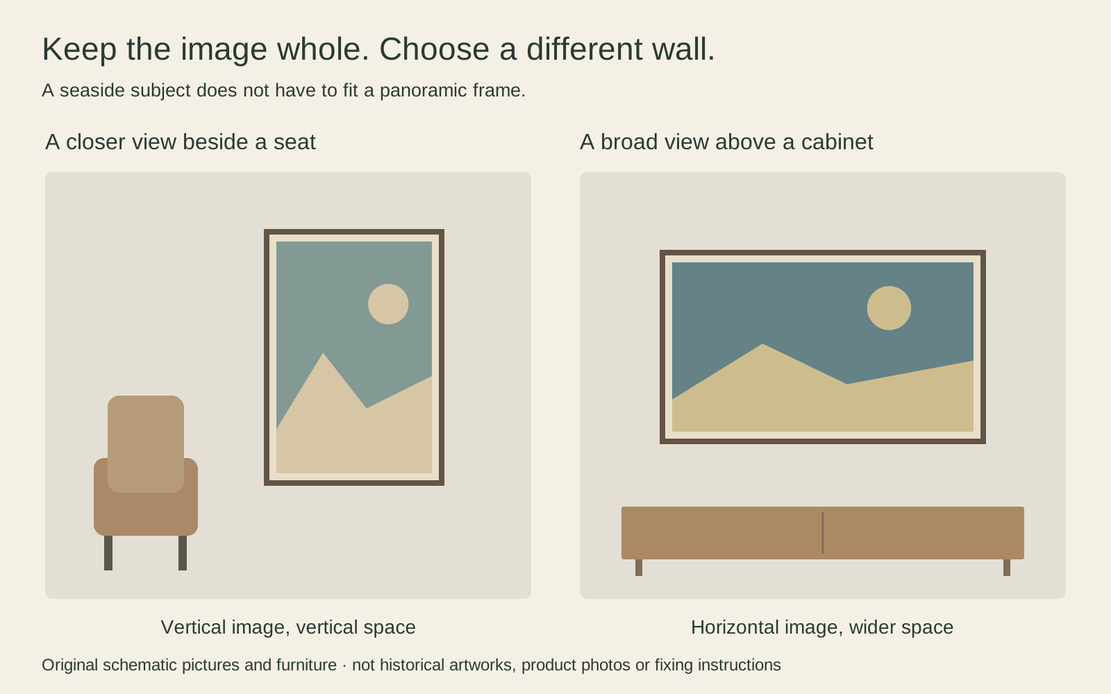
Measure the framed object, including any mat. A hypothetical image 40 cm wide and 50 cm high does not become a 50 × 50 cm image when placed on a square sheet: there would be unused width, or the image would have to be cropped or distorted. Ask which approach the reproduction uses.
If you want two pictures together, they need not be identical sizes. Similar frame treatment can connect them while preserving their proportions. Portrait or landscape gives a fuller way to compare the available wall with the image you actually want.
Connect the colours without building a theme park
One shared colour or material is often enough to begin. A timber frame could relate to the boat in Homer; a muted violet textile could pick up a small area in Sorolla. Neither requires every furnishing to follow the picture’s palette.
A room with an actual view of the sea already has a changing visual subject. You might prefer a close human scene on the wall rather than another horizon beside the window. Inland, a seascape can stand on its own without surrounding it with objects that imitate a beach.
Avoid matching every frame to the lightest foam or darkest wave. Compare samples against the whole image. The best surround is the one that lets you keep looking at the picture rather than noticing only the border.
Check the real room before you order
Place paper outlines where the outer frames would go and look from the sofa, table and doorway. Check whether glazing would reflect a window across the most important part of the scene. A room mockup can suggest scale, but it cannot establish your lighting or the exact print colour.
Keep prints out of direct sunlight where practical. As the Library of Congress explains, filtering ultraviolet radiation does not remove all light-related damage. A sunny coastal subject does not make a print suitable for a sun-drenched wall.
Finally, check the actual listing’s dimensions, material, border, frame and delivery terms. The museum works shown here are examples for choosing art, not a claim that every version is available in the shop. Pick the scene first, preserve its composition, and give it a place where its particular kind of sea can be seen.
Editorial record
About this article
- Author
- Publisher
- GeMarkt
- Published
- Reviewed
- Internal source & rights check. Conducted by GeMarkt Research Review. This is an internal editorial check—not independent peer review.
- Source standard
- Buying guide source standardSeparates measured or first-hand evidence from general guidance and keeps practical limits visible.
Found a claim that needs checking? Report a factual error.