GeMarkt Blog · Practical guide
Scandinavian Interiors: Hammershøi, Larsson and Friedrich
Choose art for a Scandinavian-inspired room through three different approaches: quiet light, colourful family life and a darker landscape.

Scandinavian-inspired rooms do not need a uniform diet of pale, empty pictures. Hammershøi offers light and quiet intervals; Carl Larsson offers colour and family activity; Friedrich offers a darker landscape. Choose the particular image that fits the way you use the room, rather than treating these artists as a matching set.
There is an important distinction in that list. Hammershøi was Danish and Larsson Swedish; Friedrich was German. His landscapes are useful possibilities for this decorating approach, not evidence that he belongs to Scandinavian art. Nor does a painting of an attractive room tell you to recreate every furnishing inside it.
Start with the life of the room
Before choosing art, look at the wall in ordinary use. Where do people sit? Which surface collects books and cups? Is the room already full of colour, or does it have a few broad, similar surfaces? A print should join that actual setting, not a photograph of a room nobody occupies.
For a pale room with little contrast, a dark landscape may give the wall a clear point of attention. Beside colourful books and cushions, a restrained interior scene may be easier to distinguish. These are styling choices, not promises about how a picture will change everyone’s mood.
Choose one place first. The wall above a chest, the space beside a reading chair and a narrow passage all invite different kinds of looking. You can build a connection between them later without ordering three identical frames immediately.
Try Hammershøi for light and intervals
In Hammershøi’s Interior in Strandgade, Sunlight on the Floor, the window and its light matter as much as the furnishings. The seated figure is turned away; the door, curtain and sunlit floor give the eye several quiet places to stop. SMK identifies the painting as a work of 1901 and the figure as his wife, Ida, in its account of the picture.
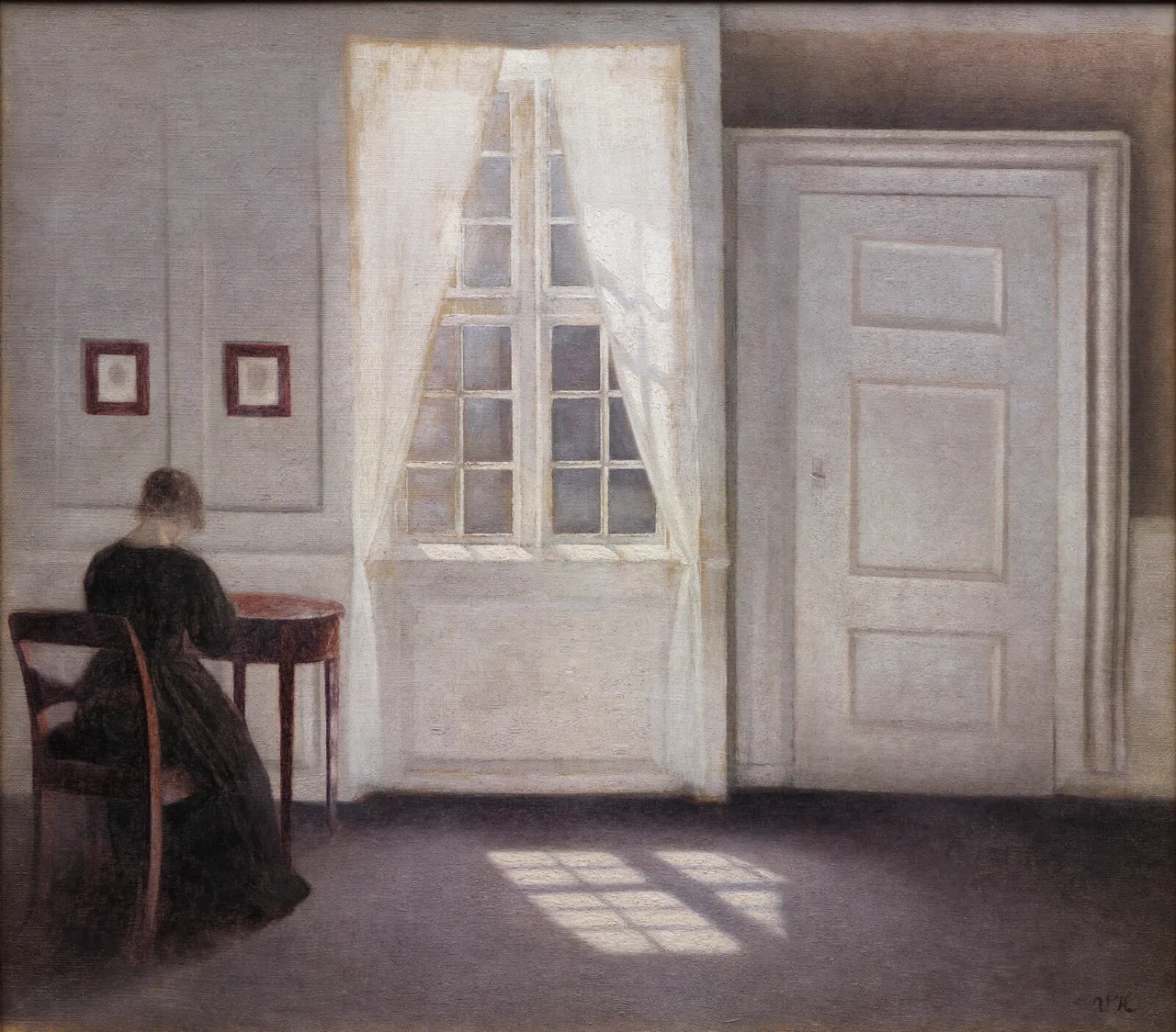
I would try this near furniture with clear edges, where the picture’s doorways and floor pattern have something to relate to. A plain timber frame or a narrow dark frame can both work. Test which makes the pale interior legible against your wall rather than automatically choosing white on white.
You do not have to empty your home to enjoy it. A painting can contain the open space that a busy room lacks. Keep a lamp or shelf from cutting across your view of the print, but leave your useful belongings alone.
Look to Carl and Karin Larsson for colour
Carl Larsson’s The Kitchen offers a very different starting point: ochre panelling, a green stove hood, a bright red blouse and daily work. Nationalmuseum’s record places it within A Home, a group of 26 watercolours. The museum also describes this kitchen as a working room, less modern in comfort than other parts of the house.
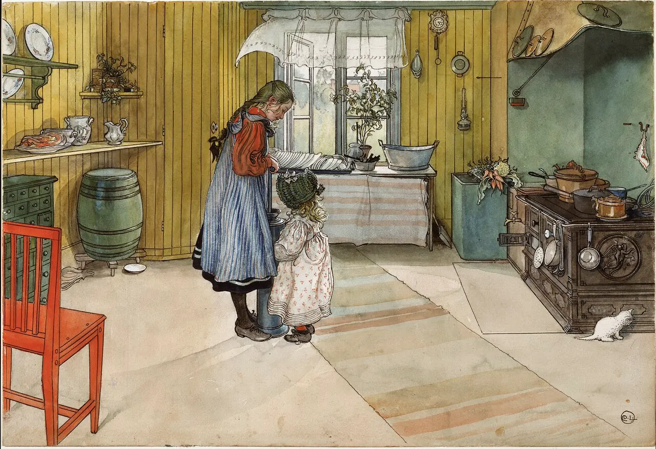
The home was not Carl’s achievement alone. The Carl Larsson house museum presents Karin Larsson’s design and textile work as central to its character. That shared domestic invention is a better lesson than assuming Scandinavian interiors must be colourless.
Try taking one small colour connection from the picture: the red of a familiar cushion, for example, rather than buying a green cabinet and yellow wall paint to match. A kitchen scene can belong in a dining corner or hallway; it does not need to hang beside a cooker to make sense.
Give Friedrich a place without changing his nationality
Friedrich’s Two Men Contemplating the Moon brings dark branches, rock and a small light in the sky. The Met’s version, dated about 1825–30, is the one shown here. It is not the earlier Dresden painting of the subject.

This is an option if the room needs something more concentrated than another pale surface. Look at the print from your usual seat: can you still separate the figures from the tree? If not, changing the location or size may help more than surrounding it with extra accessories.
A dark picture does not require dark walls. Against a pale wall, its outline is already distinct. Start with a straightforward frame and let the landscape supply the drama.
Make the picture visible against a pale wall
The diagram keeps the furniture and wall the same while changing the picture and surround. None is the official Scandinavian answer. The useful comparison is whether you can distinguish the image, frame and wall from where you normally look.
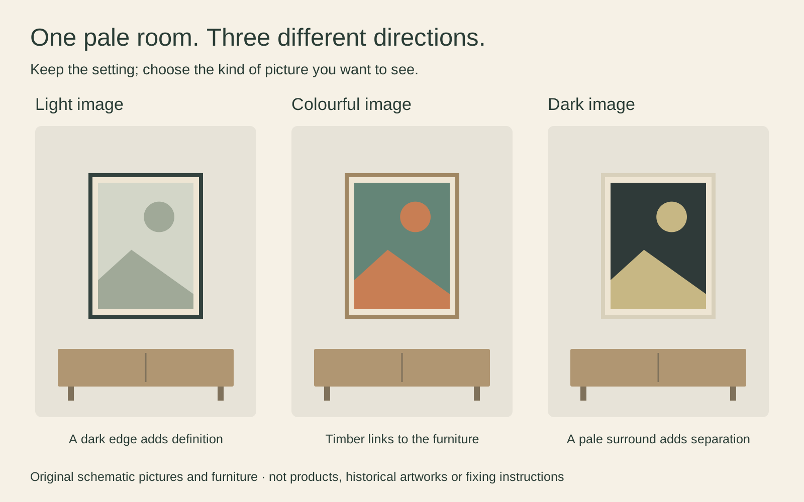
Check this in daylight and with the lights you actually use at night. A reflection may hide a pale scene, while a dim corner may swallow detail in a dark one. Do not solve that by putting a vulnerable original in direct sun: the Library of Congress explains that light damage accumulates. A reproduction and a valuable original need different care decisions.
Measure the frame not the style label
Make paper templates at the proposed outer frame sizes. Two frames each 60 cm wide with a 6 cm gap occupy 126 cm altogether. They will extend beyond a 120 cm chest if centred over it. That may be deliberate, but a small online thumbnail will not reveal it.
Keep image size separate from sheet, mat and frame size. A generous mat can make a modest image into a substantially larger object. Our guide to painting proportions and standard frames explains why the same outer frame does not give every painting the same visible image.
Leave room for a home to change
Start with the picture you genuinely want to see. Live with its paper template, then with the framed print, before filling every neighbouring space. A collection can include a family photograph or an unfamiliar artist without losing its connection to the room.
If you later add another picture, repeat one useful feature: a frame colour, a generous margin or a similar level of contrast. Repeating everything is unnecessary. The aim is a home with pictures you notice and enjoy, not a room that passes a style-label inspection.
Editorial record
About this article
- Author
- Publisher
- GeMarkt
- Published
- Reviewed
- Internal source & rights check. Conducted by GeMarkt Research Review. This is an internal editorial check—not independent peer review.
- Source standard
- Buying guide source standardSeparates measured or first-hand evidence from general guidance and keeps practical limits visible.
Found a claim that needs checking? Report a factual error.