Art History · Learning chapter
Atlas IV — The long nineteenth century · 7 of 7
Posters and Art Nouveau: print technology, advertising, nightlife, travel, and the mass viewer
Five colour posters show how printing, billposting, celebrity, tourism, and brand memory turned the modern street into a market for attention.

What we’ll look at
How did colour posters capture attention and sell products, nightlife, and travel?
Before it entered a museum, Henri de Toulouse-Lautrec’s Moulin Rouge: La Goulue occupied the street at the scale of a person. It is 190 centimetres high, printed from three sheets of paper in four colours. At the top, the venue’s name repeats in large red letters. Below, yellow lamps puncture a flat black crowd. The dancer La Goulue kicks through the centre while her partner, Valentin le Désossé, becomes a cropped grey silhouette in the foreground.
Nothing asks for slow contemplation. The poster must seize a viewer walking or looking elsewhere. Words, bodies, colour, and empty paper work at urban speed.
The colour poster was a production and distribution system before it was a style. A commissioner wanted to reach a public, and an artist designed the image.
Lithographers separated the colours onto stones or plates. Printers aligned paper and ink across a large edition, and billposters placed the sheets where people passed.
Together they gave performers, products, venues, railway lines, and destinations recognisable identities. Passers-by completed the circuit when they noticed, remembered, attended, travelled, or bought.
This chapter asks:
How did the colour poster turn streets, theatres, skating rinks, shops, and railway stations into a market for attention—and what becomes visible when Art Nouveau is treated not as a look but as a system of printing, advertising, labour, and public viewing?
Five posters provide a route through Paris-centred print networks between 1891 and 1903: Jules Chéret’s advertisement for an ice rink, Toulouse-Lautrec’s first poster for the Moulin Rouge, Alphonse Mucha’s advertisement for JOB cigarette paper, F. Hugo d’Alési’s railway invitation to Menton, and Leonetto Cappiello’s galloping image for Chocolat Klaus.
They do not form one visual school. Mucha corresponds strongly to what became known as Art Nouveau; d’Alési specialised in scenic travel advertising; Cappiello moved toward the isolated brand image. Their differences make the medium easier to understand.
A new public surface
Colour advertising did not suddenly appear in 1890. Lithography had been used during the nineteenth century for illustrated music, prints, maps, labels, and commercial images. What changed was the scale and density of the system. The Met’s history of nineteenth-century printmaking describes how technical developments enabled increasingly large multicolour lithographs. Commercial competition, expanding entertainment, department stores, consumer goods, newspapers, and railway travel supplied commissioners and subjects.
The legal environment mattered too. The Musée d’Orsay’s Art is in the Street research identifies the French law on the freedom of the press of 29 July 1881 as a major stimulus to commercial billposting. Regulation did not disappear, and advertisers did not receive every surface they wanted. But a wider field of authorised posting helped the illustrated colour poster become a mass urban medium.
Lithography made this field materially possible. As the V&A explains, an artist or transfer worker draws with a greasy substance on a flat stone or metal plate. Treatment allows damp areas to repel oil-based ink while the greasy image accepts it. Paper pressed against the surface receives the image. A multicolour poster usually requires a separate prepared surface and printing pass for each colour.
Every additional colour costs time, material, and registration: the sheets must meet the ink in the correct position so that one passage does not drift away from another. Printers could overlap a few inks to generate more hues. Large posters might be divided across several sheets. Immediacy rested on organised repetition.
Posters were printed in editions that could reach thousands, then dispersed. Some impressions were pasted outdoors. Others were sold or reserved for collectors. The 1890s fashion known as affichomanie—poster mania—produced specialist dealers, journals, exhibitions, albums, and collectors who removed the street image from its first commercial setting. The same design could operate as disposable advertisement, signed art print, portfolio plate, interior decoration, and later museum object.
The street was never a neutral open-air museum. Walls, kiosks, columns, hoardings, and stations were owned, rented, regulated, and contested. Calling the poster “art for everyone” captures broad exposure, not an equal right to commission or occupy space.
Chéret: movement sells modern leisure
In brief: Jules Chéret designed this large colour poster in 1893 for the Palais de Glace ice rink in Paris. Its moving female figure made the entertainment venue noticeable from a distance.
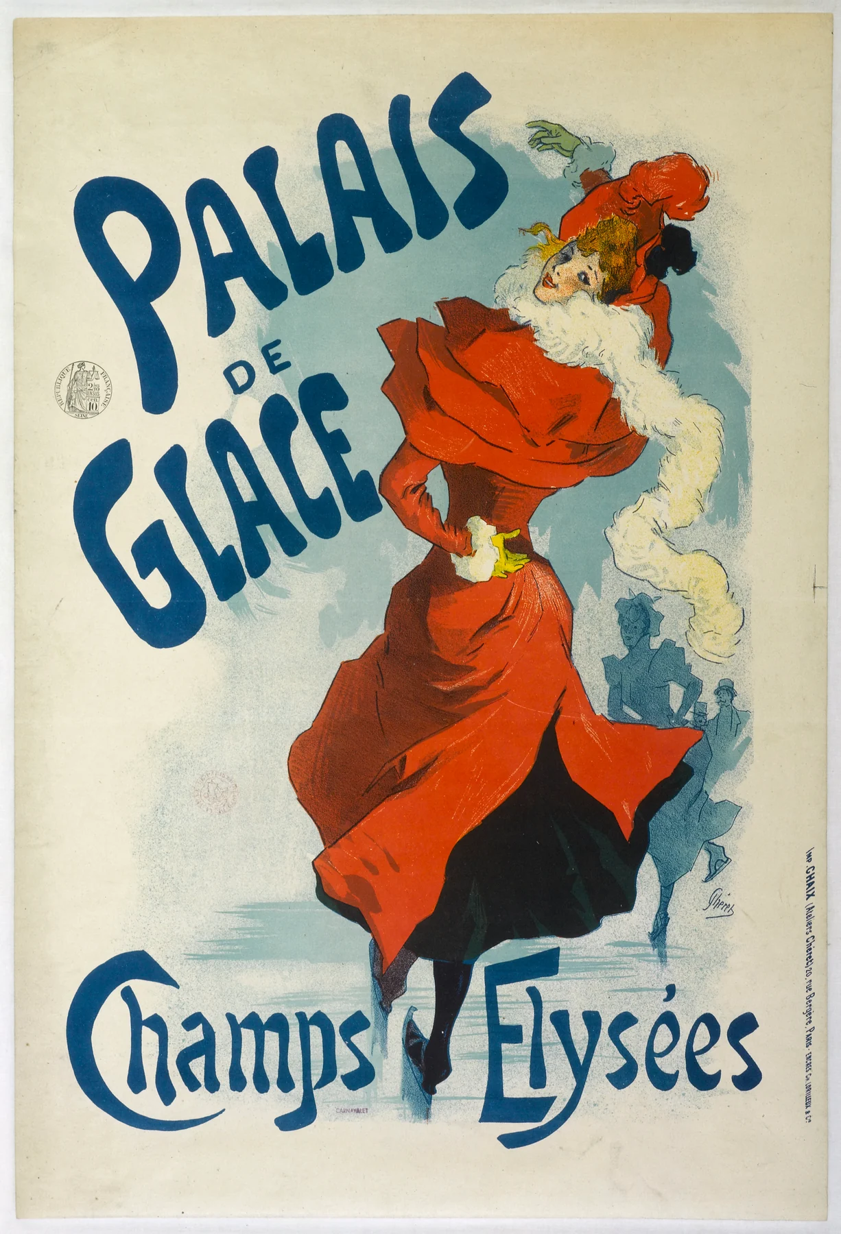

The name Palais de glace fills the upper third. Its blue letters bend around the red and black figure. Her hat feather, scarf, lifted skirt, extended arm, and curving path turn the words into movement.
Behind her, skaters dissolve into economical loops and strokes. The print does not describe the architecture of the Champs-Élysées ice palace in detail. It offers an atmosphere of circulation: a fashionable place where bodies move, meet, watch, and are watched. The woman is large enough to attract someone at a distance; the background supplies just enough social evidence to make the venue desirable.
Chéret is often called the father of the modern poster. The phrase is memorable and too solitary. He was an influential designer and printer who developed a vivid economy of colour, motion, and legibility through the printing firm Chaix. The credit line names one artist; the object records a workshop.
His recurring women became known as Chérettes and were celebrated as emblems of a newly active public woman. This skater is energetic, yet activity and agency are not identical. Her fashionable body sells a commercial leisure venue: participant and attraction at once.
Research by art historian Ruth E. Iskin, documented through the National Gallery of Art’s Center for Advanced Study in the Visual Arts, separates several roles poster women could occupy: sexualised fantasy, participant in modern mobility or leisure, and consumer using a product. These positions can overlap. Asking only whether Chéret’s figure is “liberated” is weaker than asking what she does, who looks, and what she helps sell.
Instead of listing an address and opening time, Chéret makes the viewer feel movement and attach that feeling to the name.
Toulouse-Lautrec: a venue becomes a silhouette
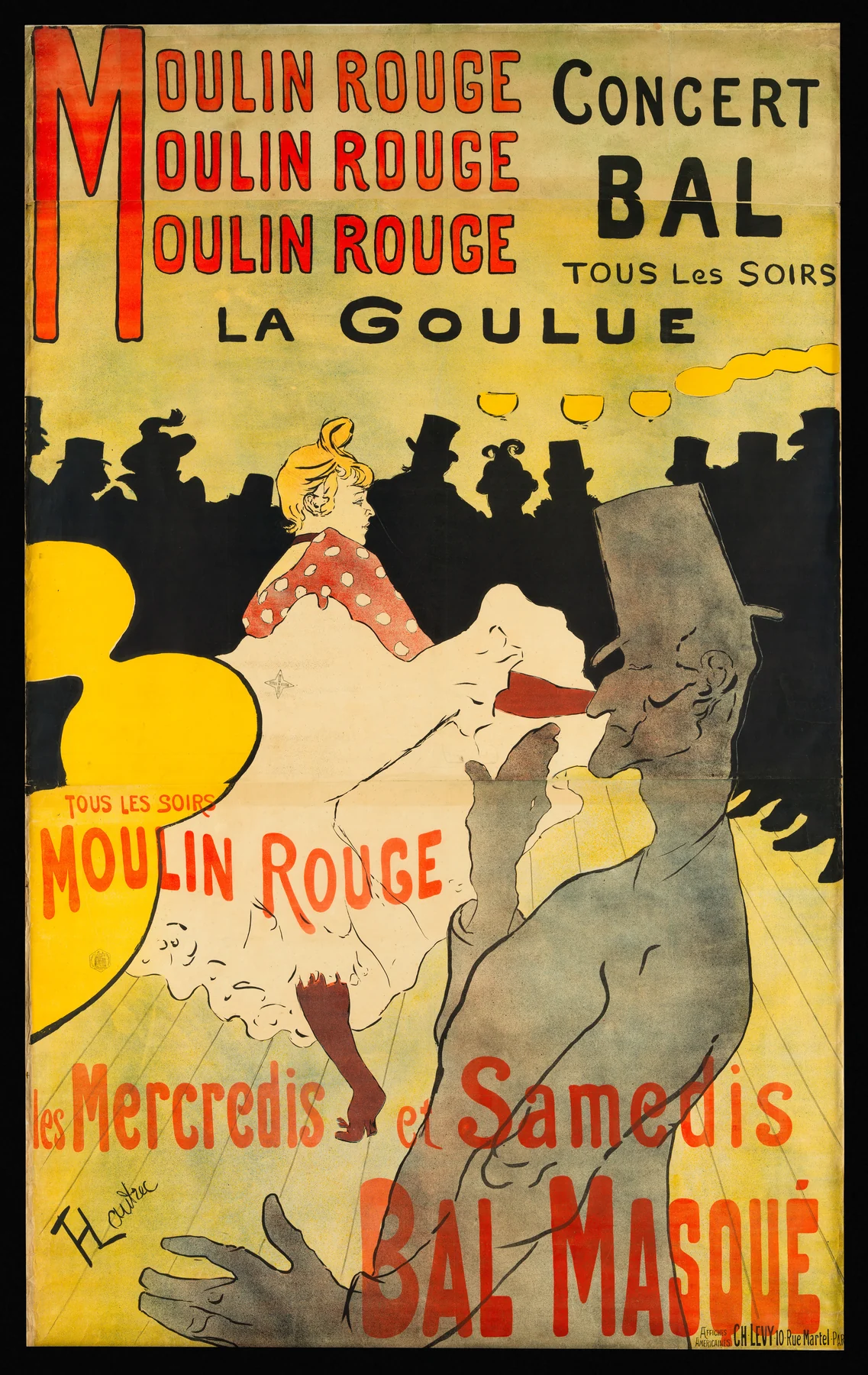
The Moulin Rouge had opened in 1889. Two years later it commissioned Toulouse-Lautrec to advertise the hall and its star dancer. The Met’s object record describes the six-foot poster as the work that launched his career in the medium.
Its four colours do not imitate a fully illuminated interior. They divide attention. Red names the venue. Yellow marks the lamps and the dancer’s skirt. Black compresses the audience into one irregular horizon. Grey brings Valentin le Désossé abruptly close, his body cut by the lower and right edges. Large areas of bare or lightly coloured paper keep these signals from competing with unnecessary description.
La Goulue—Louise Weber—appears near the centre, recognised through her lifted skirts and kicking dance. Her fame helps sell the Moulin Rouge, while the mass circulation of the poster increases her fame. This is not a simple portrait of an independent performer, nor only an image imposed upon a passive subject. Celebrity is being built through a triangular exchange among venue, artist, and performer, then multiplied by the printer and the street.
The anonymous spectators are decisive. Their black band makes the dancer visible while converting many customers into one sign: crowd. A passerby could imagine joining it. The image sells the fact of other people’s attention.
Toulouse-Lautrec learned from Japanese woodblock prints circulating in Paris. The useful comparison is specific, not mystical. The Museum of Modern Art notes devices including flat colour, abrupt cropping, strong diagonals, and unexpected viewpoints in his print work. Such choices can be studied beside imported ukiyo-e without turning “Japan” into one timeless aesthetic or denying the European commercial networks through which Japanese objects were selected, sold, and reinterpreted.
The poster’s bold simplification still depended on precision. Charles Lévy printed the separate colours; three paper sheets had to join into one imposing image. The object advertises spontaneous nightlife through planned industrial repetition.
La Goulue’s trained physical performance becomes a repeatable graphic signal. The printer stabilises it across impressions; billposters return it to bodily scale. A working performer has become a public brand.
Mucha: the brand hides inside the ornament
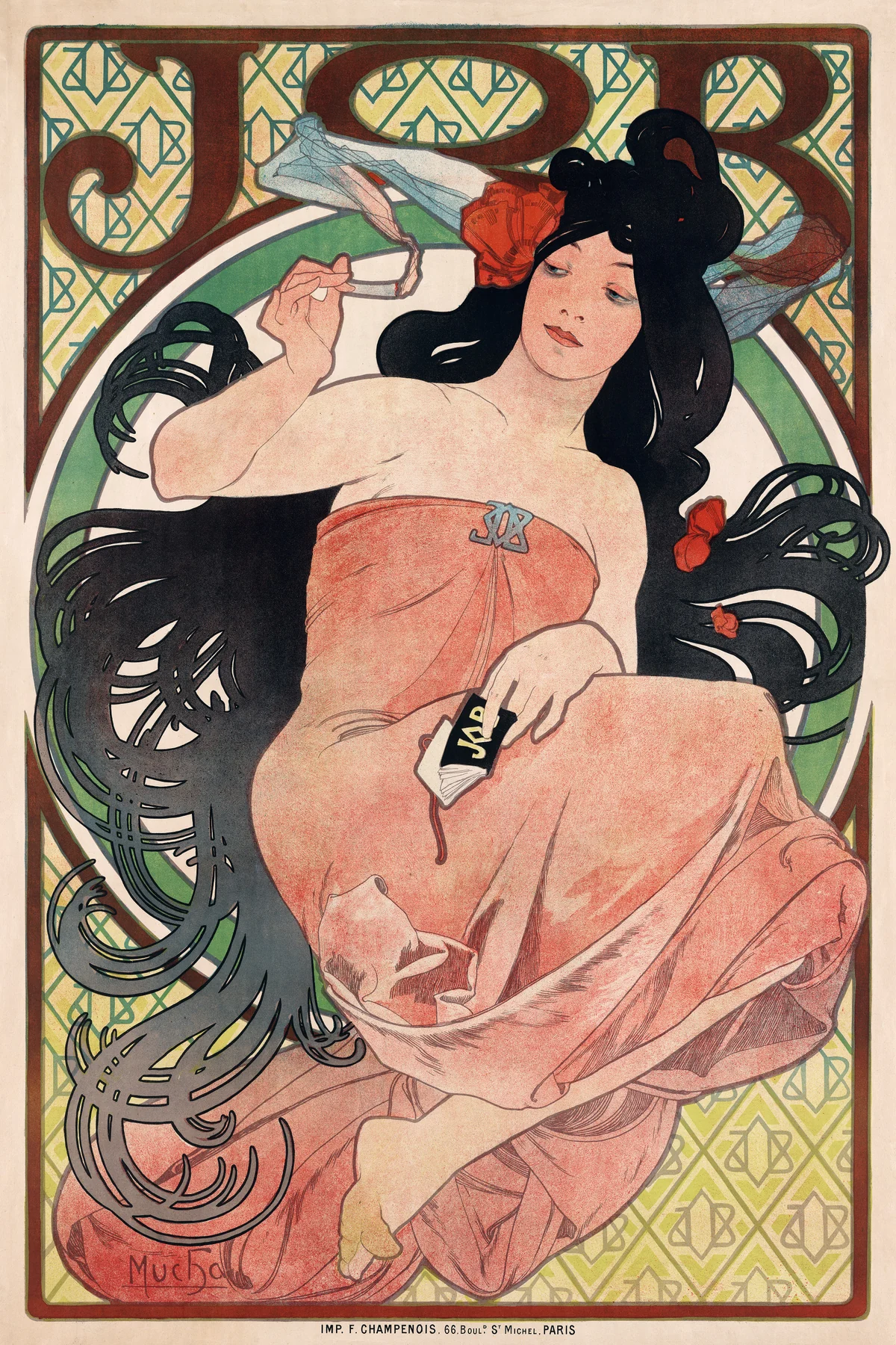

At first, Mucha’s JOB seems to drown advertising in hair. A seated woman’s brown locks spread into looping bands; cigarette smoke continues the curves. A mosaic-like background, decorative frame, large letters, brooch, and patterned dress flatten the image into a sumptuous surface.
Look again and the brand is everywhere. JOB dominates the top. Its monogram repeats through the background and appears on the clasp at the woman’s chest. A packet of cigarette paper rests in her hand. Ornament does not distract from the product. It makes the product’s name difficult to escape.
The poster sells association, not paper quality or price. It joins JOB to touch, fashionable leisure, erotic display, and the pleasure of a line that never seems to stop. The consumer remembers a mood and retrieves the name later.
Mucha was born in what is now the Czech Republic and built his decisive poster career in Paris. His breakthrough came through theatre: a rushed 1894 commission for Sarah Bernhardt’s Gismonda produced an elongated, ornamentally unified image that was conspicuous on the street. Bernhardt then entered a sustained working relationship with him. The V&A’s account of Mucha’s “whiplash” line connects his poster work, celebrity commissions, and the sinuous curve that became closely associated with Art Nouveau.
The label should not erase the commission. Mucha did not first invent an autonomous style and later allow commerce to borrow it. Theatre, printers, deadlines, packaging, magazines, and decorative panels helped the visual language develop and circulate.
The smoking woman can appear modern because she occupies the poster without a supervising man. She is also a constructed advertising body: closed eyes, exposed profile, abundant hair, and pleasure are attached to tobacco use. The product is cigarette paper, but the poster still belongs to tobacco culture. Formal admiration should not make consumption equal emancipation.
What Mucha adds to this five-object route is not simply “more decoration.” Text, frame, figure, commodity, and signature pattern have fused. The brand no longer sits beside the image; it inhabits the image’s entire visual grammar.
D’Alési: the railway sells time as landscape
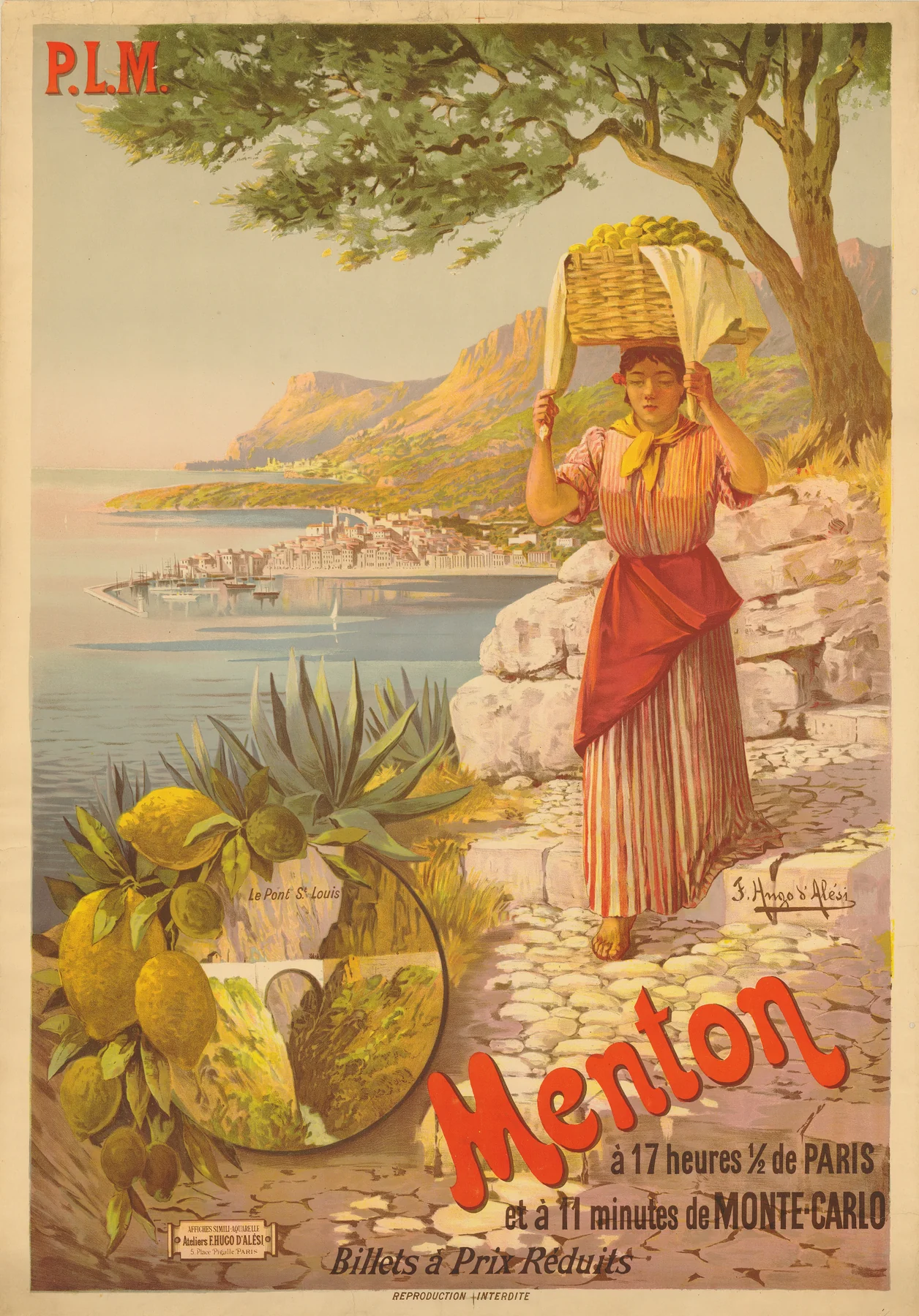

No locomotive appears in d’Alési’s poster. Rail infrastructure enters as arithmetic: Menton is seventeen and a half hours from Paris, eleven minutes from Monte Carlo, with reduced round-trip fares during winter.
Above that timetable, transport becomes atmosphere. Blue water, pale buildings, palms, fruit, and flowers promise warmth and abundance. Tracks, engines, ticket offices, porters, and maintenance crews are absent. P.L.M.—Paris-Lyon-Méditerranée—presents itself through the destination it makes reachable.
The BnF’s overview of early tourism posters places the growth of destination advertising alongside new forms of passenger transport and leisure. The SNCF archives likewise document how nineteenth-century railway companies used posters to draw travellers toward regions served by their lines. D’Alési, born in Romania and active in Paris, specialised in this scenic form.
The woman carrying a laden basket complicates the paradise. She appears amid lemons and blossoms that make Menton desirable, but she also performs work. The advertisement turns local produce, a gendered labouring body, and coastal topography into signs available to the tourist’s gaze. Her burden gives the landscape a human presence while the overall composition softens the economic relations between visitor, railway company, service worker, and resident.
Travel posters organised expectations before arrival. A coast became a quick sequence of weather, fruit, sea, and architecture. The network compressed space twice: rails reduced journey time; the image reduced a lived place to a promise.
Even the date warns against false certainty. The BnF catalogue assigns this design to 1898; the Letterenhuis record dates its impression 1900. The difference may reflect cataloguing evidence, impression history, or inherited documentation, but the available records do not justify choosing a hidden story. “About 1898–1900” preserves what the two institutions can support. Object records are evidence made by people, not infallible labels delivered by the past.
Cappiello: one impossible image, remembered at speed
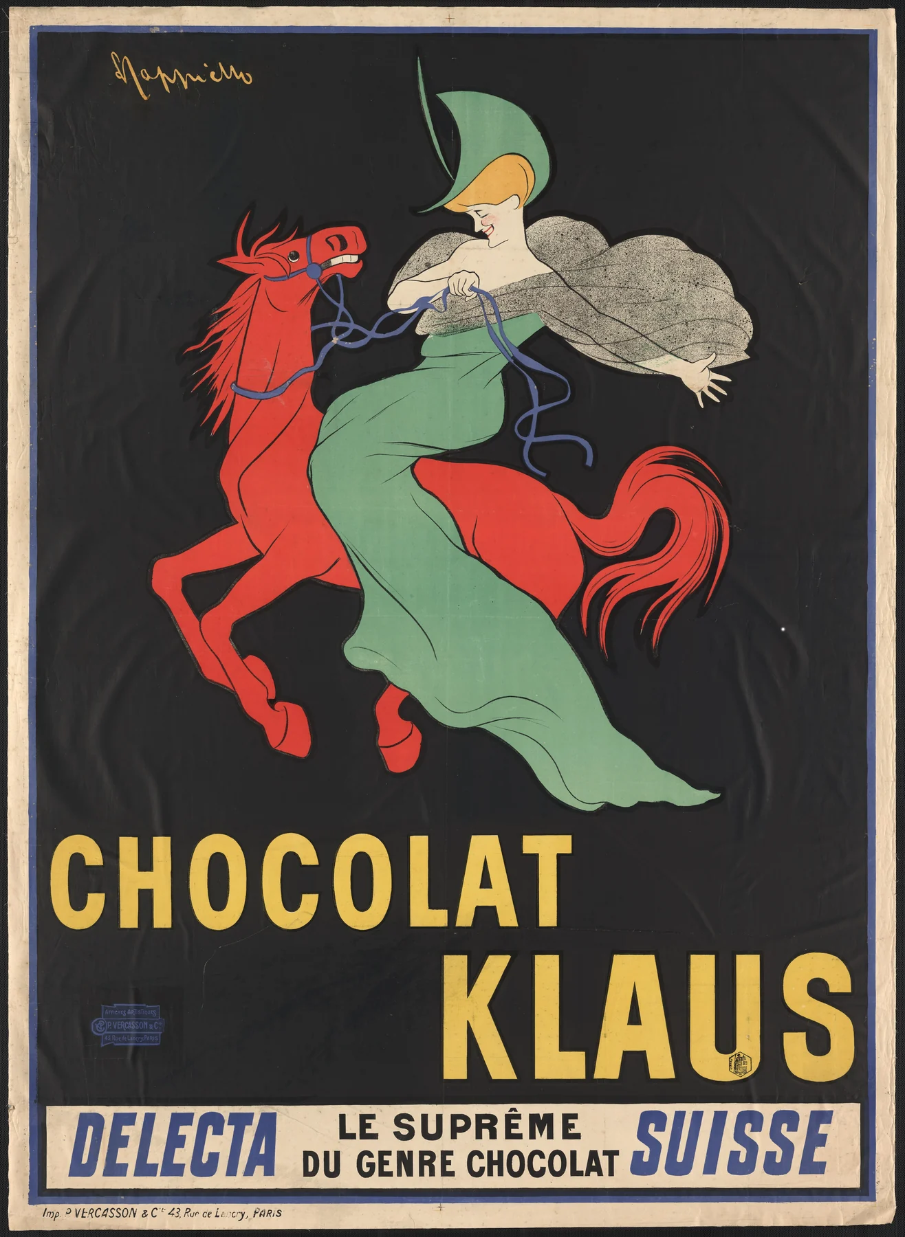
A red horse gallops out of blackness. A rider in a green dress turns her face toward us. Below them, CHOCOLAT KLAUS occupies three yellow lines. No chocolate bar, cup, cocoa bean, factory, or dining scene explains the product.
The mismatch is the strategy. A brilliant horse and elegant rider have little necessary relation to chocolate, so their relation must be learned through repetition. The Library of Congress record notes that the image remained the Swiss company’s logo for fifty years. The poster does not demonstrate the commodity. It builds a memory structure for the name.
Cappiello was born in Livorno, Italy, and established his career in Paris. In Chocolat Klaus, he abandons the surrounding ornamental field characteristic of Mucha. The figure is isolated against black; extreme red, green, and yellow make it legible from afar. Detail yields to contrast. The viewer does not have to understand a narrative before the image can lodge in memory.
This is why Cappiello belongs at the end of the route without needing to become a perfect Art Nouveau artist. His poster overlaps the period and uses the colour-lithographic advertising system, but it points toward a modern logic of branding: one striking figure, one name, one durable association. Period labels become more useful when an object can cross their edges.
It also changes the relation between viewer and commodity. Chéret offers an imagined experience at a venue. Toulouse-Lautrec names a real performer and crowd. Mucha places the product inside an ornamental ritual. D’Alési shows a destination made reachable by rail. Cappiello can withhold the product itself. By 1903, the poster’s accumulated techniques make an apparently arbitrary image commercially useful.
The street was a market, not a neutral museum
The five posters are beautiful enough to encourage a comforting story: colour escaped elite galleries and made the city into art for everyone. Broad public visibility was real. Equality was not.
A pedestrian did not pay admission to see a poster. Yet commissioners paid for design, printing, and placement. Routes carried different commercial value; authorities controlled legal surfaces; new sheets covered old ones. The public sphere expanded together with commercial competition for attention.
Nightlife carried the same tension. Moulin Rouge advertising made performers famous while converting their identities and bodies into revenue. Entertainment offered pleasure and wages within class and gender hierarchies. A pictured crowd is a desired market, not proof of equal entry.
Tourism widened mobility for those with time and money. Rail posters helped middle-class travellers imagine distant coasts as accessible experiences. They also turned inhabited places into views and local people into atmosphere. The modern traveller and the person serving, carrying, cleaning, building, or maintaining the journey do not occupy the same position.
Nor was the poster’s internationalism innocent. Parisian print culture absorbed artists and motifs across borders, while French consumer culture also advertised colonial exhibitions, racialised spectacles, and imperial goods. The Musée d’Orsay’s poster research keeps political propaganda and colonial imagery inside the medium’s history. Art Nouveau’s lines cannot be detached from every object, market, and power structure they helped make attractive.
The poster’s public was plural and unequal
There was no single “mass viewer.” A commuter read a railway promise differently from a tourist with a ticket. A theatre fan recognised a dancer whom another passerby knew only as a kick and a skirt. A printer inspected registration; a collector wanted an unpasted proof; a child might remember a red horse without knowing what it sold.
Viewing conditions changed meaning. From across a boulevard, contrast and silhouette dominated. Up close, printer marks, lettering, line, and paper became visible. Repetition could make a poster familiar before its text was consciously read. Weather and overlapping sheets altered the image over time. At home in a portfolio, the same design could be examined as signed graphic art with the original advertisement safely neutralised.
Female bodies carried a disproportionate share of poster desire: performer, consumer, allegory, decoration, and invitation. Some images pictured new mobility while offering women’s appearances for commercial judgement. Rather than declare poster culture liberating or oppressive, ask how one image distributes looking, activity, pleasure, labour, and purchase.
Class and literacy mattered too. Strong colour and recognisable figures could communicate before detailed reading, but words remained essential: venue, product, timetable, fare, printer, destination. A poster often divided information by distance. The largest name reached the hurried viewer; smaller text rewarded proximity and ability to read it.
The “mass” was an advertising ambition—a large, repeatable field of attention. The actual public remained many people with unequal resources and different knowledge.
From wall to portfolio to museum
Poster collecting began while the medium was still commercially new. Admirers searched for fresh sheets, bought special impressions, followed designers, and subscribed to publications such as Les Maîtres de l’affiche. Dealers and publishers made reduced-format plates available to interiors and portfolios. The street advertisement became a collectible category rapidly enough to influence how artists, printers, and commissioners conceived it.
This transition preserved works that might have vanished and changed their status. Paste stains, tears, fading, and sheet joins could become damage rather than evidence of use. A clean, signed proof privileged design over billposting; anonymous production receded behind the artist.
Today’s museum page performs another translation. A poster more than a metre high appears on a phone at the width of a hand. Zoom reveals paper fibres while destroying the bodily experience of scale.
Preservation is not falsification; without it, this history would be poorer. But the object should be mentally returned to its circuits. Ask where it was placed, what surrounded it, how long it remained, who paid, who printed it, and who was expected to act after seeing it.
Five posters, five kinds of attention
| Poster | Commission and likely site | Colour strategy | Text–image relation | Imagined viewer | Labour or risk easy to miss |
|---|---|---|---|---|---|
| Chéret, Palais de glace | A leisure venue promoted through urban billposting | Red figure and blue type animate pale paper | The skater’s motion carries the venue’s name | Passerby seeking fashionable recreation | Workshop printing; the active woman also functions as advertising display |
| Toulouse-Lautrec, Moulin Rouge | Nightlife venue and star performer advertised in Paris | Four colours reduce lamps, crowd, dancer, and foreground to signals | Repeated name, silhouette, and kick create instant recognition | Entertainment public drawn by celebrity and crowd | Performer identity becomes venue property; three-sheet registration and posting disappear behind the artist |
| Mucha, JOB | Cigarette-paper brand distributed through commercial poster networks | Hair, smoke, mosaic, and frame create a continuous ornamental field | The brand repeats inside the decoration | Consumer invited to associate tobacco with sensual modern pleasure | Advertising construction can be mistaken for female autonomy; tobacco harm is aestheticised |
| D’Alési, Menton | P.L.M. railway destination advertising, especially effective around stations | Warm fruit and coast contrast with blue sea and sky | Travel time and fares make the landscape purchasable | Traveller with money and leisure | Rail and service labour disappear; a resident’s burden becomes tourist atmosphere |
| Cappiello, Chocolat Klaus | Chocolate brand seeking rapid public recognition | Red, green, and yellow leap from black | An unrelated memorable figure is trained to equal the brand name | Moving viewer who may see the image repeatedly | Product absence looks effortless; printing, repetition, placement, and commercial testing create the association |
The sequence is not an evolution in which Cappiello corrects Chéret. Each poster answers a different commission. Together they show how attention could be organised through movement, celebrity, ornament, destination, and mnemonic shock.
What the term Art Nouveau can and cannot do
Art Nouveau is useful for identifying an international field active from the 1880s to the First World War across graphic design, architecture, interiors, furniture, glass, metalwork, textiles, and other applied arts. Natural growth, asymmetric composition, rhythmic line, and the famous curving “whiplash” recur across parts of that field. Artists and designers challenged the hierarchy that separated fine art from useful or commercial form.
The name was never universal. The V&A’s international overview distinguishes related but non-identical formations and labels: Jugendstil in German-speaking contexts, the Vienna Secession in Austria, Modernisme in Catalonia, and Stile Liberty in Italy, among others. Even within one city, objects associated with the period did not share a single appearance or politics.
The term can therefore help connect Mucha’s integrated ornament to wider experiments in line, lettering, and designed environments. It can also help explain why the poster mattered to the effort to bring art into everyday life. It cannot make every colour advertisement Art Nouveau. Chéret’s skating figure, d’Alési’s scenic railway realism, and Cappiello’s black-ground brand image expose the cost of using one style label for an entire medium.
Nor did stylised plant forms grow outside history. Designers learned through botanical study, rococo decoration, Celtic and Islamic ornament, Gothic revival, Japanese prints, new photographic circulation, workshops, exhibitions, colonial trade, and competitors’ reproductions. The Met’s Art Nouveau essay is valuable precisely because it places the movement across media and international exchange. “Nature inspired the line” is only the beginning; materials, institutions, markets, and unequal routes decided where that line could travel.
For this chapter, poster is the stronger organising category. It keeps the commissioner, printer, wall, viewer, product, and afterlife visible. Art Nouveau then becomes one important current within that system, not a decorative filter placed over all of it.
A compact timeline
- 1790s: Alois Senefelder develops lithography, a planographic printing process later adapted to large-scale commercial colour work.
- Mid-nineteenth century: Technical, industrial, and transport changes widen the production and distribution of illustrated printed matter.
- 1881: France’s law on freedom of the press loosens important restrictions around billposting and helps expand commercial advertising surfaces.
- 1889: The Moulin Rouge opens in Paris.
- 1891: Toulouse-Lautrec designs Moulin Rouge: La Goulue.
- 1893: Chéret advertises the Palais de glace on the Champs-Élysées.
- 1894: Mucha’s Gismonda poster for Sarah Bernhardt establishes a major theatrical and commercial partnership.
- 1895: Siegfried Bing opens his Paris gallery L’Art Nouveau, helping popularise the French name.
- 1898: Mucha’s JOB is printed in Paris; the BnF also dates d’Alési’s Menton poster to this year.
- 1900: The Letterenhuis dates its impression of d’Alési’s Menton poster to 1900, the year of the Paris Exposition Universelle.
- 1903: Cappiello’s Chocolat Klaus turns an improbable rider and red horse into a durable brand sign.
- 1914–18: The First World War redirects poster systems toward recruitment, propaganda, relief, and national mobilisation while commercial graphic design continues to change.
Key terms
- Lithography: A planographic printing process based on the repulsion of water and grease; each colour in a poster normally requires a separate prepared stone or plate and printing pass.
- Chromolithography: Colour lithography using multiple stones or plates, carefully registered to build a multicolour image.
- Registration: The alignment of separate impressions so colours and shapes meet where intended.
- Billposting: The work and system of attaching printed advertisements to authorised or contested public surfaces.
- Affichomanie: The late nineteenth-century “poster mania” involving collecting, dealing, exhibitions, portfolios, and specialist criticism.
- Morris column: A cylindrical Parisian street structure used for advertising performances and public notices.
- Art Nouveau: An international, internally varied design field of roughly the 1880s to the First World War, known under different regional labels.
- Whiplash line: A sharply curving, energetic line associated with parts of Art Nouveau, often derived from stems, hair, smoke, or bodily movement.
- Brand image: A repeatable visual sign designed to make a name or product recognisable, sometimes without depicting the product itself.
- Mass viewer: Not one real person but an advertiser’s model of a large public whose attention can be reached and repeated across urban sites.
Ten questions for close looking
- Which part of the poster remains legible from the greatest distance?
- How many colours can you distinguish, and where might overlapping inks create additional hues?
- Does the lettering describe the image, sit beside it, or become part of its movement and pattern?
- What does the poster promise: a product, an experience, a destination, a social identity, or recognition itself?
- How is the viewer’s body imagined—walking past, waiting at a station, standing close, or collecting at home?
- Which kinds of work are pictured, and which are required but absent?
- Does a represented woman act, consume, perform, labour, invite, or become decoration? Can several be true at once?
- What changes when a street advertisement enters a museum frame or a phone screen?
- Which formal choices might relate to Japanese prints, and through what historical routes did those prints circulate?
- What does the label “Art Nouveau” clarify about this object, and what does it conceal?
Five shortcuts to refuse
“Art Nouveau was one European style”
It was an international field with different names, institutions, materials, and visual languages. Similar curves do not prove identical meaning.
“The poster democratised art”
It widened visual access, but surfaces, commissions, purchasing power, mobility, and representation remained unequal. Public exposure is not the same as public control.
“Mucha’s women prove emancipation”
Commercial images could picture new female mobility and pleasure while arranging women’s bodies to sell products. Read the specific action, gaze, product, and commission.
“Japanese influence explains the modern flat style”
Artists selected particular devices from Japanese works circulating through European trade and collecting. Name the device and route; do not reduce many Japanese artists to an ahistorical source of European innovation.
“The named artist made the poster”
The design required commissioners, lithographers, printers, presses, paper, ink, edition planning, billposters, urban permissions, sites, and viewers. Authorship and production are related but not identical.
Source guide
- The Musée d’Orsay’s research for Art is in the Street and La rue multicolore establishes the relation among advertising, colour lithography, billposting law, entertainment, tourism, collectors, and mass culture.
- The Museum of Modern Art’s digital project Paris—the 1890s provides a concise account of the decade’s print boom, public and private display, artistic visibility, and collector impressions.
- The V&A’s poster history, international Art Nouveau overview, and essay on the whiplash line connect print mechanics, regional terminology, Mucha, and commercial design.
- The Met’s Art Nouveau essay and nineteenth-century print history place poster design across media, exchange, and technical change.
- Ruth E. Iskin’s research report through the National Gallery of Art’s Center for Advanced Study in the Visual Arts provides a framework for analysing women as fantasies, modern participants, and consumers in poster imagery.
- The BnF tourism-poster overview and SNCF archives connect rail expansion, destinations, and scenic advertising.
- The individual Chéret, Toulouse-Lautrec, Mucha, d’Alési, and Cappiello object records support dates, dimensions, techniques, institutions, and reproduction status used here.
Continue through the collections
The posters survive as objects, but they also reward comparison in groups. Continue through Toulouse-Lautrec for nightlife, performer identity, and the graphic silhouette; Alphonse Mucha for theatre, advertising, decorative panels, and the integrated line; Leonetto Cappiello for the turn toward modern brand recognition; and Railway posters or Riviera and sea for the visual construction of travel.
The exact Chocolat Klaus image discussed here is also available as the Chocolat Klaus Cappiello poster. The historical question should travel with the object: not only whether the red horse is memorable, but who made that memory, through which material system, and for whose commercial purpose.
A poster is not merely a beautiful surface that happened to advertise. It is a machine for joining image, word, place, repetition, and desire. Art Nouveau changed parts of that machine. The street, the printer, the performer, the railway, the commodity, and the moving viewer made the rest.
Editorial record
About this article
- Author
- Publisher
- GeMarkt
- Published
- Updated
- Reviewed
- Internal source & rights check. Conducted by GeMarkt Research Review. This is an internal editorial check—not independent peer review.
- Source standard
- Art history source standardPrioritises object records and research sources, distinguishes evidence from interpretation, and states material uncertainty.
Found a claim that needs checking? Report a factual error.