GeMarkt Blog · Practical guide
Paintings of Women Reading and Writing
Choose a reading or writing picture through three real works by Cassatt, Vermeer and Fragonard, with practical advice on gaze, detail, proportions and placement.

A picture of someone reading can seem an obvious choice for a reading corner. Look a little longer, though, and the differences matter. Is the person absorbed in the page, looking towards you, or holding a letter without reading it? Those are three different encounters to bring into a room.
The best choice need not match your furniture or depict your own routine. It should reward the way you will actually see it: across a desk, beside a chair or while passing through a hallway. These works by Mary Cassatt, Johannes Vermeer and Jean-Honoré Fragonard offer three useful starting points. They are examples for choosing a reproduction, not a claim that a particular print size or finish is currently available.
Choose the moment, not just the subject
“Women reading” is a broad search term, not a single mood. A newspaper, a letter and a book suggest different activities, but none tells us everything about the person pictured. Avoid choosing on the assumption that a female reader must represent gentleness, solitude or domestic contentment.
Instead, describe what you can actually see. Where are the hands? Does the person look at the page or outside the picture? Is the surrounding room spare or full of pattern? This gives you a more useful shortlist than an imagined personality.
You might want a companionable figure who seems aware of your presence, or prefer someone occupied in their own world. Neither is inherently better for a study. And although a picture can be meaningful to you, it is not a treatment for distraction or a promise of better concentration.
Cassatt: a reader with a newspaper
Mary Cassatt’s On a Balcony, 1878–79, shows a woman reading a newspaper rather than a novel. The Art Institute of Chicago’s record identifies the painting and its lively colour. She holds the broad sheet upright in front of her; her attention stays within the scene.
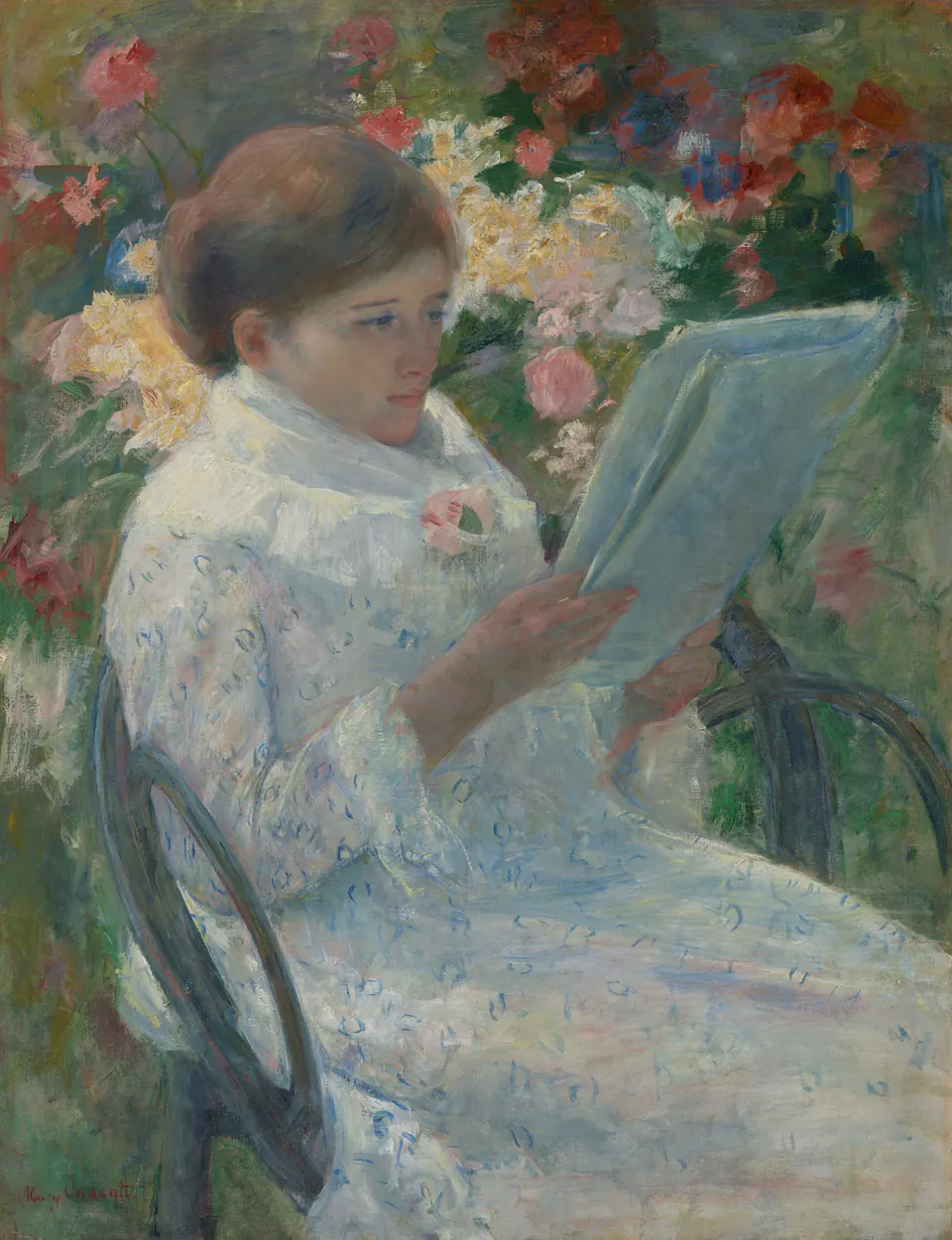
This is not a visually empty picture. Pink and red flowers surround the pale figure, while blue appears in the dress and paper. If you want a reading image without a predominantly brown interior, it is worth considering. That is a judgement about the visible palette, not a rule about the atmosphere it must create.
Try looking at the image small before choosing a small print. Can you still distinguish the newspaper from the dress? If it becomes one pale shape, a larger reproduction or a position that permits a closer look may better preserve the reason you chose it. Do not select it for the flowers alone and then crop away the reader’s hands and page.
Vermeer: a writer who looks back
In Vermeer’s A Lady Writing, about 1665, a woman holds a quill at her desk but turns her face towards the viewer. The National Gallery of Art’s painting, accession 1962.10.1, is the particular work shown here. Its yellow jacket, pale face and dark surroundings make a quite different arrangement from Cassatt’s floral setting.
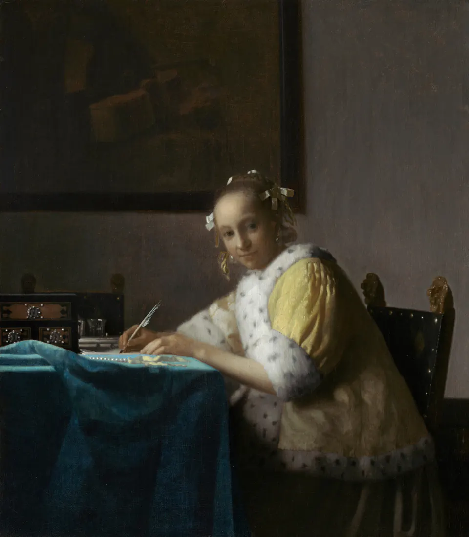
The outward glance may feel more conversational to you than Cassatt’s downward attention. Put the two thumbnails beside a photograph of your intended wall and ask which relationship you prefer. You are choosing an encounter with a figure, not just a yellow or pink accent.
For this reproduction, inspect the shadow detail as well as the face. The writing surface and the blue cloth at the lower left help establish the scene. A version that brightens everything indiscriminately, or closes the dark areas into solid black, can make it a less interesting picture. Compare the offered file with the museum image; a tiny room mockup is not enough to judge that difference.
Fragonard: a pause in correspondence
Fragonard’s The Love Letter, from the early 1770s, is not a straightforward image of someone reading or writing. The woman has turned from her desk, holding flowers and a letter. The Met describes a genre scene, not an identified portrait. The title does not give us permission to invent the sender or the contents of the letter.
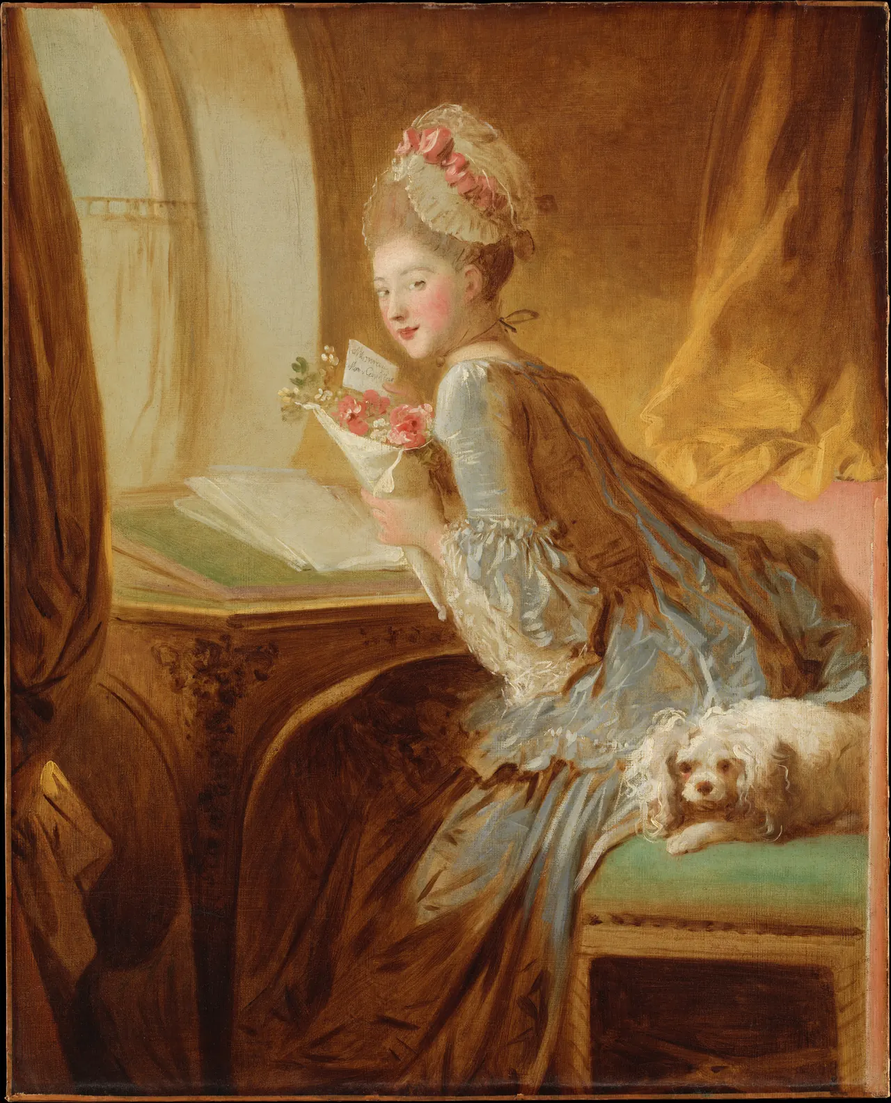
This is a useful option if you enjoy a picture that prompts questions. The letter, flowers, desk and dog give the eye several things to connect. It does not need to be assigned a romantic meaning in your own home, but its visible activity differs from uninterrupted reading.
A close crop of the face would remove much of that interest. Keep the desk and the hand holding the letter when evaluating a size preview. If you like the whole scene, choose a frame arrangement that accommodates it rather than squeezing it into a convenient opening.
Decide where you will meet the picture
Beside a reading chair, consider the view from the chair as well as the doorway. A picture directly behind your usual seat may look excellent on entering but be absent from your own reading experience. That can still be the right choice; make it consciously.
At a desk, try a paper template before buying. Will the picture sit beyond the monitor, or will the screen hide its lower half? Our home-office art guide also separates the view you enjoy from what a video-call camera sees.
Do not digitally reverse a historical picture merely to make the figure face towards the centre of a wall. Move the frame or choose another work. Flipping changes the composition and reverses any writing; it is not the same as changing the frame colour.
Protect the small details when choosing a size
All three examples are vertical, but their proportions differ. “Portrait format” does not mean they fit the same opening without a crop or a border. Compare the complete image with the actual printed area, then add any mount and frame dimensions.
For a pair, matching outer frames can be useful without forcing equal image shapes inside them. Two hypothetical frames, each 40 centimetres wide with a 10-centimetre gap, occupy 90 centimetres altogether. Mark that complete arrangement on the wall; do not measure only the artworks.
At your normal viewing distance, look for the quill, newspaper or letter. If the important action disappears, adjust the size or position. The print-size guide explains why paper, image and frame measurements should be kept separate.
Check the reproduction before the frame
Ask which museum image the reproduction uses, whether the full composition survives, and whether any colours or details have been altered. The public-domain status of a painting does not describe the quality of a particular scan or print.
Then check the physical offer: paper or canvas, printed dimensions, borders, framing and delivery. A digital download leaves those production choices to you; a framed print should specify them. Our guide to reading an art listing gives a practical checklist.
Finally, return to the person in the picture. Do you want absorption, an answering glance or a story left open? That small distinction is often more useful than searching for a picture labelled simply “perfect for a reading nook.”
Editorial record
About this article
- Author
- Publisher
- GeMarkt
- Published
- Reviewed
- Internal source & rights check. Conducted by GeMarkt Research Review. This is an internal editorial check—not independent peer review.
- Source standard
- Buying guide source standardSeparates measured or first-hand evidence from general guidance and keeps practical limits visible.
Found a claim that needs checking? Report a factual error.