GeMarkt Blog · Practical guide
Minimalist Wall Art: When One Picture Is Enough
Choose and place one picture without making a room feel unfinished. Compare scale, detail, empty wall and framing with Mondrian and Vermeer examples.

One picture is enough when it gives the room something you enjoy looking at without needing neighbouring pictures to explain its place. It can be large and bold or small and detailed. The aim is a clear choice, not an empty-room competition.
Before buying more art, try removing the objects that compete with the picture you already have. A nearby clock, tall lamp and row of small decorations may be the reason the wall feels unresolved. Sometimes a clearer arrangement solves the problem without a new purchase.
Choose one place for your attention
Pick the view that matters most. From a sofa, that might be the wall opposite; from a dining table, it might be a picture on the side wall rather than behind your back. Stand where you enter and sit where you spend time. Those views can suggest different positions.
A single picture does not have to dominate the whole room. It can give a reading corner its identity while a window remains the main feature. Decide whether you want an immediate image from across the space or something that rewards a closer approach.
Count other things that already act like pictures: a television, a strongly patterned rug, a bright window, an open bookcase. A wall can feel busy without carrying many frames. You are arranging the whole view, not counting only objects labelled “art”.
This is especially helpful in a small room. Adding a second picture because the first seems lost may make the view busier without making either work easier to enjoy. First try a different height, a different surround or a place where you can see the detail.
Separate a minimal room from Minimalist art
A sparingly furnished room does not require art from the historical Minimalist movement. MoMA’s glossary identifies Minimalism with a largely American movement of the 1960s, including simplified geometric forms and industrial approaches to making. That is a particular art-historical context, not a name for every picture with a pale background.
Your single image could be an engraving, a portrait, a flower study or a colourful abstraction. The restraint lies in how you arrange the room. There is no need to reject a favourite detailed painting because it fails to look like a furniture advertisement.
Likewise, reducing a room’s objects does not guarantee better concentration or wellbeing. If a wall full of family pictures matters to you, removing them for an aesthetic rule is not automatically an improvement. Use fewer things where fewer things make your daily experience better.
Look at what Mondrian leaves open
Piet Mondrian’s 1927 Composition with Red, Yellow, and Blue offers a useful example of a picture that can hold a wall without filling its entire surface with detail. Much of the image is pale. Black divisions and small areas of strong colour establish an arrangement around that space.
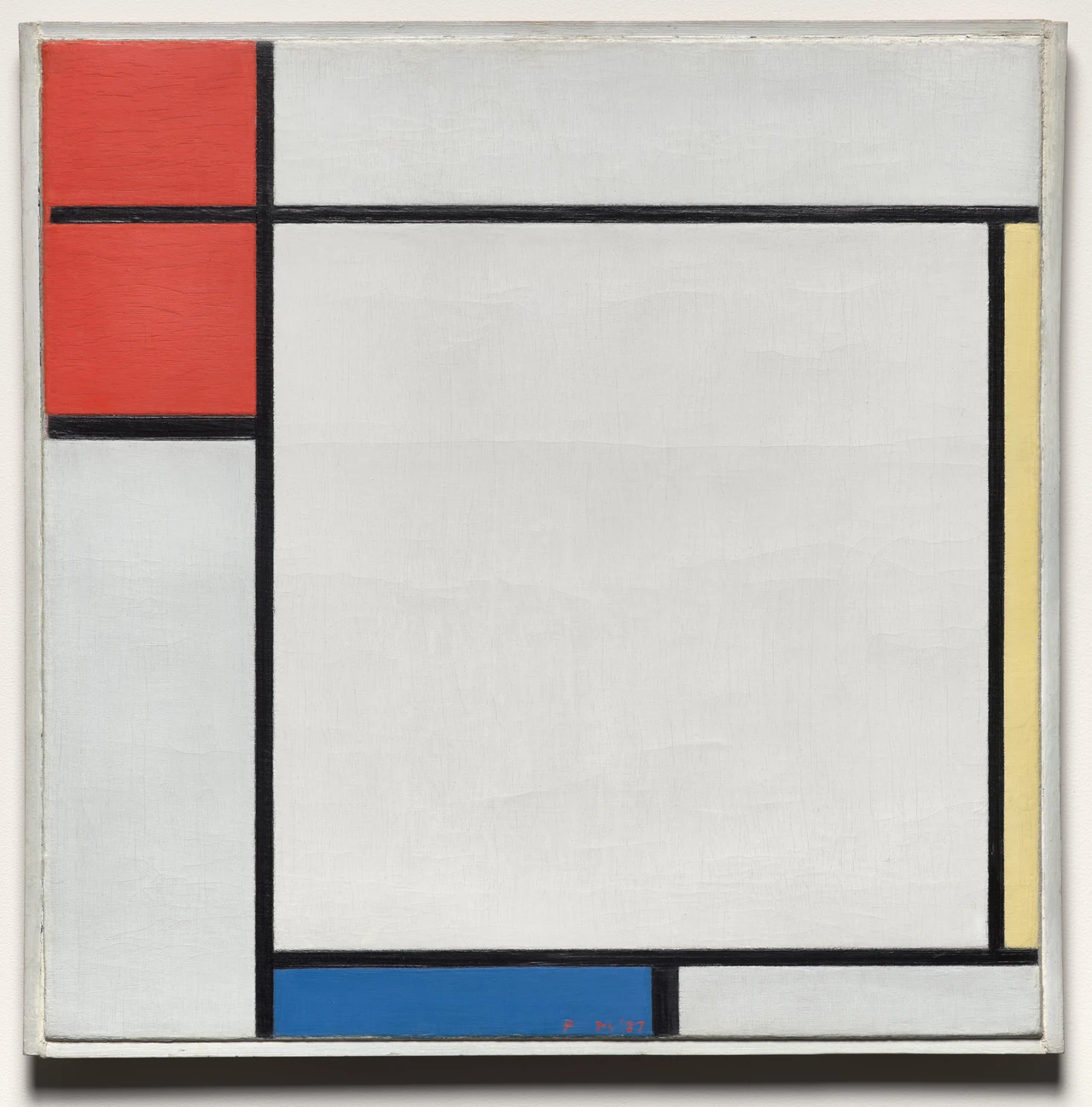
Try following one black line across the picture, then noticing where it stops. The pale areas have different shapes and sizes; they are not simply leftover background. This is a reason to preserve the complete composition rather than crop it to make the red square larger.
The painting predates the 1960s Minimalist movement. Its usefulness in a restrained room does not change that history. Nor does it oblige you to add red, blue and yellow accessories. A single coloured passage can remain a distinct event in the room.
Let a detailed picture stand alone
Vermeer’s Young Woman with a Water Pitcher is almost the opposite of an empty geometric image. There is a map, patterned fabric, a window, clothing and reflective metal. Yet all that detail can belong to one clearly bounded object on your wall.
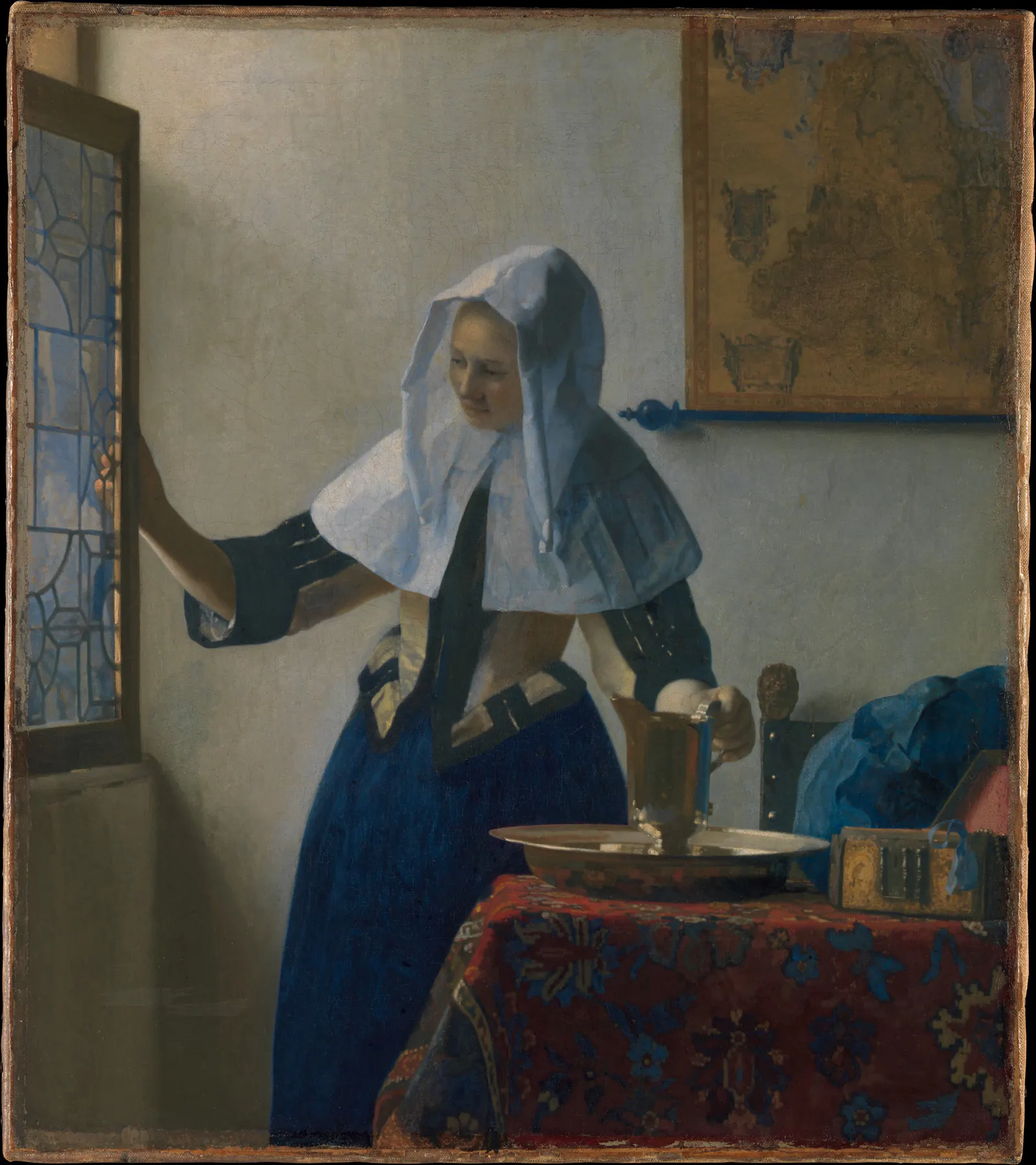
I would try a picture like this where you can approach it: beside a chair, on a landing or above a modest cabinet. The woman’s hands and the objects around them give you something to follow without needing a second image as a companion.
Do not assume that detailed art must be printed very large. Choose a reproduction whose details remain satisfactory at your normal viewing distance. A small, well-placed picture may be more rewarding than a huge enlargement that you only see from an awkward angle.
Size the picture for the way you look
Measure the complete framed object, not just the printed image. Then test its outline in the actual place. A mat and frame can make a relatively small image occupy much more wall than you expect.
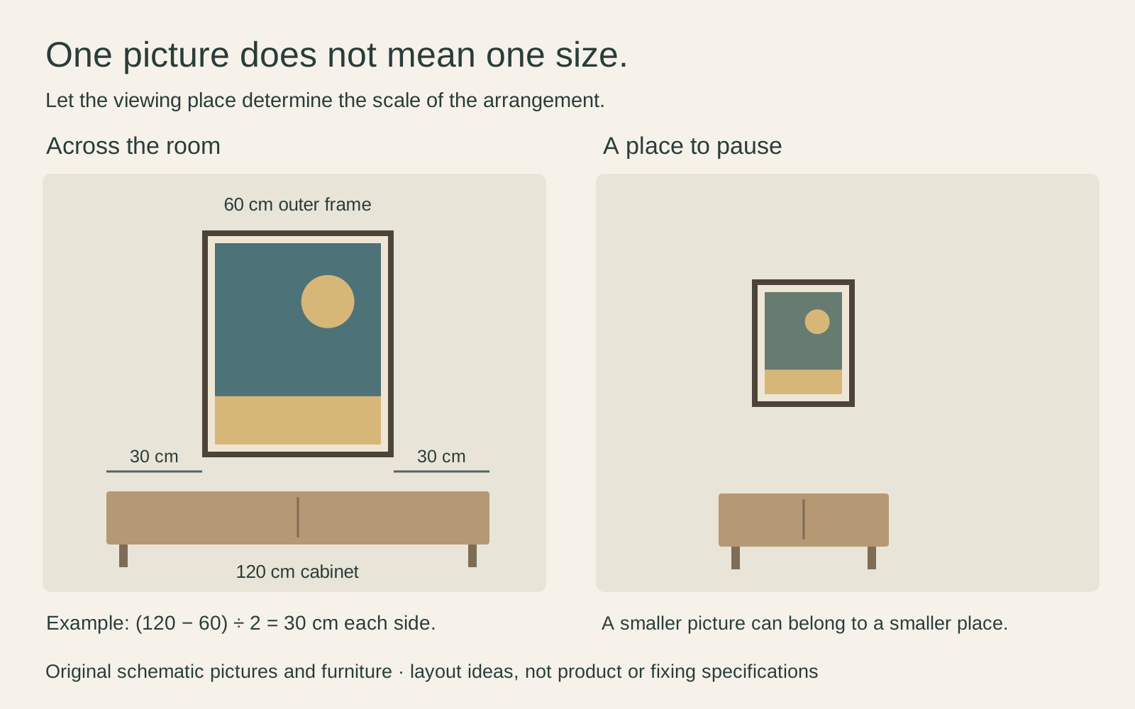
As a planning example, a 60 cm-wide outer frame centred above a 120 cm-wide cabinet leaves 30 cm on each side of the frame within the cabinet’s width. That arithmetic describes one possible relationship, not an ideal proportion or an available product size. Try a wider outline too and decide which looks intentional from your seat.
If a small picture feels lost, you have several options besides buying a larger one: move it to a narrower wall, bring it closer to the place you sit or remove competing objects. The one large print or several small ones guide compares the broader choice.
Make the frame and surround deliberate
With one picture, the edge is easy to notice. Compare a quiet timber frame, a dark outline and a pale surround beside the image. The right choice depends on what you want to emphasise, not on a fixed rule that minimalist frames must be black and thin.
Check the seller’s preview for an existing photographed frame or paper margin inside the image. The Mondrian photograph above includes its historical surround. A reproduction of that photograph is not the same thing as receiving the original type of physical frame.
Leave some surrounding wall visible, but do not turn empty space into a measurement contest. The Getty’s introduction to space distinguishes the area occupied by forms from the area around them. At home, looking at both helps you see whether the picture is comfortably placed or stranded far from everything else.
Stop when the wall does its job
Live with the arrangement through an ordinary day before adding anything. Check reflections under the lamps you use and make sure the frame does not obstruct a switch, door or useful surface. The attachment must suit the wall, frame weight and manufacturer’s instructions; fewer pictures do not make unsuitable fixings safe.
Ask what you still find unsatisfactory. If the picture is interesting but hard to see, address position or glare. If the wall feels good and you are merely used to shopping for another object, it may already be finished.
One picture is not an irreversible commitment. You can change it later, move it to another room or build a group when you find something genuinely worth adding. For now, a single work you notice and enjoy is a complete arrangement.
Editorial record
About this article
- Author
- Publisher
- GeMarkt
- Published
- Reviewed
- Internal source & rights check. Conducted by GeMarkt Research Review. This is an internal editorial check—not independent peer review.
- Source standard
- Buying guide source standardSeparates measured or first-hand evidence from general guidance and keeps practical limits visible.
Found a claim that needs checking? Report a factual error.