GeMarkt Blog · Essay
Lithograph vs Screen Print
Lithography transfers ink from a flat surface; screenprinting pushes it through a stencil. See the processes and why bold colour cannot identify either.

A lithograph takes ink from a prepared flat surface. A screenprint takes ink through the open parts of a stencil held in a mesh screen. The difference is the route the ink follows, not whether the image is colourful, modern-looking or valuable.
Both processes can create strong areas of colour and fine detail. Both can involve an artist working with a specialist printer. A bold red poster is not automatically a screenprint, just as a delicate drawing-like print is not automatically a lithograph.
The difference is the route of the ink
The diagram above separates two mechanisms. On the left, the paper receives ink from the surface beneath it. On the right, ink travels through openings in a screen to reach the paper below. The spaces are exaggerated to make the paths visible; this is an explanatory drawing, not a historical printing press or a scale model.
| Question | Lithograph | Screenprint |
|---|---|---|
| What carries the design? | A prepared stone or metal plate | A stencil associated with a mesh screen |
| What keeps areas unprinted? | The different behaviour of image and non-image areas | Parts of the screen block the ink |
| How does ink reach the sheet? | It transfers from the printing surface | It passes through open mesh |
Those distinctions come from the Met’s demonstrations of lithography and screenprinting. Neither technique is defined by a particular subject matter.
Lithography prints from a flat surface
Traditional lithography uses a prepared limestone or metal plate and depends on the different behaviour of grease and water. The image is made with greasy drawing materials and chemically prepared. During printing, damp non-image areas resist oily ink while image areas accept it. Paper receives the ink under pressure.
The technical name is planographic: printing from a flat plane. The design is not a set of high ridges, as in woodcut, and the printing lines are not cut channels, as in engraving. The Met’s lithography guide shows how a drawing-like mark becomes a printable image without those carved structures.
This offers a useful way to look at a lithograph. A mark that resembles crayon can belong to the printing process itself; it need not be crayon added to the finished sheet. The impression records the prepared image, including textures chosen by the maker.
Screenprinting sends ink through mesh
In screenprinting, fine mesh is stretched across a frame. A stencil blocks some areas and leaves others open. A squeegee, a tool with a flexible edge, moves ink across the screen and forces it through the unblocked areas onto the surface below.
Stencils can be made in different ways, including using light-sensitive materials to prepare photographic imagery. That does not make every screenprint a photograph or every photographic-looking image a screenprint. It describes one route for creating the stencil. The Met’s screenprint demonstration explains the relationship between screen, stencil, ink and receiving sheet.
You may also see silkscreen or serigraph in a catalogue. These belong to the screenprinting vocabulary rather than naming a third transfer mechanism. MoMA’s printmaking guide explains the historical use of silk mesh and the term “serigraph” for artists’ screenprints.
Colour needs alignment in both
To build a multicolour picture, different colour stages need to land in the intended positions. This alignment is called registration. Lithographic colour printing can use separate stones or plates; screenprinting can use separate stencils for the different colours. The two Met demonstrations show those separate stages.
Imagine a red circle intended to sit inside a black outline. If one stage lands to the side, a sliver of paper may remain visible on one edge while the colours overlap differently on the other. That is an alignment question, not proof that one process is better than another.
Look for how colours meet, but resist diagnosing a print from a small web image. A digital reproduction may conceal a tiny misalignment or introduce one of its own. A photograph also cannot reliably tell you the thickness or surface character of the original ink.
A bold poster that is not a screenprint
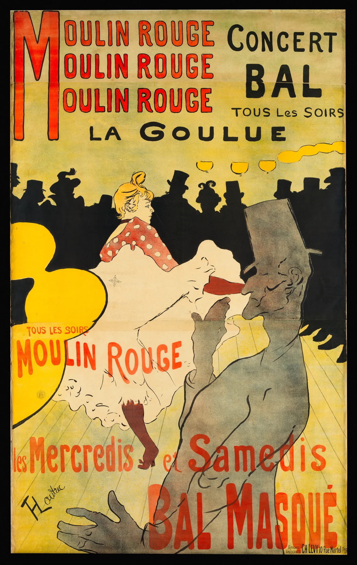
Toulouse-Lautrec’s Moulin Rouge: La Goulue is full of shapes that might look “screenprinted” to someone who associates that process with flat colour. The crowd forms a black band; the red lettering reaches across the top; yellow lamps punctuate the scene. Yet the Met’s exact object record identifies it as a four-colour lithograph.
The foreground figure offers a particularly good comparison. Its grey body has a grainier-looking field than the solid dark crowd behind. Both belong to the same printed composition. A single process can provide more than one kind of mark.
The museum also records a large physical object, printed on three sheets, not a small modern poster with one uninterrupted sheet of paper. Those details matter when discussing the historical print. A newly printed reproduction of this image is not the same object merely because it carries the same title.
Colour lithography was part of a much broader nineteenth-century print culture. The Met’s history of lithography describes a medium used by artists and commercial printers, with colour posters among its possibilities. Commerce and artistic invention were not separate processes with separate names.
A process is not a value rating
“Lithograph” and “screenprint” tell you how an object was printed. They do not, on their own, establish its date, authorship, edition, condition or relationship to an artist. A signature printed as part of an image is also different from a signature added by hand to a particular sheet.
The same applies to words such as “original” and “limited.” A useful description should connect those claims to the object being offered. Is this a historical impression, a later issue, or a modern reproduction? If a seller only supplies the artist’s name and “lithograph,” an essential part of the explanation is still missing.
Read the object, not just the image
Start with the medium in a museum or collection record. Then examine the image with a question in mind: how does this process support these particular marks? In Toulouse-Lautrec’s poster, compare the lettering, silhouettes and grey foreground rather than treating all its colour as one effect.
If you are choosing a reproduction, ask what its own printing method is. “Reproduction of a lithograph” does not mean “printed lithographically,” and a reproduction of a screenprint need not have passed through a screen. Our guide to originals, reproductions and prints explains that separate question.
The short distinction is enough to remember: lithography transfers from a flat surface; screenprinting passes through a stencil. Once that is clear, the visible choices of the artist and printer become easier to appreciate without forcing every image into a visual stereotype.
Editorial record
About this article
- Author
- Publisher
- GeMarkt
- Published
- Reviewed
- Internal source & rights check. Conducted by GeMarkt Research Review. This is an internal editorial check—not independent peer review.
- Source standard
- Art history source standardPrioritises object records and research sources, distinguishes evidence from interpretation, and states material uncertainty.
Found a claim that needs checking? Report a factual error.