GeMarkt Blog · Practical guide
Industrial and Loft Wall Art
Choose art for tall walls, exposed brick and open-plan rooms without defaulting to oversized factory prints. Plan around furniture, viewing distance and texture.

In a loft or an industrial-inspired room, art should relate to the places where you sit, work and walk—not just the height of the ceiling. Exposed brick, steel shelving and large windows already supply strong lines and texture. A picture can answer those features or provide a useful contrast; it does not have to show a factory.
A tall wall is not an instruction to order the biggest print available. Begin with one part of the room, decide where you want the picture to be seen from, and preserve the image’s proportions. Empty wall above an arrangement can be part of the room rather than unfinished decorating.
Start with one usable part of the wall
An open-plan space becomes easier to decorate when you break it into everyday places: the sofa, dining table, desk or entrance. Stand and sit in each before choosing the art. The picture you can enjoy at close range beside a desk may become a small patch of colour from the far end of the room.
Choose a wall area that belongs to one of those places. It might end at a column, a change in surface or the edge of a bookcase. You do not need to centre a picture across the entire building frontage if the sofa occupies only one part of it.
This also helps with awkward features. A switch, radiator, opening door or service pipe is not something to hide behind a frame. Work with the usable area that remains. If that area is narrow, a vertical picture may make more sense than reducing a broad landscape until its subject becomes unreadable.
Use city painting without copying every hard edge
Caillebotte’s Paris Street; Rainy Day, dated 1877 by the Art Institute of Chicago, gives you architecture and urban movement without reducing a city to an engineering diagram. The lamp divides the view, façades recede, and umbrellas introduce curves among the straight lines.
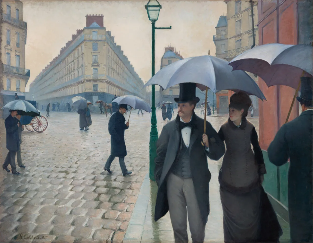
I would try it where the whole composition can be read, rather than using only the couple as a narrow crop. The broad empty paving on the left and the nearer figures on the right are part of its balance. The picture’s sense of space can contrast with a flat brick surface behind the frame.
It also offers colours beyond black and grey: pale stone, subdued green, blue and a warm wall on the right. A room with black metal furniture does not require every print to be monochrome. Let one of these less obvious colours connect to an existing textile or painted surface if you want a link.
Let Monet bring colour to built structure
Monet’s The Bridge at Argenteuil, from 1874, combines a substantial bridge with boats, trees and bright water. This is the National Gallery of Art’s stone-bridge picture, not a different Monet railway-bridge painting with a train. Keeping the exact work clear prevents an attractive title from supplying the wrong history.
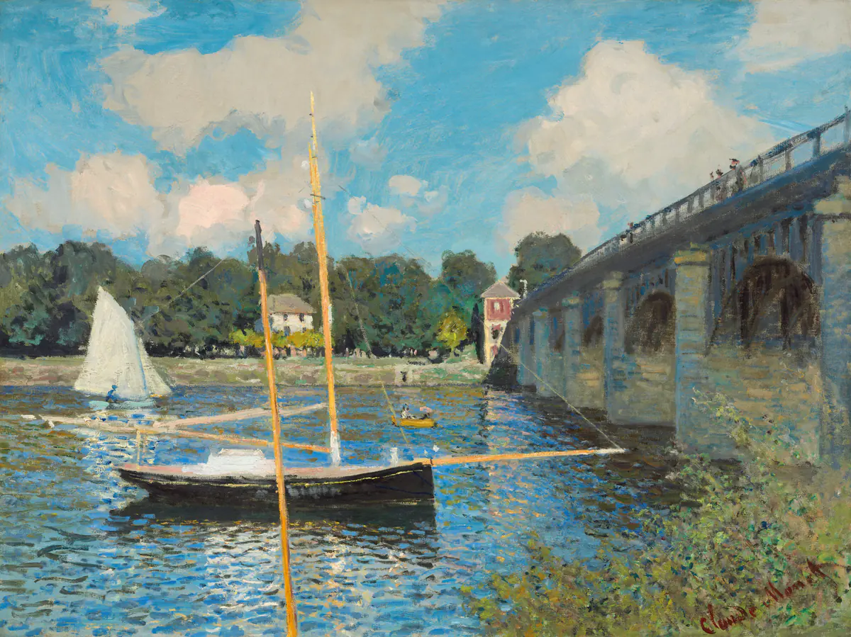
The bridge’s repeated supports could relate to beams or shelving in a room, while the water introduces a much looser pattern. I would consider this when the furnishings already feel angular and another severe geometric image seems unnecessary.
Keep the vertical masts and the broad sky when assessing a reproduction. Cropping to the bridge alone would change a painting about several interacting spaces into a different composition. You can choose a wider wall or a smaller complete print instead of asking an unsuitable frame opening to determine the picture.
Choose a picture that can compete with texture
Brick, rough plaster and closely spaced shelves can make fine detail harder to pick out at a glance. Try a print with a clear broad structure before deciding that more size is the only answer. A picture with large light and dark areas may remain distinct where a delicate line drawing visually merges with its surroundings.
For detailed art, a mat or an area of plain wall can create separation. A black frame directly against dark brick may have less definition than a timber frame or a pale surround. That is a visual comparison to make with samples, not a reason to assume one frame colour works in every loft.
Do not digitally sharpen or recolour a historical image to make it fight the wall. Move it to a less demanding surface, increase its visible size within the available file quality, or choose a different picture. The surface behind it and the artwork are separate decisions.
Bring art back to the furniture
A high ceiling can tempt you to hang the picture halfway between the furniture and the ceiling. That may put the subject far above the view from the sofa. Test a position related to the furniture first, while keeping practical clearance for use and access.
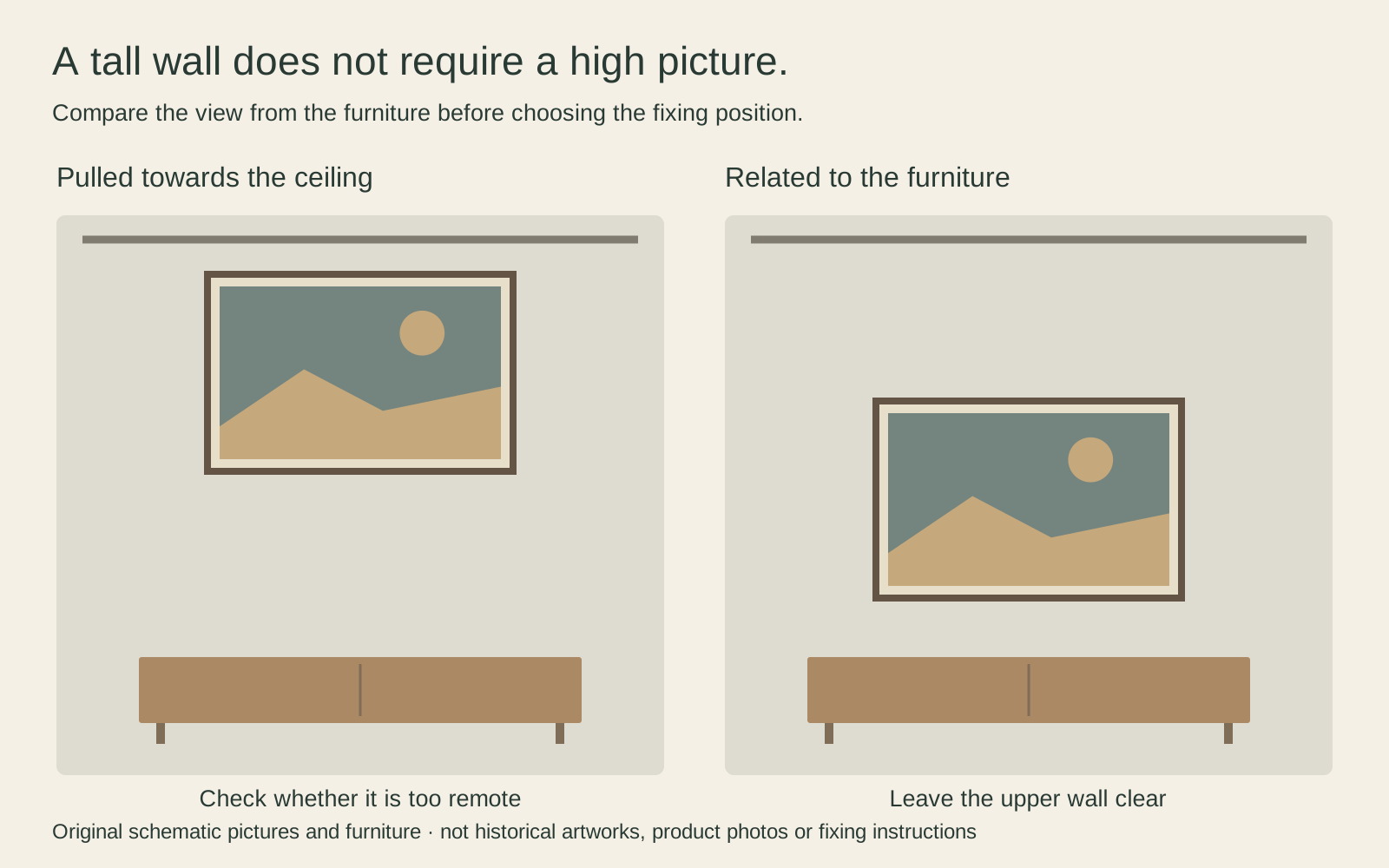
Make a paper outline using the outer frame dimensions, not just the image size. Look from the seats as well as the entrance. If the lamp blocks the image, adjust the arrangement rather than applying a fixed hanging-height rule without regard to the room.
For a hypothetical pair of frames each 50 cm wide with a 10 cm gap, the group is 110 cm wide. Above a 180 cm cabinet, centring leaves 35 cm on either side. Adding wider frame mouldings later changes that calculation. Check the finished measurements before deciding where the fixing points belong.
Connect open-plan areas without repeating everything
You can give the dining area one broad image and the desk a smaller pair. A shared frame colour or a recurring subject may connect them without repeating the same size across every wall. Similarity is useful when it helps the eye move through the room; it is not an obligation to make each area identical.
Walk the route between the areas. If three pictures are visible at once, consider which one should attract attention first. A large image near the sofa and a quieter drawing beside a work surface can coexist. If every piece demands equal attention, try relocating one before buying additional furniture to balance it.
The guide to one large print or several small ones can help with that choice. Judge the group from its real viewing distance, not only from a close photograph where every detail appears equally large.
Treat the wall as a building material
Exposed surfaces are not automatically suitable fixing points. Brick, mortar, plasterboard and concrete require different approaches, and what you see may be a decorative finish rather than the underlying structure. Follow the frame, fixing and wall-system instructions; use a qualified installer when the material, load or concealed services are uncertain.
Do not drill into structural steel or improvise suspension from pipes. A renter should confirm permission before altering the surface. Large framed works also need safe handling and an appropriate route into the room; a dramatic display is not worth an insecure mounting.
Before ordering, check the selected file, crop, outer dimensions and glazing as carefully as the subject. Leave the highest or hardest-to-access wall empty if necessary. A picture placed where it can be safely installed and genuinely enjoyed contributes more than one positioned merely to prove the room is large.
Editorial record
About this article
- Author
- Publisher
- GeMarkt
- Published
- Reviewed
- Internal source & rights check. Conducted by GeMarkt Research Review. This is an internal editorial check—not independent peer review.
- Source standard
- Buying guide source standardSeparates measured or first-hand evidence from general guidance and keeps practical limits visible.
Found a claim that needs checking? Report a factual error.