GeMarkt Blog · Practical guide
Food and Still Life Art for the Kitchen
Find kitchen art beyond food slogans. Compare Cézanne’s apples, Hokusai’s lobster and Pissarro’s market, then choose a sensible wall, size and frame.

The best kitchen art is something you enjoy looking at in a place that is not routinely hot, wet or greasy. Fruit, vegetables and market scenes can connect naturally with the room, but there is no need to match every ingredient on the wall to what you cook. A good still life remains interesting after you have recognised the apples.
Start with the usable wall, then choose the subject and size. The small breakfast area or a dry wall near the doorway may offer a better place for a print than the tempting gap above the cooker. The examples below are works to learn from, not a promise that each one is stocked in every size or material.
Find a wall away from the work
Look at the kitchen while it is being used. Where does steam rise? Where are hands wet? Which surfaces need frequent wiping? An attractive empty gap in a photograph may be an unsuitable place for paper art once the kettle, sink and hob are in action.
The Canadian Conservation Institute explains that paper can be damaged by moisture, heat, light and pollutants. A frame is not a licence to ignore those conditions. Keep ordinary art prints away from direct splashes, cooking vapour and heat sources rather than trying to set one universal safe distance for every appliance and wall.
Choose a dry area you can see from a breakfast seat or the doorway. Check cupboard doors, wall switches and the path of a carried tray. If no suitable position exists inside the working kitchen, the adjoining dining area can carry the food theme just as well. An original or valuable work deserves professional advice about display rather than an improvised protective treatment.
Cézanne’s apples offer more than a food theme
Paul Cézanne’s Still Life with Apples and a Pot of Primroses, about 1890, puts familiar objects into an unusually active arrangement. The fruit is easy to recognise; the folds, edges and colours give you reasons to keep looking.
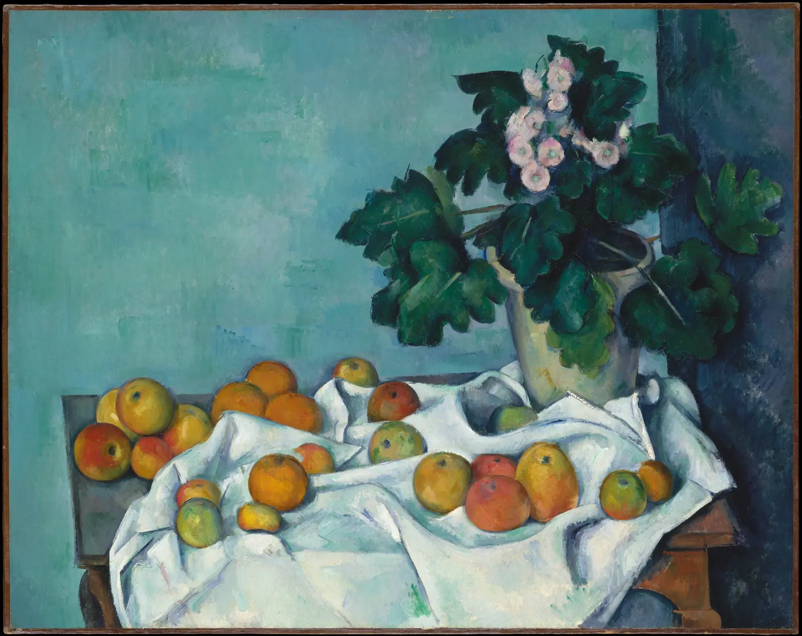
Notice how the rounded apples sit against pointed folds. The cloth seems to gather and spread rather than becoming one flat white surface. Above it, the leaves and flowers create a taller shape, while the blue-green background gives the fruit room to stand out.
For a kitchen, you could relate a frame to the timber furniture or pick up a small colour already present in the room. There is no need to buy red accessories simply because the picture contains red apples. Try the work beside the actual cabinet finish: a colour that looks subdued on a screen may be quite assertive next to a glossy door.
This is also an alternative to a series of isolated food icons. One fuller arrangement can give you fruit, flowers, cloth and furniture without several competing frames. If you are drawn to the painting’s relationships, preserve the whole image rather than cropping out the plant just to make a row of apples.
Hokusai’s lobster makes a long horizontal picture
Hokusai’s Large Lobster, dated 1800–1815, is a colour woodblock print of the type called surimono. The Met’s sheet is JP1865. The example is unusually wide, with long antennae extending far beyond the curved body.
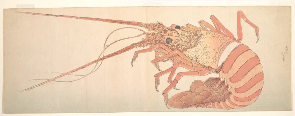
The open area beside the body is not wasted space. It allows the antennae to stretch and makes the animal’s shape legible. Cutting the image into a standard upright rectangle would remove much of that relationship. A different-shaped mat or a different work is a better answer if your wall is narrow.
The muted pinks also show that food-related art does not have to be saturated or photographic. You might prefer this restrained drawing to a brightly coloured bowl of fruit. Inspect the exact reproduction, though: artificially increasing the red would change the effect of this pale impression.
A seafood subject will not appeal to everyone who cooks. Choose it because you like the image, not because a kitchen is supposedly required to display food. In a shared household, compare it with a fruit still life or a market scene before settling on the subject.
Pissarro’s market connects food with people
Camille Pissarro’s Chestnut Vendor, St. Martin’s Day Fair (Pontoise), 1878, is a drypoint in the Cleveland Museum of Art. It is a scene of people and trade, not a still life. That makes it a useful alternative if you prefer the social life around food to a display of ingredients.
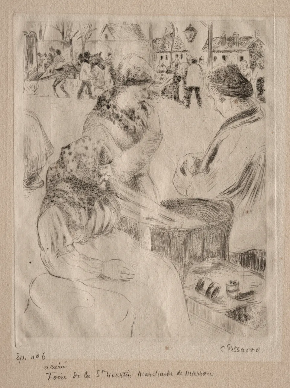
The foreground figures are close enough to feel like an encounter rather than a distant crowd. Behind them, the fair continues in lighter lines. The handwriting below the scene belongs to the particular print image shown here; it is not a caption added by a modern decorator.
I would try this beside a small table where you can see the faces and hands. From the far end of a large open-plan room, its fine lines might become a general grey texture. That is not a fault in the art, but it may be a poor match for the viewing distance you have available.
Fit the image around real kitchen use
Measure the outside frame, not just the advertised print size. In a hypothetical dry wall bay 80 cm wide, a 50 cm-wide finished frame leaves 15 cm on each side when centred. That describes the arrangement only; it does not establish clearance from a hob, kettle, opening door or fitting.
Use a paper outline and leave it in place while you go through normal routines. A cupboard door may cover the picture when open. A coffee machine or cereal box may hide its lower edge. You can move the outline without committing to a hole or discovering after delivery that the image sits behind an appliance.
The image’s shape matters too. Hokusai’s long lobster and Pissarro’s upright print should not be forced into identical visible openings. You can connect different shapes with similar frames, or give one picture a wall of its own. For a compact kitchen, one work with clear space around it may be more enjoyable than a row squeezed between cupboards.
Choose materials without assuming they are washable
A modern canvas print is not automatically splash-proof; a paper print behind glass is not a sealed kitchen panel. Check the actual maker’s care instructions and the frame construction. Do not spray cleaner onto artwork or assume a varnish or coating makes any surface safe to scrub.
For valuable paper art, ask a qualified framer about suitable separation from the glazing and protective materials. Do not tape the picture into a frame with whatever is available beside the kitchen drawer. A low-cost reproduction may be replaceable, but choosing a less exposed position is still simpler than repeatedly cleaning damage from it.
Our guide to cleaning framed art and canvas separates the different surfaces. It is worth checking before choosing a finish mainly because it looks easy to wipe.
Keep the choice personal and the counter clear
Look from the place where you drink coffee or wait for dinner, not only from the most flattering camera angle. Choose the image that offers something you actually want to notice: folds around fruit, a sharply observed animal or people buying food at a fair.
You need not finish the arrangement with matching bowls, towels and decorative jars. The kitchen already contains useful objects. Let the picture add a different kind of interest without taking away the space you need to work. If you want a fuller arrangement around a table, continue with dining room art; the same picture may find a better home a few steps away.
Editorial record
About this article
- Author
- Publisher
- GeMarkt
- Published
- Reviewed
- Internal source & rights check. Conducted by GeMarkt Research Review. This is an internal editorial check—not independent peer review.
- Source standard
- Buying guide source standardSeparates measured or first-hand evidence from general guidance and keeps practical limits visible.
Found a claim that needs checking? Report a factual error.