Decorating with vintage travel posters: a room-by-room guide
Travel posters were designed to command attention across a street. Learn which styles suit each room, what size to choose, and why a three-poster wall reliably works.
From the studioThe poster rooms — Cappiello, the Alps, the Riviera, the railway age →
A travel poster had one job: stop a person walking past a railway station, from twenty metres, in the rain. Everything about the form follows from that — the flat fields of colour, the single strong figure, the type you can read across a street. A century later, that same engineering is why a vintage poster can carry a wall that a subtle painting can’t. You don’t hang a travel poster to be studied. You hang it to be felt from the doorway.
That doorway logic is also the best guide to where each poster belongs. Room by room:
The hallway: the departure board
An entry hall is the most poster-shaped space in a home — you pass through it, you don’t sit in it, so it rewards one bold image over anything that asks for study. This is where the railway sheets belong: a tall vertical from the railway room reads as a promise every time you leave the house. Travel posters were mostly printed in tall formats (they were made for station columns and hoardings), which happens to be exactly the shape of the wall beside a front door.
One big vertical beats three small ones here. Hang it slightly higher than you would in a sitting room — it’s read standing up, in motion.
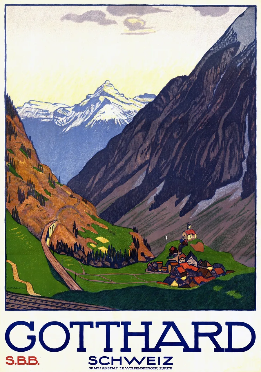
The living room: one anchor, chosen warm or cool
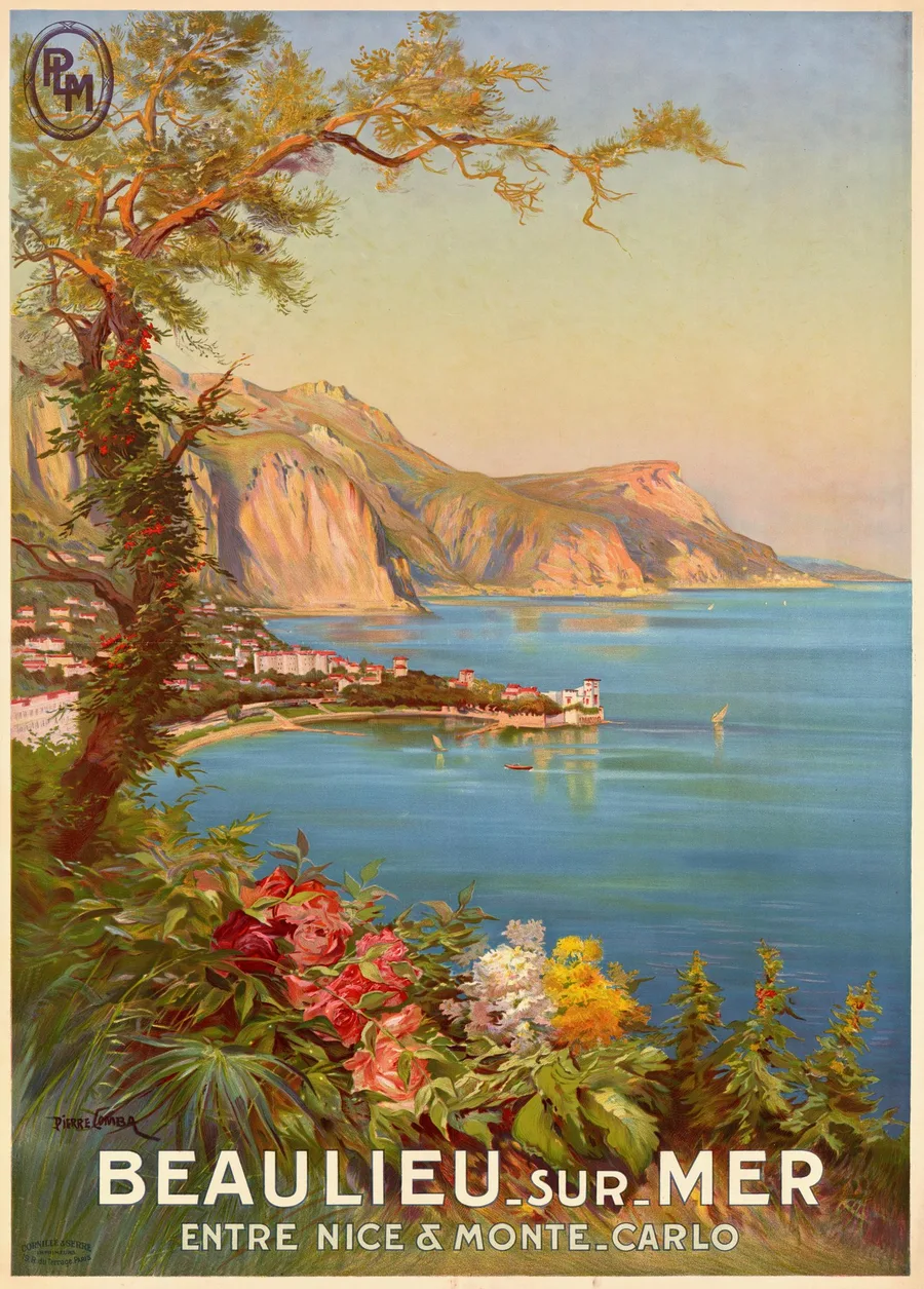
Above a sofa, the old rule holds: the artwork should span roughly two-thirds of the sofa’s width — one large poster, or a pair side by side. What matters more with posters is temperature. The Riviera room is warm by design — those sheets were literally selling sunshine, and they bring that heat into a room with cream, terracotta or wood tones. The Swiss Alps run cool: lake blues, snow whites, glacier greens that suit grey sofas and pale walls.
Pick the temperature first, the town second. Nobody regrets Menton over a warm-toned sofa or a Davos winter over a cool one; people do regret fighting a room’s palette with a poster that shouts against it.
The study: one figure, one joke
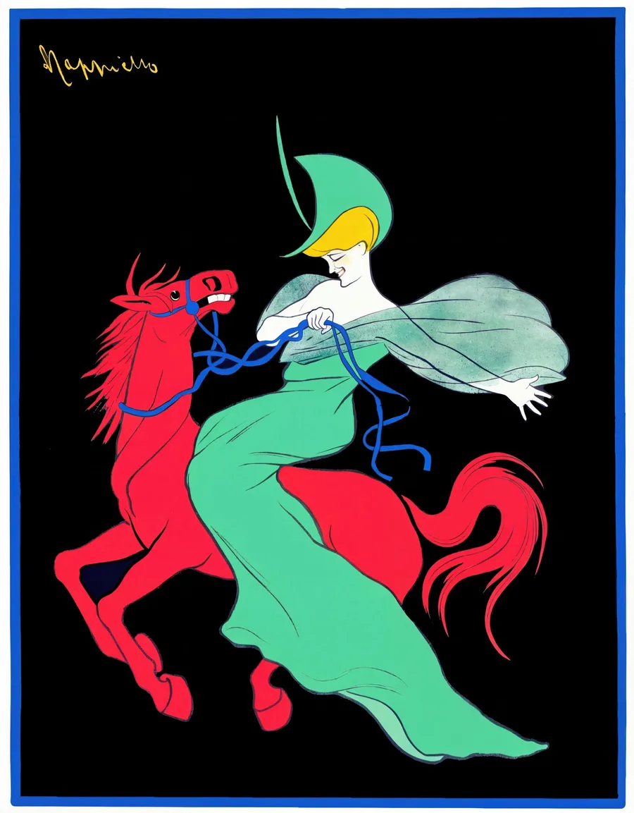
Work rooms collect the worst wall art in the world — motivational typography, generic skylines. The antidote was invented in Paris around 1900: Cappiello’s single figure on a flat dark ground. A rearing red horse for a chocolate maker, a lady in green lifting a champagne glass. These posters are witty without saying a word, and their dark grounds sit beautifully behind a desk without swallowing the light the way a large dark painting would.
One is enough. A Cappiello wants to be the only loud thing in a quiet room.
The kitchen and dining room: the appetite pictures
The aperitif and food posters — biscuits, champagne, cocoa — were made to make people hungry, and they have not lost the knack. Smaller formats work here: kitchens rarely have the sightlines for a full-size sheet, and a modest framed print above a counter does more than a giant one crammed beside a cupboard. Browse the drink and table subjects inside the Cappiello room — the century-old appetite engineering still works at breakfast.
The bedroom: choose the quiet ones
Not every travel poster wants to sell you something at full volume. The lake scenes and snowfields — an Alpine shoreline at dusk, a white slope with two small figures — hold the same period charm at a much lower register. From the Alps room, the lake subjects in particular make bedroom walls feel wider and colder in the best way. Skip the casino sheets here; nobody sleeps well under a poster designed to keep people awake.
The three-poster wall
If you want the classic look — the one that makes visitors assume you’ve been collecting for years — the formula is strict and worth obeying:
Three posters. One thread. Same frame. Same size. One row.
The thread can be a region (three Swiss resorts), a company (three sheets from the same railway), or one artist’s hand (three Cappiello figures). The discipline is what reads as curation; three unrelated posters in three frames read as clutter. Hang them in a single row with a hand’s width between frames, centres at eye level.
And one rule we’d defend with our lives: don’t mix posters and painting reproductions on the same wall. A Monet whispers, a poster shouts — side by side, both lose.
Framing and formats, briefly
Posters are graphic objects, so frame them like graphics: thin black metal or pale natural wood, never ornate gold — gilding belongs to paintings. Full-bleed (no mat) is period-correct and usually stronger; a white mat can calm a very loud sheet if the room needs it.
As for formats: the rolled poster is the way in if you already have a framer you trust — most of our posters are tall verticals, and framing locally is often the economical route for big sizes. Framed paper behind glass is the ready-to-hang classic. Canvas suits painterly artwork better than flat lithographs, so for posters we’d steer most people to paper. The full comparison lives in our print format guide; every listing shows all options in your own currency.
One last thing, because it is the quiet difference between a crisp wall and a muddy one: flat colour fields are unforgiving. A travel poster is four or five big shapes of solid ink, and any softness in the source shows instantly at poster size. It’s why we restore from the strongest scans we can find and why every sheet in the collections carries its date and attribution. The posters were built to be read across a street. On your wall, from the doorway, they still should be.
Editorial record
About this article
- Publisher
- GeMarkt
- Published
Found a claim that needs checking? Report a factual error.