GeMarkt Blog · Practical guide
Dark Academia Wall Art
Build a bookish room with portraits, landscapes and prints that remain visible. Compare dark pictures, pale paper, frame surrounds and reading corners.

Dark academia wall art works best when it gives you something to look at, not just another dark surface. Start with a portrait, landscape or print that interests you. Then make sure its details remain visible beside books, timber furniture and the room’s normal evening lighting.
You do not need to paint every wall brown or fill every gap with a gilt frame. Here, dark academia means a bookish decorating direction, not a historical art movement or a requirement to like the same authors and pictures as everyone else. A pale print can belong as convincingly as a shadowy painting.
Choose a subject you want to live with
A reading room can hold more than portraits of famous men and imaginary ancient libraries. A landscape connected to somewhere you know, a botanical subject you can identify or an image related to a book you enjoyed gives you a reason to return to it.
Before thinking about a frame, ask what you would tell someone about the picture. If the answer is only that it looked suitably old in a small thumbnail, open it larger. Look for the people, objects and activity it actually contains. A dramatic scene may involve hardship or violence that a decorative label leaves out.
You can still choose an image primarily because you like its shapes. The aim is not to pass an art-history examination before decorating. It is to avoid acquiring an entire wall of pictures that become interchangeable brown rectangles as soon as you move away from the screen.
Give a portrait more than a colour role
Rembrandt’s Self-Portrait of 1660 at the Met is a useful starting point. A cap and brown clothing occupy much of the image, but the face holds the attention. The museum discusses the built-up paint around the signs of ageing and the marks used to describe his curls.
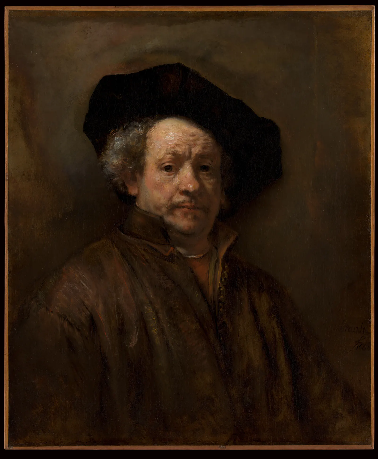
In a reproduction, those differences need to survive the print and the setting. A very small print viewed across a room may preserve the outline of the head while losing the changing edges around the eyes and mouth. That does not make the reproduction bad; it may simply make the chosen location unhelpful.
Try a portrait near a chair or on a wall you approach regularly. Decide whether you enjoy meeting its gaze there. Keep a tall lamp from interrupting the face, and check the view while seated as well as standing. The picture should not have to compete with the reflection of a bare bulb.
Use pale paper as part of the room
Doré’s The Breaking Ice, Souvenir of Norway provides a different possibility. Cleveland records this object as a lithograph from the late 1800s. It is not one of his Divine Comedy illustrations, and calling every monochrome Doré an engraving would misidentify the medium.
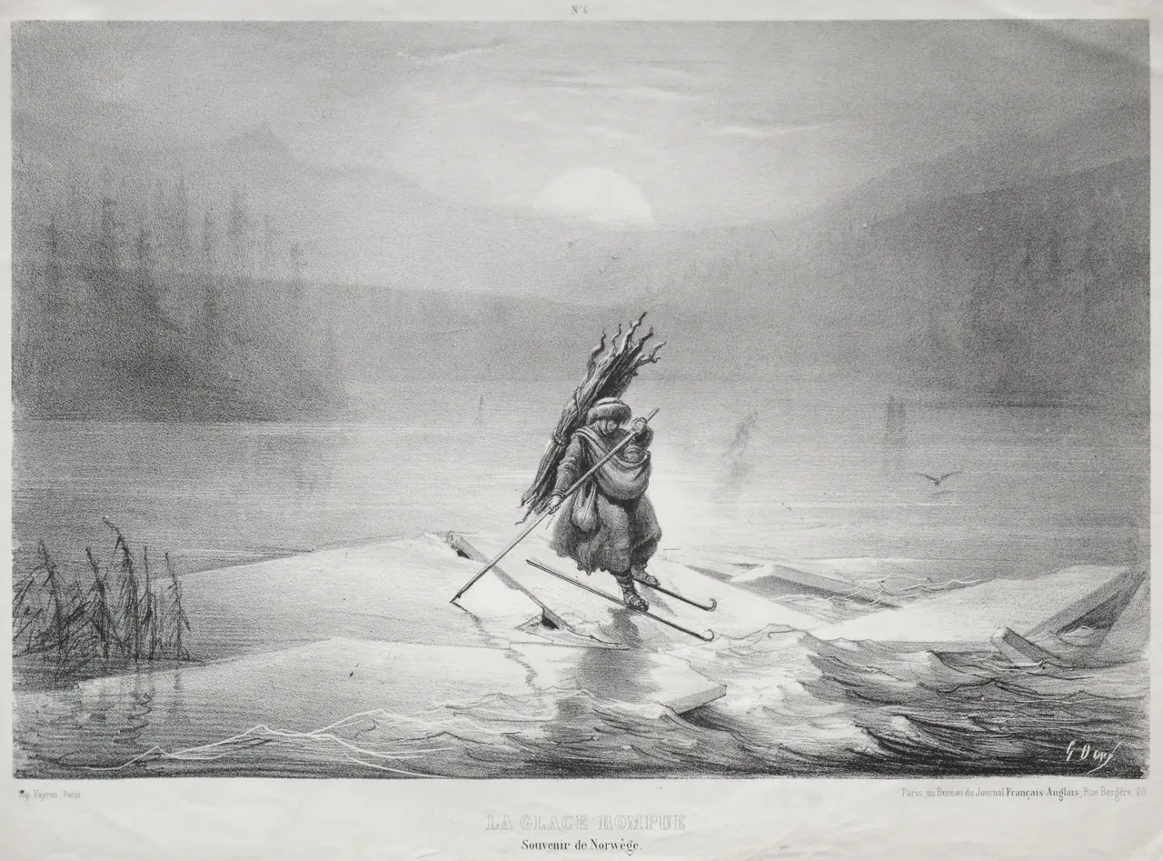
The light sky and paper margins give the eye somewhere to rest. At the centre, the figure and fractured ice provide a more unsettling subject than a generic snowy view. That contrast is a reason to choose the image, not a reason to darken the file until every part matches a room palette.
A monochrome print can work between coloured book spines because its broad light area reads differently from them. Keep the inscription if it is part of the reproduction you are choosing. Cropping it out is a change to the presentation, not an automatic improvement in cleanliness or style.
Separate the picture from a dark wall
When a dark picture seems to disappear, first change its surroundings rather than increasing the image’s brightness digitally. A pale mat, a lighter frame or a different wall may give its boundary enough definition.
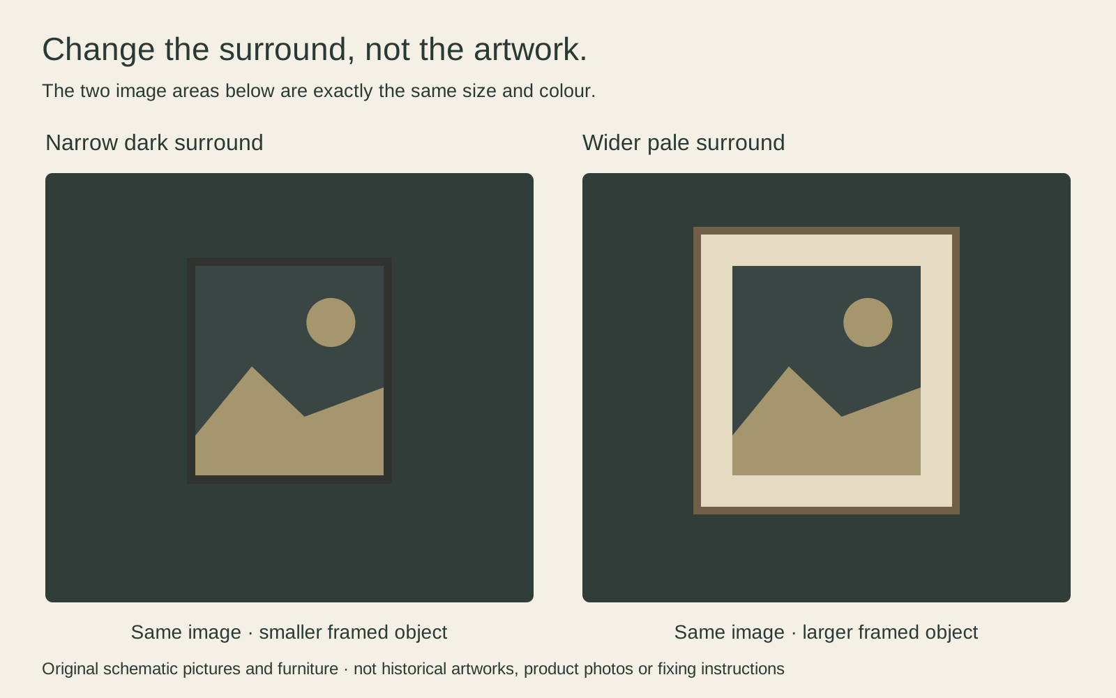
Compare actual frame and mat samples if possible. Cream, grey and white are not interchangeable beside a particular paper or wall. A bright surround can become the strongest shape in the arrangement; a narrower or less contrasting one may be enough.
Remember that a mat sits around an image opening. It is not a pale area painted into the artwork. For a hypothetical 30 × 40 cm visible opening, a 5 cm surround on every side occupies 40 × 50 cm before adding the frame moulding. The finished frame will be larger still, according to its construction. Measure that outer object when planning the wall.
Arrange art around reading not around props
Start with your useful things in position: chair, lamp, desk, shelves and any equipment. Put the book you are reading where you can reach it. Only then decide which remaining sightline deserves a picture. This avoids a polished arrangement that requires dismantling whenever you work.
A print over a desk can be enjoyable when you look up, but a low-hanging frame may interfere with a monitor or adjustable lamp. Over a bookcase, check whether the upper shelves remain accessible. Do not balance a heavy frame unsecured where pulling out a book could disturb it.
For a group, mix scale deliberately. A medium portrait can be the main picture, with a smaller landscape beside it rather than several equally forceful works crowding together. Use paper outlines to test the gaps. Leave space for the collection to change rather than buying pictures merely to complete a symmetrical rectangle.
Keep the light useful and controlled
A room for reading needs usable light even if you prefer dark walls. Do not make yourself work in a dim room to preserve an atmosphere. Instead, check whether the picture can be seen from the chair without a lamp shining back at you through its glazing.
For the print itself, avoid direct sun and unnecessary exposure. The Library of Congress explains that light damage accumulates and that visible light still matters when ultraviolet radiation is filtered. This is not a promise that one lamp or frame can make a print fade-proof.
Switch off display lighting when it is not needed and keep hot lamps away from the frame, following the equipment’s instructions. Valuable original works need advice appropriate to their materials. For everyday reproductions, protecting prints from sunlight and fading explains the basic distinctions without turning museum limits into household guarantees.
Build a collection rather than a costume
There is no need to buy old books as colour blocks, artificially age a print or make every surface appear antique. A room can feel coherent because its objects are used and understood. Contemporary writing, family images and bright details need not be excluded to keep the walls serious.
Choose one picture, establish its size and frame, and live with its position before adding another. If the room already feels crowded, remove a competing object before ordering a smaller print. The result should make it easier to enjoy both the art and the books, not require constant staging to maintain a look.
Editorial record
About this article
- Author
- Publisher
- GeMarkt
- Published
- Reviewed
- Internal source & rights check. Conducted by GeMarkt Research Review. This is an internal editorial check—not independent peer review.
- Source standard
- Buying guide source standardSeparates measured or first-hand evidence from general guidance and keeps practical limits visible.
Found a claim that needs checking? Report a factual error.