GeMarkt Blog · Practical guide
Autumn Wall Art: Harvest and Golden Light
Find autumn wall art beyond orange leaves: compare Bruegel’s harvest, Millet’s gleaners and Friedrich’s moonlight, then choose colour, scale and placement.

Good autumn wall art does not have to show orange leaves. A golden field, a subdued harvest scene or an evening landscape can suit the room you want to use as the year turns. Start with the kind of light and subject you enjoy, then consider how the picture looks beside your existing furniture.
Keep the artwork’s actual subject separate from its seasonal use. Bruegel’s The Harvesters, for instance, can make a striking autumn decorating choice, but the scene represents summer. Calling it autumn simply because the wheat is gold would get the painting wrong. The three examples below help make a more deliberate choice.
Start with the autumn you actually like
One person’s autumn is an open field in warm light; another’s is a dark walk at dusk. If you prefer the second, a wall full of bright yellow foliage may not suit you, however consistently it matches seasonal shopping displays. Think about a place, an activity or a view you genuinely enjoy rather than trying to collect every conventional seasonal colour.
Also separate the season outside from the room inside. You may live somewhere without falling leaves, or use the same room throughout a rainy season rather than a northern European autumn. A chosen picture can have personal meaning without pretending to describe your local weather.
Look at the wall before adding objects. An amber lamp, a wooden cabinet and a patterned rug may already provide plenty of warm colour. In that room, the dark and pale parts of an artwork can matter more than whether it contains another patch of orange.
Bruegel’s gold is a summer harvest
Pieter Bruegel the Elder painted The Harvesters in 1565. The Metropolitan Museum identifies its place in a seasonal cycle with July and August. This is a useful reminder that harvesting and golden fields are not automatic proof of an autumn date.
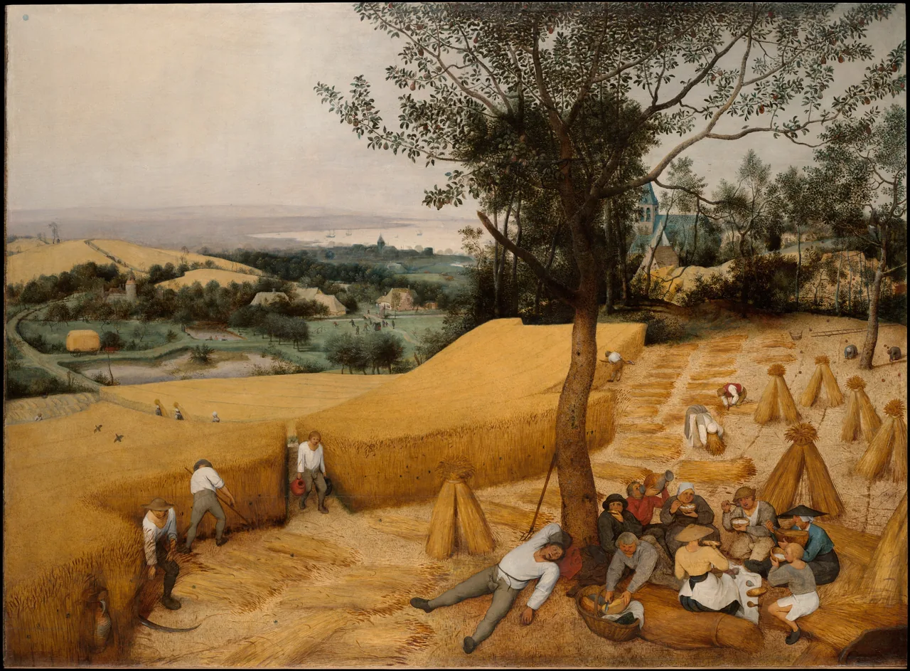
For a room, the appeal may be the broad yellow field set against the tree’s deep green. The picture contains cutting, carrying, eating and resting rather than an empty decorative landscape. Choose it if you want those human activities to remain part of what you see.
A low horizontal wall beside a dining area would let the landscape spread out without needing to become a panorama. Avoid a crop that retains only a band of wheat: the foreground group and distant view are important to the composition. A small reproduction may convey the colour, but you will need a closer viewing position to enjoy the people.
If you display a title card or tell someone about the print, keep its summer identity. Choosing a summer painting for your autumn room is perfectly reasonable; changing its subject is unnecessary.
Millet keeps the work in the picture
Jean-François Millet’s 1857 The Gleaners shows three women collecting ears of grain left after the harvest. The Musée d’Orsay connects their work with the much larger harvest visible behind them. This is not simply a painting of abundance.
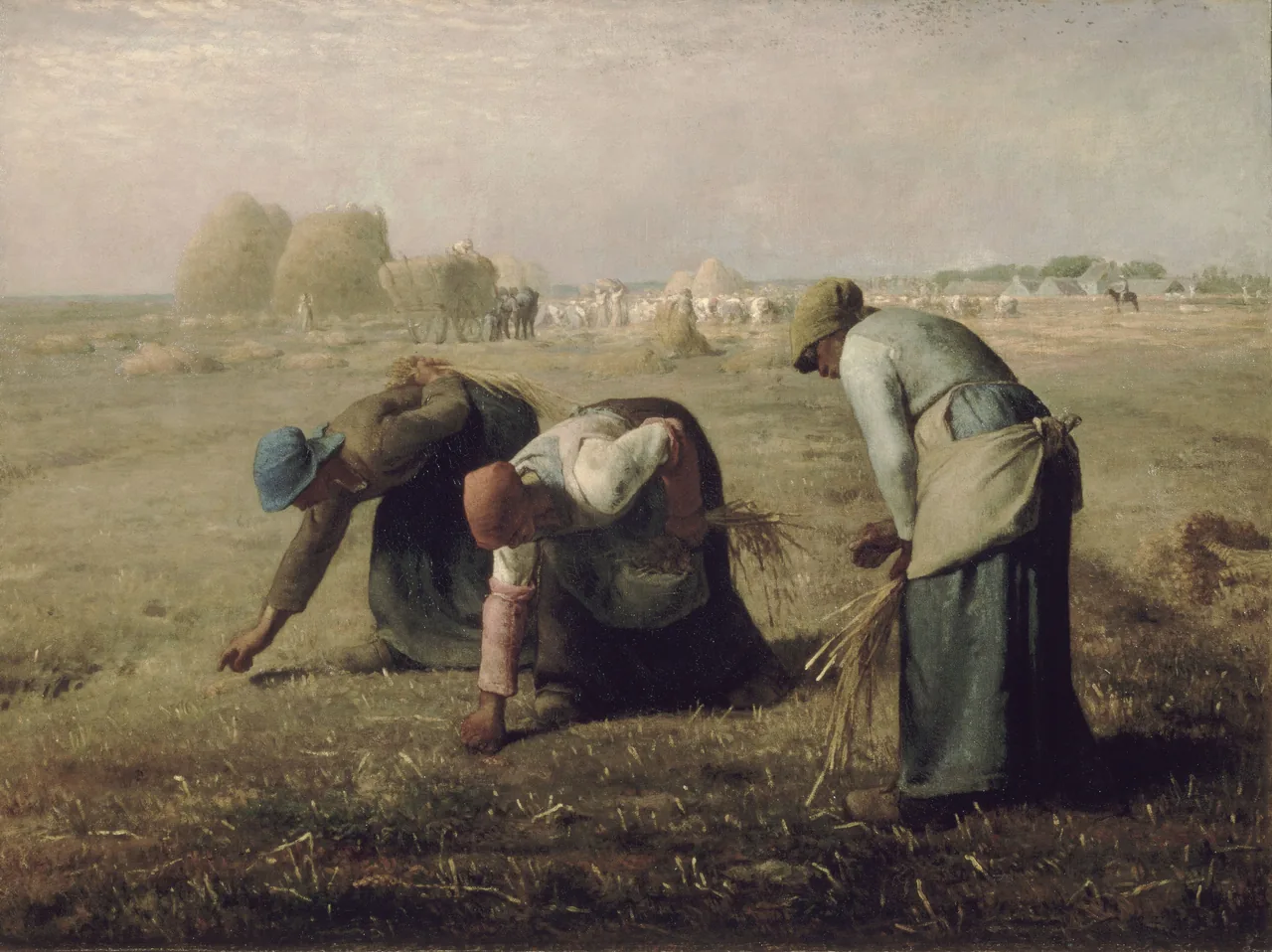

The three bent figures give the image a repeated shape, while their blue, red and pale clothing breaks up the field’s browns. Those muted accents offer alternatives to matching every surrounding object to the wheat. A plain blue-grey textile might relate to the picture without making the whole room look themed.
I would avoid adding a cheerful harvest slogan over this reproduction. That would flatten a scene of demanding work into a generic celebration. You can appreciate its colour and composition while still acknowledging the people depicted.
Check a reproduction’s darker areas before committing to a large print. The women should remain distinct from the ground, not merge into a single brown strip. If the image looks dull on a sales page, compare it with the named collection source rather than assuming all old paintings ought to look uniformly sepia.
Friedrich offers an evening alternative
Caspar David Friedrich’s Two Men Contemplating the Moon, about 1825–30, provides a different direction. The Met holds this particular version. Its brown landscape and sparse branches can suit an autumn arrangement, but those colours alone do not establish the season depicted.
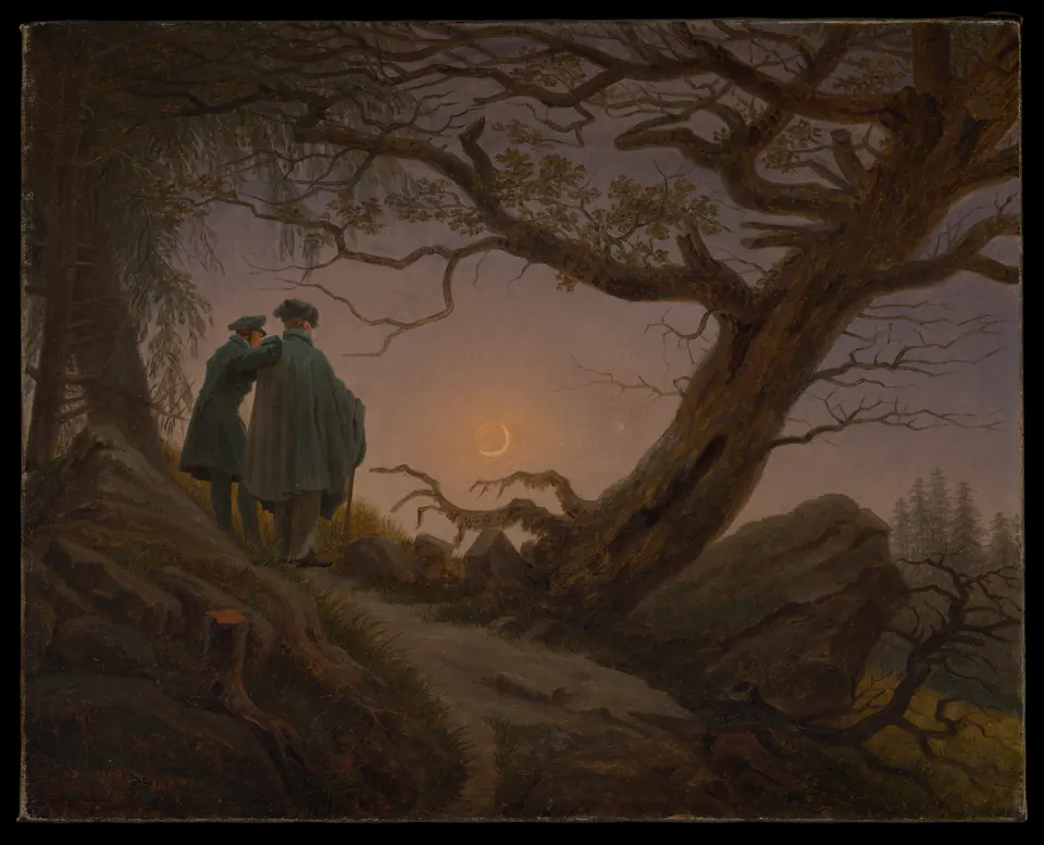
The crescent is small. Much of the image’s interest comes from the tree leaning across the sky and the two figures standing together. A reproduction hidden in the darkest corner of the room would make those relationships difficult to see; choosing a dark picture does not require displaying it in darkness.
Try this direction if the room already has warm materials but you do not want a bright yellow focal point. A pale mat may help distinguish the dark picture from a dark wall. The mat is a separate surface: it need not reproduce the brown of the painting or pretend to be part of the original canvas.
Compare warmth with contrast
Before buying, describe the difference between your two favourite candidates without using the word autumn. Perhaps one is golden and busy, while the other is brown and spare. That is a much more useful distinction when deciding what you want above a desk or beside an armchair.
Look at the darkest and palest areas as well as the main colour. A golden painting with strong dark trees can stay legible from across a room; a softly coloured scene may rely on smaller differences. Neither is inherently better. Compare them from the position where you expect to spend time.
Do not solve a mismatch by applying an orange filter to the artwork. Change the frame, mat or nearby objects instead. A reproduction should not acquire invented sunset light simply to match the cushions. For a broader way to compare pictures with existing paint, see matching art to wall colour.
Choose one clear viewing distance
Decide whether the picture will mostly be seen across the room or close up. Bruegel’s many small incidents reward access; Friedrich’s dark outline may register first from farther away. A hallway can work for a detailed print if there is a comfortable place to pause, not only a fast route past it.
Measure the proposed outer frame on the wall with a paper outline. Include the mat if there will be one. A 40-centimetre-wide image with 5-centimetre side margins occupies 50 centimetres before the frame moulding is added; calling it a “40-centimetre picture” can understate its actual footprint.
For two autumn pictures, choose a connection you can explain: human work, evening light or a shared dark-green accent. They need not be two paintings of the same field. Test the pair before buying matching frames, and do not crop the originals into equal shapes merely to force symmetry.
Make a seasonal change you can reverse
One changing position is easier to manage than replacing every print in the room. Keep the other artworks in place and see whether the new picture actually contributes something. If the room already has a harvest scene you enjoy, moving it to a clearer position may be more useful than purchasing another.
Keep image details with the print when storing or reframing it. Note the artist, title and exact source so that next year’s display does not become an unidentified pile of similar landscapes. Our seasonal art rotation guide covers planning a manageable change without making every wall temporary.
Above all, let the subject survive the decorating idea. Bruegel’s summer workers, Millet’s gleaners and Friedrich’s two observers deserve to remain more than colour palettes. Choose the one you want to keep looking at when the seasonal accessories have gone.
Editorial record
About this article
- Author
- Publisher
- GeMarkt
- Published
- Reviewed
- Internal source & rights check. Conducted by GeMarkt Research Review. This is an internal editorial check—not independent peer review.
- Source standard
- Buying guide source standardSeparates measured or first-hand evidence from general guidance and keeps practical limits visible.
Found a claim that needs checking? Report a factual error.