GeMarkt Blog · Essay
Watercolour vs Gouache
Compare watercolour and gouache through paintings by Winslow Homer and George Barret: transparent washes, opaque colour and works that combine both.

Watercolour usually lets the light colour of the paper show through; gouache is an opaque water-based paint that can cover what is beneath it. That is the useful starting point, not a rule that divides every painting neatly in two. Artists often use both in the same work.
Winslow Homer’s boat scene above is a good example. The harbour looks light and airy, yet its museum record includes gouache as well as watercolour. A picture does not have to choose between atmosphere and solid-looking colour.
The short difference
Watercolour combines pigment—the coloured particles—with a water-soluble binder, traditionally a plant gum such as gum arabic. Gouache uses similar materials but is formulated for greater opacity, through a higher pigment concentration or added white fillers. MoMA’s definitions of watercolour and gouache explain this relationship. There is no single recipe that makes every gouache passage look alike.
Gouache is also called bodycolour. In the museum labels below, these names help identify materials, not competing styles. A painter can move between them without changing the subject or abandoning the picture.
Think of the difference as a question about a passage in a painting: are we looking through the colour towards a light support, or looking at a more covering layer of colour? A single sheet may offer both answers. “Soft” and “bold” are not reliable substitutes: transparent paint can make strong colour, and opaque paint can make a delicate image.
Two paintings to look at together
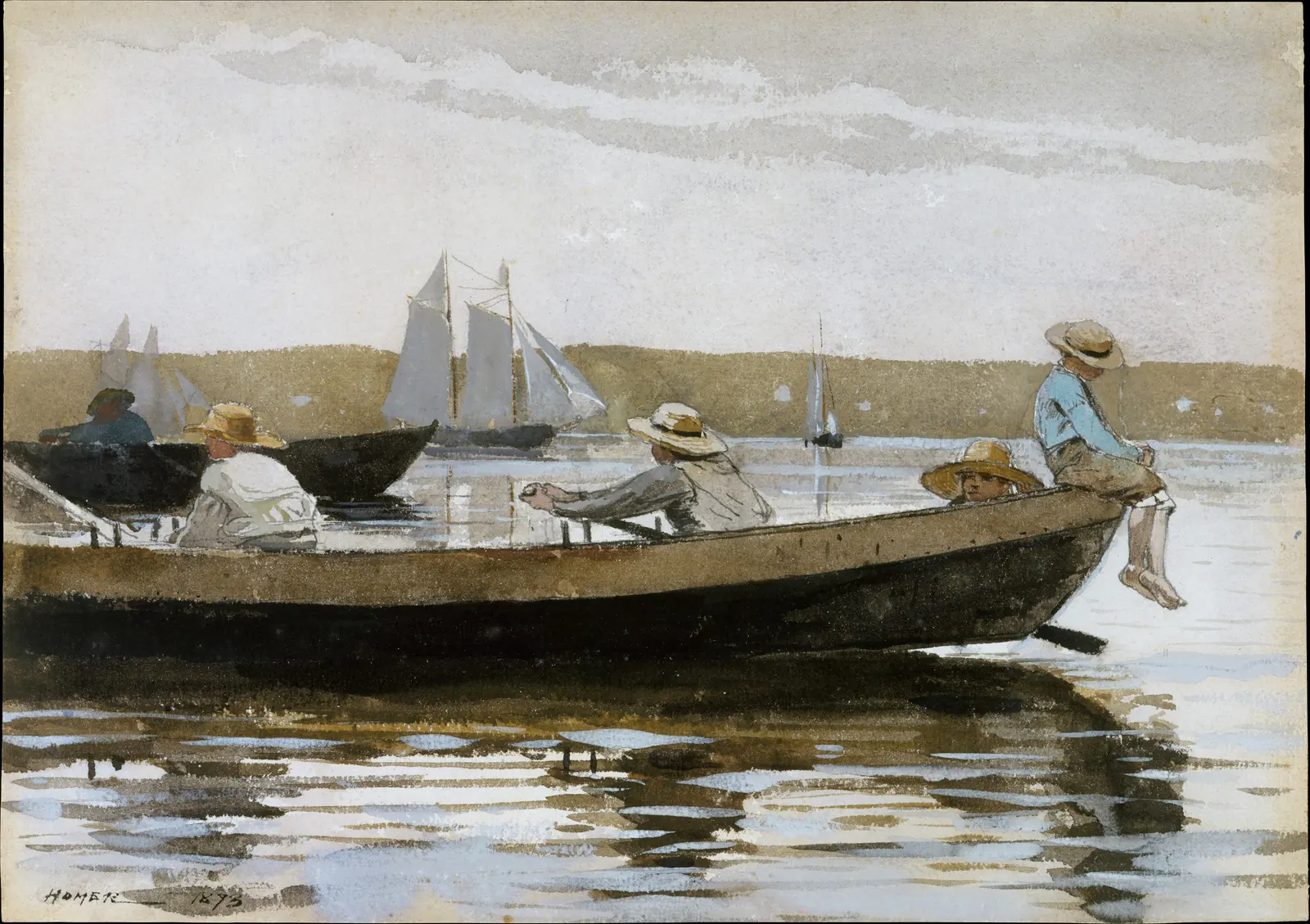
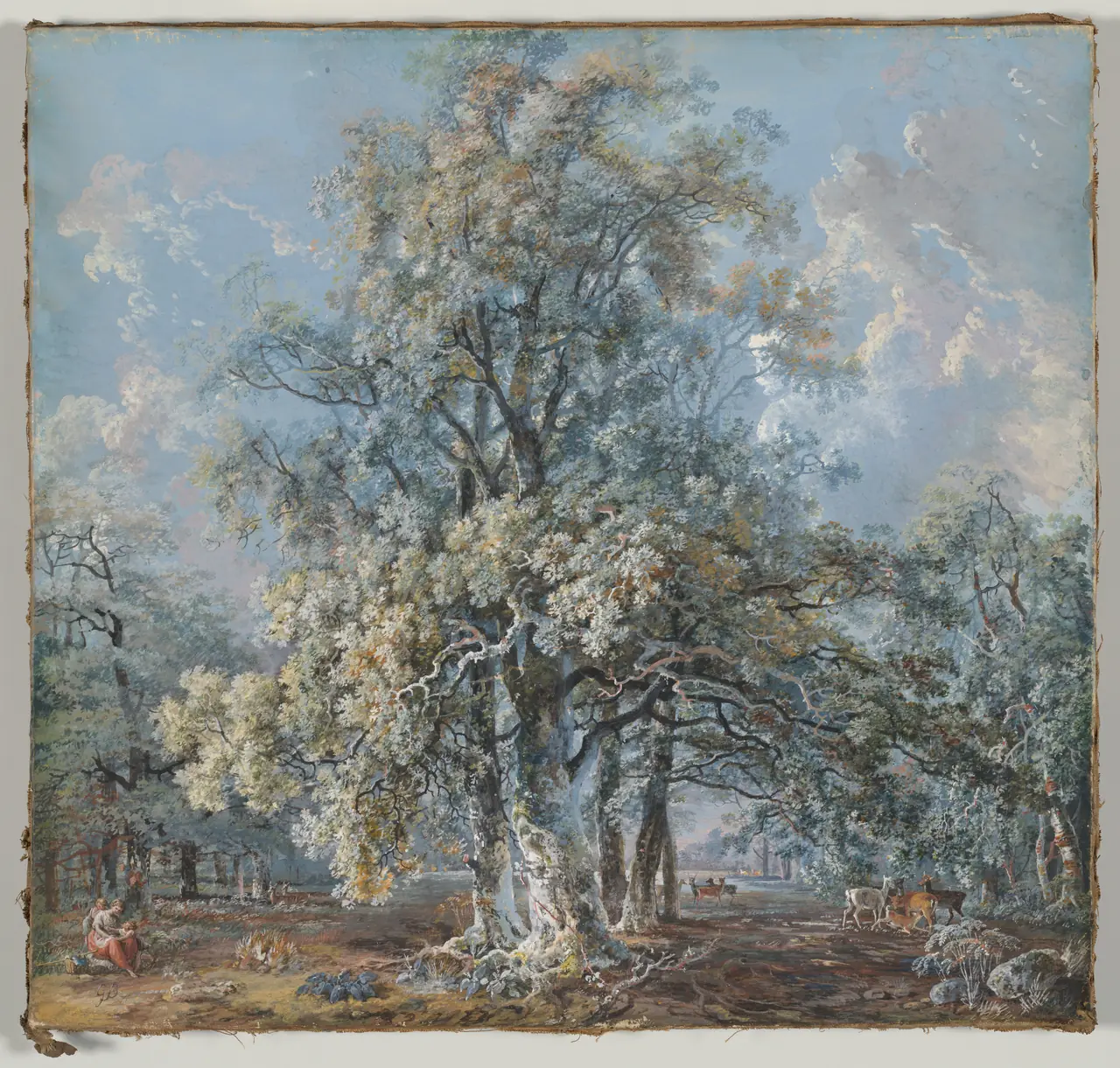
First compare the distribution of light. Homer’s broad, pale sky gives the dark boat room to stand out. Barret fills much more of the image with branching trunks, leaves and small patches of brightness. Neither arrangement proves the medium by itself; it gives us something specific to examine alongside the materials listed by the museum.
Notice the scale, too. On a screen the two images can occupy similar spaces, but Barret’s sheet is substantially larger. The small people at the bottom of his landscape are not evidence that the actual drawing is miniature.
Homer’s boat combines the two
Homer made Boys in a Dory in 1873, during a summer in Gloucester, Massachusetts. The Met’s account places it early in his professional work with watercolour, when he was making scenes of children around the fishing port. Its medium is recorded precisely: watercolour washes and gouache over a graphite underdrawing on textured white paper.
That last phrase means pencil drawing lies beneath the painted image. The museum describes his early method as cautious, with colour contained within light pencil outlines and considerable use of opaque pigment. This was not simply a few accidental splashes catching a passing scene.
Look along the boat’s upper edge. It creates a firm diagonal beneath the boys; below it, the dark hull has a weight very different from the broken reflection in the water. Then look at the right-hand boy’s blue shirt against the sky. Distinct shapes and an airy setting coexist.
We should not label every pale mark “white gouache” from a photograph alone. The record establishes the combination of materials; the image lets us see the result. Identifying the exact composition of an individual stroke would require closer technical evidence.
Barret’s tree gives colour body
Barret’s landscape was made nearly a century earlier, in 1776. Its museum record identifies graphite and gouache with gum arabic, and cautiously associates the scene with Norbury Park in Surrey. The location is a possibility, not a certainty supplied by the trees.
Start at the central trunks and follow them upward. Pale touches lie among darker branches and foliage, making the canopy appear crowded with light. At ground level, the small figures on the left and deer on the right give a sense of how large those trees are. The painting is not a flat colour chart: opaque paint serves a detailed, spacious landscape.
This is why “gouache looks like a poster” is too narrow a definition. In this work, it can describe bark, leaves, clouds and distance. Compare the open pale sky behind the tree with the densely worked canopy. The contrast comes from Barret’s decisions within the medium, not from a compulsory gouache style.
Light is not always bare paper
A light area can have several origins. It might be paper left uncovered, a pale wash, paint lifted away during making, or opaque colour added over another passage. Likewise, a soft edge does not automatically identify watercolour while a sharp edge identifies gouache.
The Met’s technique discussion describes how wet paint on a damp surface can spread, while drier working produces more defined marks. It also shows artists removing colour or adding bodycolour to achieve highlights. These are descriptions of making, not instructions for cleaning or altering an old work.
A useful looking exercise is to compare three edges in the Homer: the cloud, the boat and the reflection. They play different roles. Naming those differences is more rewarding than trying to classify the entire picture from its lightest patch.
Not just a quick sketch
Watercolour’s portable materials made it useful outdoors, but portability did not limit it to preliminary work. The Met’s history of British watercolour connects the medium’s development to improved paints, carrying boxes and papers. Artists used it for both studies and ambitious finished pictures.
The word “watercolour” therefore says how something was made, not whether the artist considered it finished. Nor does “drawing,” used by some museum departments for works on paper, mean that no paint is present. Barret’s highly worked landscape is a useful reminder to read the full medium description before deciding what an object must be.
What the label means for a print
A reproduction of a gouache is not itself painted in gouache. Similarly, a print of Homer’s image does not contain his watercolour washes. The original medium describes the source artwork; the printing method describes the new object. Our guide to originals, reproductions and prints separates those terms.
When choosing an image, look for enough detail to preserve both broad colour and small marks. In the Homer, the quiet spaces matter as much as the boat. In the Barret, the foliage should not collapse into a blurred patch. A clear source image and an honest description do more than a vague promise of a “watercolour effect.”
The simplest distinction remains useful: transparent passages invite light through the colour, while gouache gives colour greater covering power. The paintings become more interesting when we notice where an artist uses, combines or complicates that difference.
Editorial record
About this article
- Author
- Publisher
- GeMarkt
- Published
- Reviewed
- Internal source & rights check. Conducted by GeMarkt Research Review. This is an internal editorial check—not independent peer review.
- Source standard
- Art history source standardPrioritises object records and research sources, distinguishes evidence from interpretation, and states material uncertainty.
Found a claim that needs checking? Report a factual error.