GeMarkt Blog · Practical guide
Vintage Maps and Celestial Charts as Wall Art
Choose historical maps and star charts for your walls without losing their labels, borders or meaning, with three real collection examples to compare.

A historical map can reward two kinds of looking: recognising a place from across the room and moving closer to trace a street or read a name. Decide which matters more before choosing its size. A handsome outline above a sofa and a detailed sheet beside a desk have different jobs.
The best starting point is a specific connection: somewhere you lived, a city you want to understand, or an interest in how people pictured the sky. “Vintage” alone tells you little about a map’s date, purpose or reproduction quality. These three collection examples show what to look for; they are not a promise that each image is offered as a product here.
Decide whether you want to read or recognise
For a picture seen mainly from a doorway, look first at its larger shapes: a coastline, river, circular chart or dense city surrounded by open water. Those can remain distinct when lettering becomes too small to read. For a reading corner, the names and drawn buildings may be the main attraction.
Try both distances before ordering. Stand where you will usually see the picture, then move to the place from which you would study it. A narrow passage may allow close inspection; a wall behind a deep sofa may not. Do not choose a tiny map because it has “more detail” if that detail will be inaccessible.
This is also a reason not to fill every wall with maps. One sheet that invites attention can be more satisfying than several that become a band of indistinguishable lines.
A city view is not street navigation
The Met’s View of Venice is a mid-seventeenth-century etching by an anonymous Dutch artist, published by Clement de Jonghe. It is a historical city view, not a present-day walking map. The museum identifies the particular impression as accession 2012.136.607. Collection record.
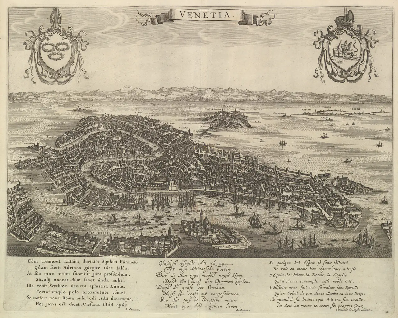
Notice how the open water sets off the crowded buildings. The title, decorative shields and text below also belong to the composition. Cropping tightly to the city would create a different picture and remove much of the sheet’s character.
This would be a useful candidate for a wall where you want a broad view rather than one dominant landmark. Its fine lines need breathing room: try it against a plain surface before surrounding it with patterned objects. Enjoy the pictured city without assuming every distance or building represents today’s Venice.
Check whether it is a sheet or a complete map
A listing can show a beautiful historical sheet without showing a whole map. Antonio Tempesta’s Plan of the City of Rome. Part 3 is exactly that: one part of a larger plan. The Met dates this impression to 1645 and identifies Santa Maria Maggiore, the Pantheon and Trajan’s Column in its title. Part 3, accession 1983.1027(3).
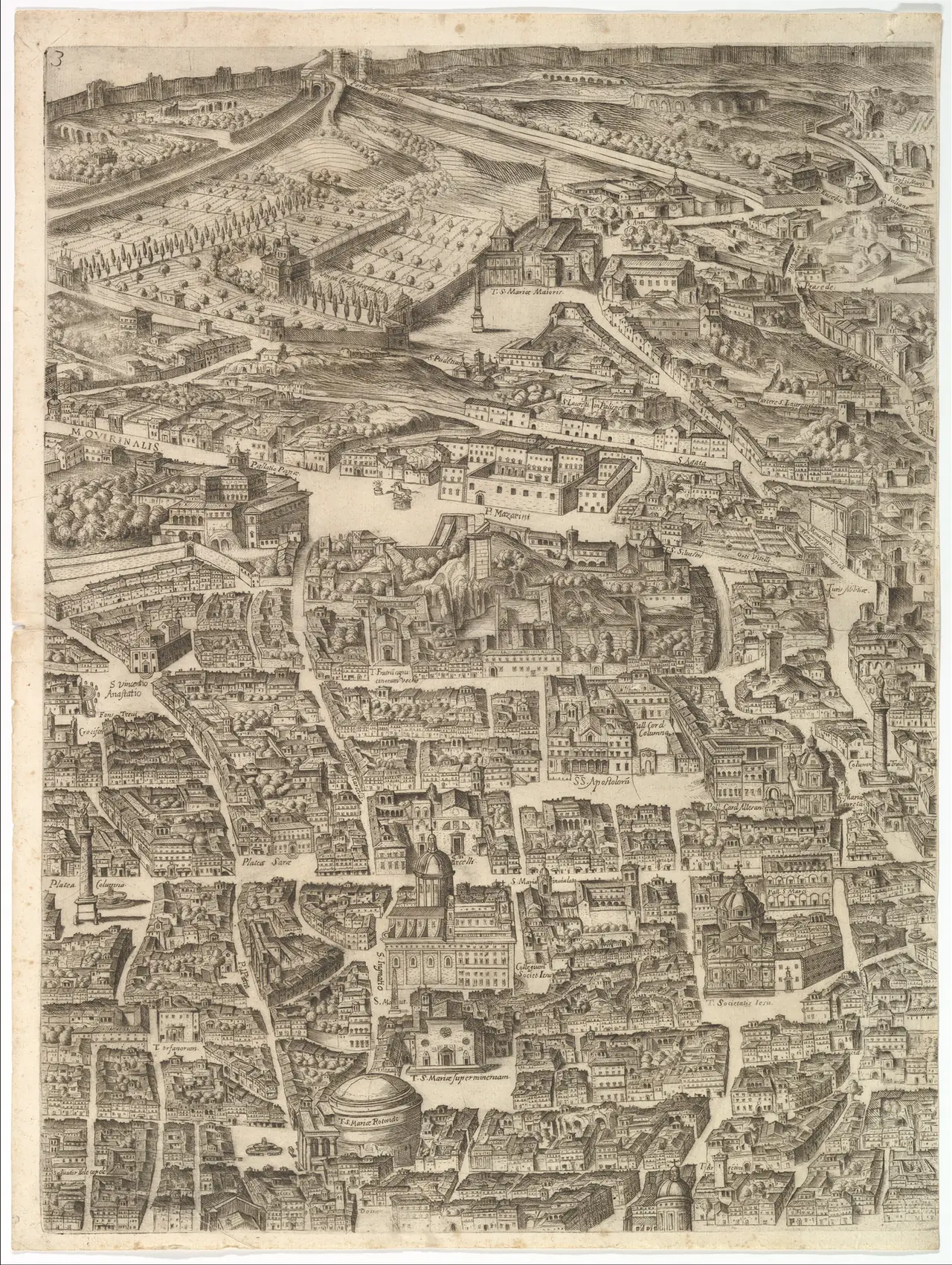
The vertical format can suit a narrow wall, but choose it because you like this particular section. Do not assume it covers a desired neighbourhood or that a separately sold sheet will join it without gaps. Different scans may include different margins, tones or distortions.
For a multi-sheet arrangement, ask for the full assembled layout before buying. If you prefer individual frames, allow the joins to remain visible rather than presenting the group as one continuous, precisely aligned map.
A celestial chart is also a historical picture
Albrecht Dürer’s The Celestial Map—Northern Hemisphere is a woodcut dated 1515. The Met connects it to a chart-making tradition transmitting classical knowledge through Arabic sources, with four astronomer portraits at the corners. It is one northern-hemisphere chart, not a view of the entire sky. The Met, 51.537.1.
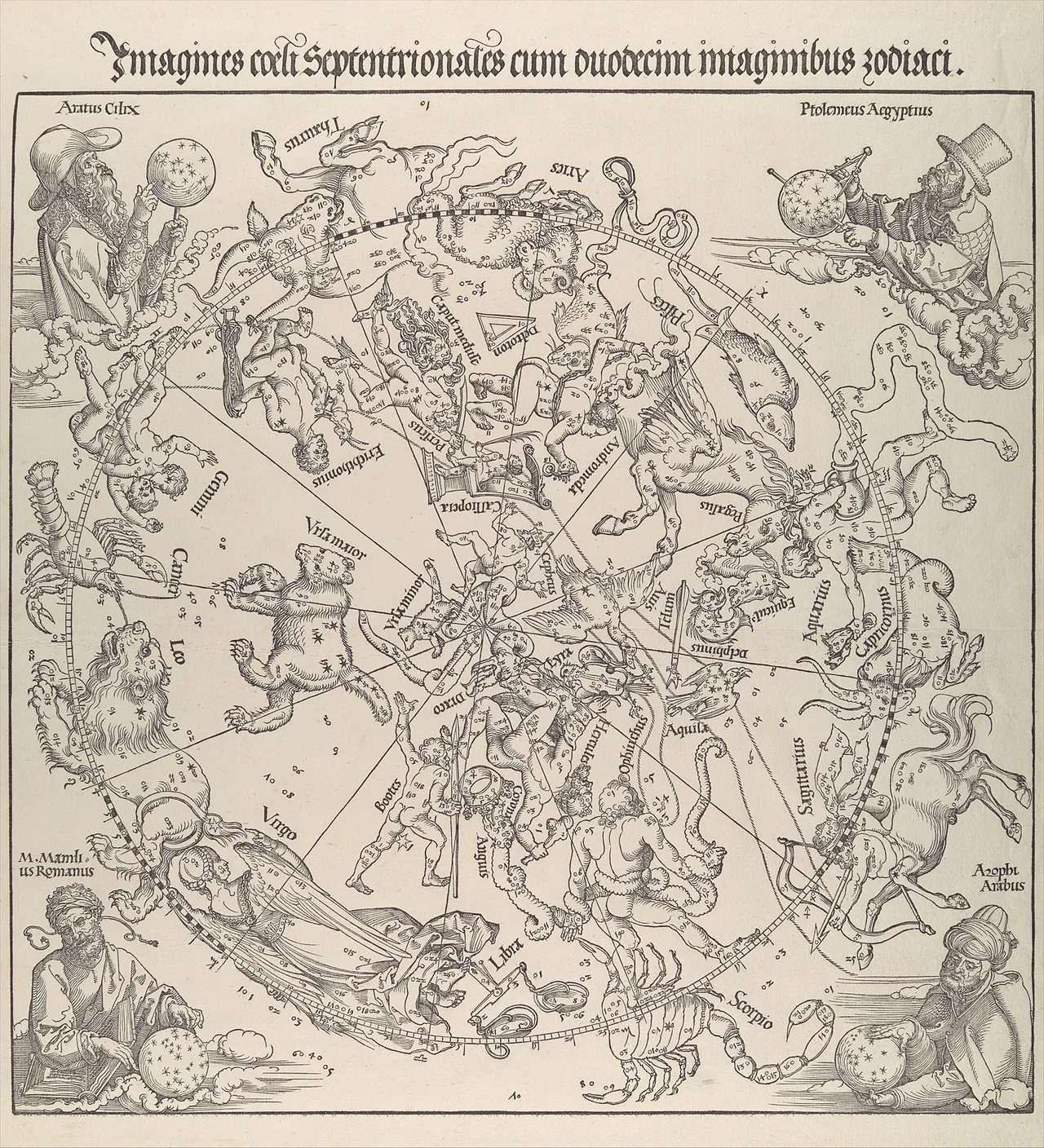
The circular structure is immediately noticeable, while the creatures and lettering offer closer discoveries. A square crop would not simply “tidy” the sheet: it could remove the heading or corner figures. Preserve the full image and use a mat to accommodate the surrounding shape.
Choose it as a historical chart and artwork. It is not a personalised birth-sky graphic or a current observing guide. If you want something to help identify tonight’s stars, that is a different requirement from choosing an image for the wall.
Test the smallest useful lettering
Small labels are often the first disappointment in a map reproduction. A preview that looks sharp on a phone does not establish how it will print. Ask which full-resolution file is being used and whether a sample detail can be shown at the intended physical scale.
For a simple hypothetical calculation, a 3,000-pixel-wide file printed 20 inches wide supplies 150 pixels per inch. That number describes available pixels, not guaranteed quality: the scan itself might be soft, damaged or heavily processed. Our image-resolution guide explains the distinction.
If making a paper test, print a small section at its intended final scale, with automatic “fit to page” disabled. Check an important name, a thin line and a pale area. A test of the whole map shrunk onto one sheet answers a different question.
Keep names, borders and meaning intact
Historical maps record a particular viewpoint. Names, boundaries, dedications and omissions deserve attention, especially when a map concerns a place with contested or changing political history. Do not present an old sheet as a neutral statement of today’s borders.
Keep the title and date somewhere accessible, even if you do not want a visible wall label. Retain a link to the collection record. If a map has been translated, recoloured or cropped, the listing should say so; an attractive modern adaptation is not the same thing as an unchanged historical reproduction.
Avoid recolouring a feature merely because it clashes with your room if that colour carries information. Choose another image instead. A map does not have to match the cushions to belong in the room.
Pair maps without forcing their proportions
Two maps of places connected in your life can form a thoughtful pair even when they have different shapes. Matching outer frames with individually sized mats is one option; matching image height with different frame widths is another. Neither requires stretching the artwork.
Measure the whole arrangement. Two frames each 40 cm wide with a 6 cm gap occupy 86 cm, not 80 cm. Those are illustrative dimensions, not a universal spacing rule. Tape paper outlines to the wall and check the result from your normal seat.
A city view and a celestial chart can also work together through line and paper tone rather than geography. Leave enough separation for each to retain its own heading, border and identity.
Choose an honest reproduction
Before ordering, establish whether you are buying an original historical print or a modern reproduction. A browned-paper appearance is not evidence of age, and a photograph of an old sheet does not guarantee permission to reproduce that particular file.
The three images here are supplied through the Met’s Open Access programme. Another source may have different terms. For a paid print, also check the actual image dimensions, included margins and whether a frame is supplied.
Choose the map whose details you will enjoy looking at, then give those details enough space. The useful final test is simple: can you still see what made you choose it?
Editorial record
About this article
- Author
- Publisher
- GeMarkt
- Published
- Reviewed
- Internal source & rights check. Conducted by GeMarkt Research Review. This is an internal editorial check—not independent peer review.
- Source standard
- Buying guide source standardSeparates measured or first-hand evidence from general guidance and keeps practical limits visible.
Found a claim that needs checking? Report a factual error.