GeMarkt Blog · Essay
The Bedroom: Three Versions Compared
Compare Van Gogh’s Amsterdam, Chicago and Paris Bedrooms through their portraits, furniture, windows and changed colours—not just a shared title.


The bed is yellow, the blanket red, and the floor seems to tip towards you. You know this room. Then you look at another reproduction: the little portraits have changed, the window opens differently, and the floor has become greener. Is the photograph wrong?
Not necessarily. Van Gogh painted three separate versions of The Bedroom. All depict his room in the Yellow House at Arles, but the two later paintings are reconsiderations of an earlier composition, not mechanical duplicates. Comparing them rewards the same attention you would give three performances of a familiar piece of music.
Three paintings not three prints
The Art Institute’s account of the three paintings establishes their sequence. Van Gogh made the first in October 1888. After that canvas suffered water damage, he returned to the composition in Saint-Rémy in September 1889, producing a similar-sized second version and then a smaller version for his family.
| Version | Date | Collection | Useful distinction |
|---|---|---|---|
| First | October 1888 | Van Gogh Museum, Amsterdam, s0047V1962 | The room painted during the Arles period |
| Second | September 1889 | Art Institute of Chicago, 1926.417 | A return to the earlier composition |
| Third | September 1889 | Musée d’Orsay, Paris, RF 1959 2 | The smaller family version |
The place represented and the place of painting are therefore not always the same. The 1889 canvases still show Arles even though Van Gogh made them in Saint-Rémy. Nor should a later print after one of these paintings be counted as a fourth painted version.
Amsterdam and Chicago side by side
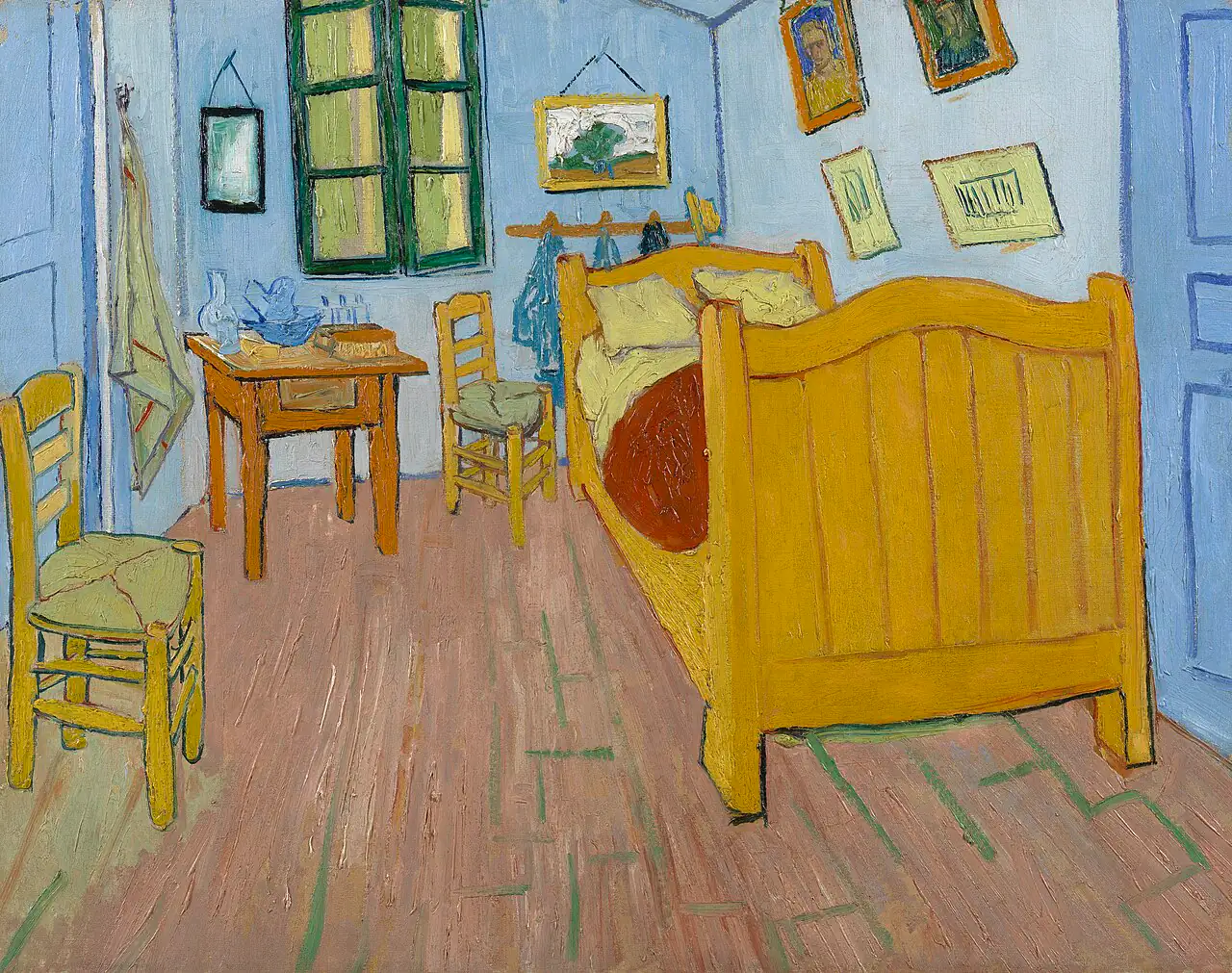
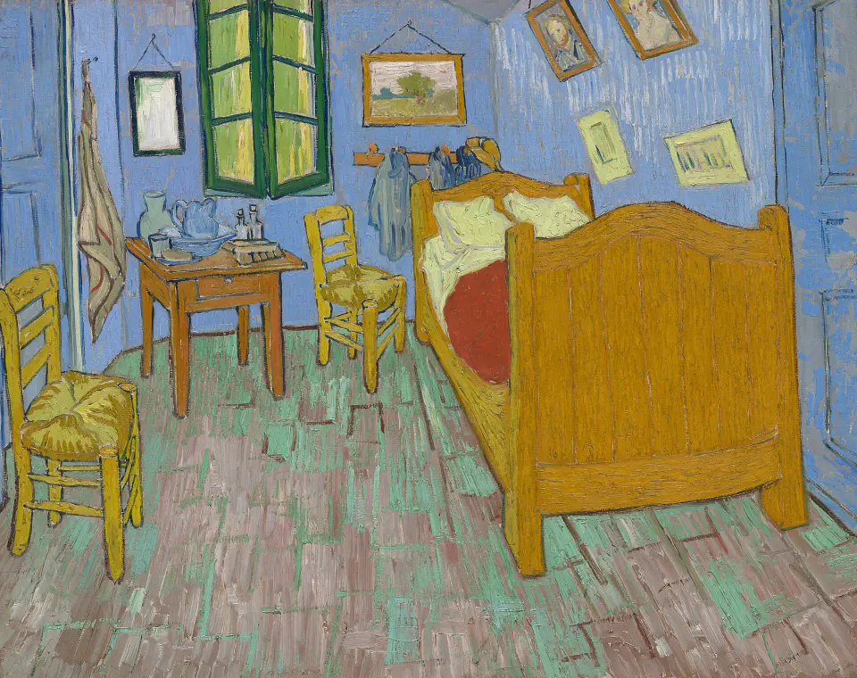
Start with the furniture rather than the colour. The washstand, mirror, towel, two chairs and bed establish a repeated arrangement. But the empty floor between them is shaped differently. In Amsterdam, the front chair presses against the left edge while the broad footboard stretches across the right. In Chicago, broken floor marks pull attention into that gap.
These are small decisions within an unmistakable design. Keeping a composition recognisable does not prevent the painter from changing how your eye travels through it.
The small portraits are the quickest clue
Look above the bed at the two larger framed faces. The Art Institute identifies the Amsterdam portraits as Eugène Boch and Paul-Eugène Milliet. In the second and third paintings, it identifies a self-portrait paired with an imagined female portrait instead. Those substitutions are more useful for distinguishing versions than a reproduction’s particular shade of blue.
They also change the room’s implied company. In the first picture, recognisable acquaintances inhabit the walls. In the later versions, the pairing is different. The museum proposes a connection with Van Gogh’s hopes for domestic life, but that remains an interpretation, not an identity label we can attach to the woman.
Notice the lower, smaller pictures too. Their positions belong to the repeated layout, yet their shapes and handling are not traced exactly. The room contains paintings that themselves change from painting to painting.
The bed and chairs change their handling
The bed is the most stable large object, but compare its outlines. Amsterdam’s broad yellow areas and contrasting edges make the frame appear firmly enclosed. In Chicago, more broken strokes move across the wooden surfaces.
The Art Institute’s examination of the beds describes flatter application in the first version and more textured handling in the later two. That is a distinction in paint, not a claim that Van Gogh bought a different bed.
Then look at the near chair’s seat. The museum’s chair comparison notes the thicker, contrasting applications in the later versions. Impasto means paint left thick enough for its physical texture to matter. Here, the seat can feel woven partly because individual strokes remain visible, rather than because every strand has been carefully outlined.
The Paris version is a smaller painting
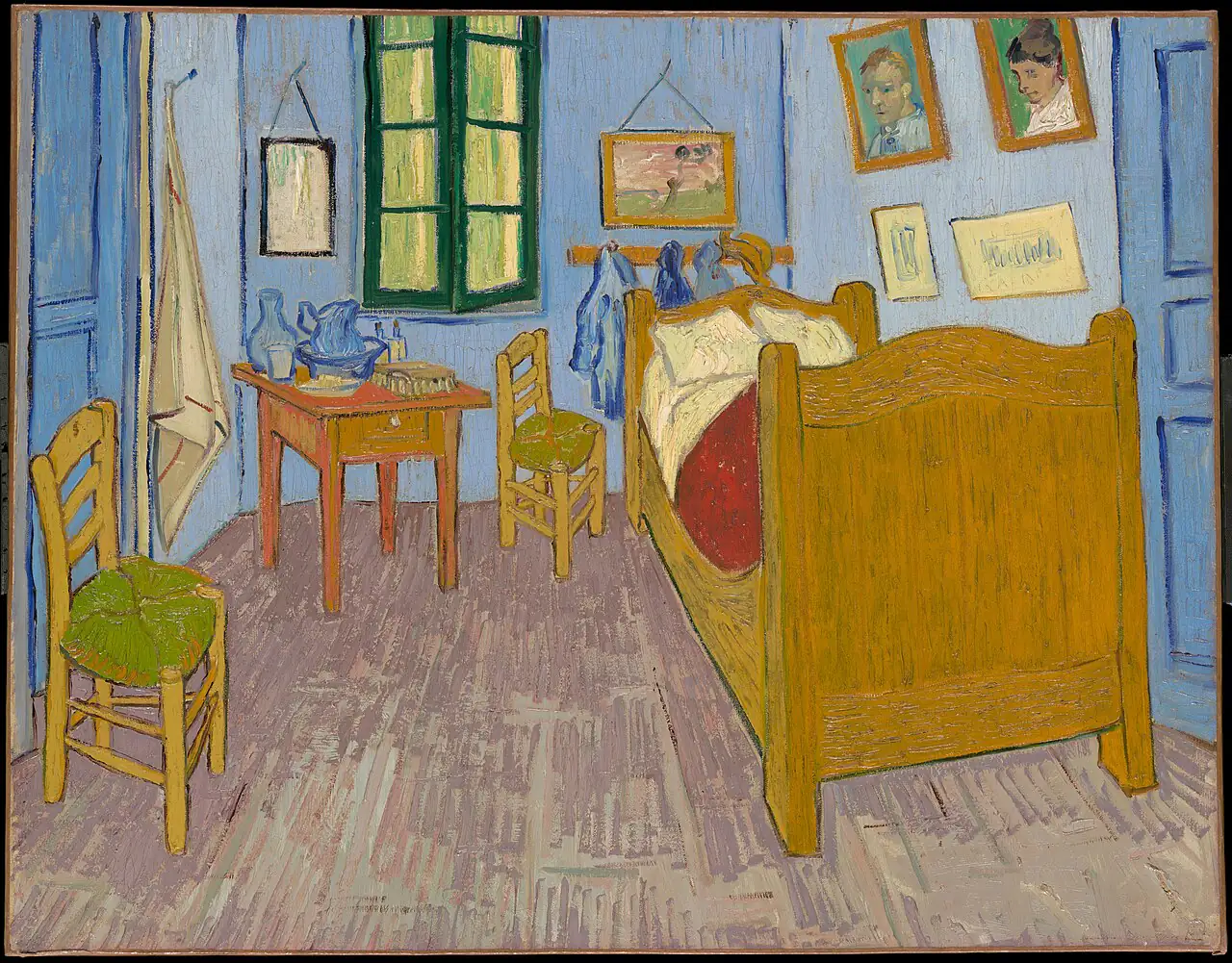

These reproductions are arranged for comparison, not at their relative physical sizes. The Musée d’Orsay records a canvas measuring 57.3 × 73.5 cm, noticeably smaller than Chicago’s. It was made for Van Gogh’s mother and sister in the Netherlands.
Yet smaller does not mean a loose thumbnail. The Paris picture retains the objects that make the room specific. The faces above the bed are particularly legible, the chair seats stand out in green, and the floor leads past a heavy yellow footboard. Rather than expecting a reduced photographic copy, compare which relationships Van Gogh chose to restate.
The window is not quite the same
The window gives you another quick test. Its vertical division and angled lower edges change across the paintings. The Art Institute’s window study reads Amsterdam’s as almost closed, Chicago’s as having both sides slightly open, and Paris’s as opening slightly on the right.
In these reproductions, Chicago’s central angle is especially clear. Follow it down towards the washstand, then compare the tighter window shape in Amsterdam. Such differences need no elaborate symbolic explanation to be interesting: they show that repetition involved fresh decisions about forms and their connections.
Why colour alone can mislead
The paintings have also aged. The museum’s floor analysis distinguishes different underlying layers and red pigments that changed at different rates. Amsterdam’s pink-purple appearance, Chicago’s green-touched floor and Paris’s purple-brown floor cannot all be treated as untouched colour choices surviving exactly as painted.
A screen adds another variable. Different photographs, processing and displays can alter the apparent balance without changing the historical object being reproduced. First identify the canvas through its collection and details; then discuss its colours.
A colour reconstruction answers a separate question about a proposed earlier appearance. It should be labelled as a reconstruction, not silently substituted for the present-state image in a comparison.
Rest is an intention not a diagnosis
The steep floor and angled furniture may feel restless to you. That response need not agree with the painter’s aim. The Chicago collection record explains that Van Gogh understood the room as a restful image despite its forceful colours and receding lines.
That tension makes the painting worth looking at. It does not allow us to diagnose him from a crooked chair, or assign an exact emotional state to every change of outline. Description, documented intention and later interpretation are different kinds of statement.
How to compare the three for yourself
Use the same route each time: the portraits, the window, the chair seats, then the floor. Finally, step back to see how those details affect the whole room. You will notice both continuity and revision without turning the exercise into a hunt for mistakes.
If you are comparing prints, check which canvas each reproduces. Our work-specific Bedroom rights guide explains the Chicago file separately. For the historical setting before the first painting, see Van Gogh and Gauguin in the Yellow House. The three Bedrooms remain individual paintings even when one familiar title travels between them.
Editorial record
About this article
- Author
- Publisher
- GeMarkt
- Published
- Reviewed
- Internal source & rights check. Conducted by GeMarkt Research Review. This is an internal editorial check—not independent peer review.
- Source standard
- Art history source standardPrioritises object records and research sources, distinguishes evidence from interpretation, and states material uncertainty.
Found a claim that needs checking? Report a factual error.