GeMarkt Blog · Essay
Sargent vs Whistler
Compare Sargent's Elizabeth Swinton with Whistler's Joanna Hiffernan: how pose, white fabric, space and the sitter's identity change a full-length portrait.

A woman in a white dress can become a brilliant social presence or a quiet arrangement of almost-matching tones. John Singer Sargent and James McNeill Whistler show how much can change without changing that basic subject. Their full-length figures occupy narrow canvases, yet ask us to look in different ways.
In Sargent’s portrait of Elizabeth Swinton, the pose, furniture and flashes of fabric build an animated public appearance. In Whistler’s painting of Joanna Hiffernan, repeated whites and a more vertical arrangement slow our attention. These are effects of the particular paintings, not proof that one artist painted personalities while the other ignored people.
Start with the person and the picture
Both artists were American-born or American by parentage, with careers deeply shaped by Europe. Sargent was born in Florence to American parents and trained in Paris. The National Gallery’s biography records that he met Whistler in Venice in 1881. They belong to connected artistic worlds, not isolated national schools.
The pictures below were made decades apart. Sargent’s portrait dates to 1897. Whistler’s is catalogued 1861–1863, 1872, preserving the later work on the canvas as well as its first period of creation. Comparing them is not an assertion that they were painted for the same exhibition or in direct competition.
Two women in white side by side
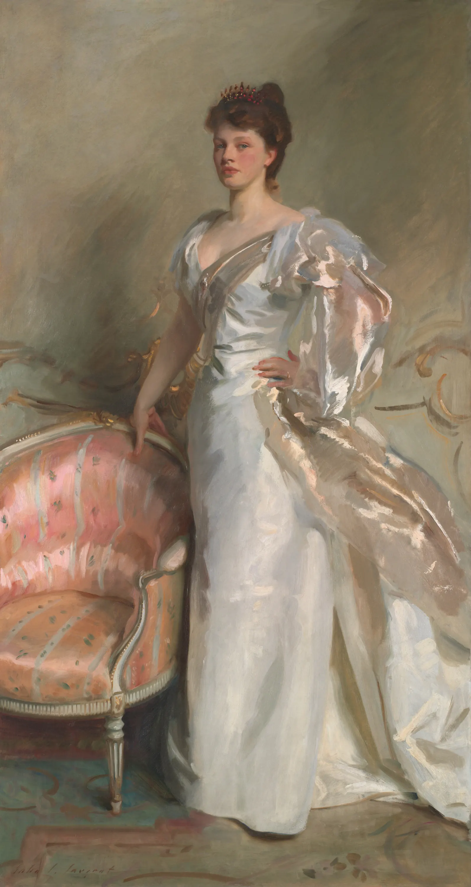
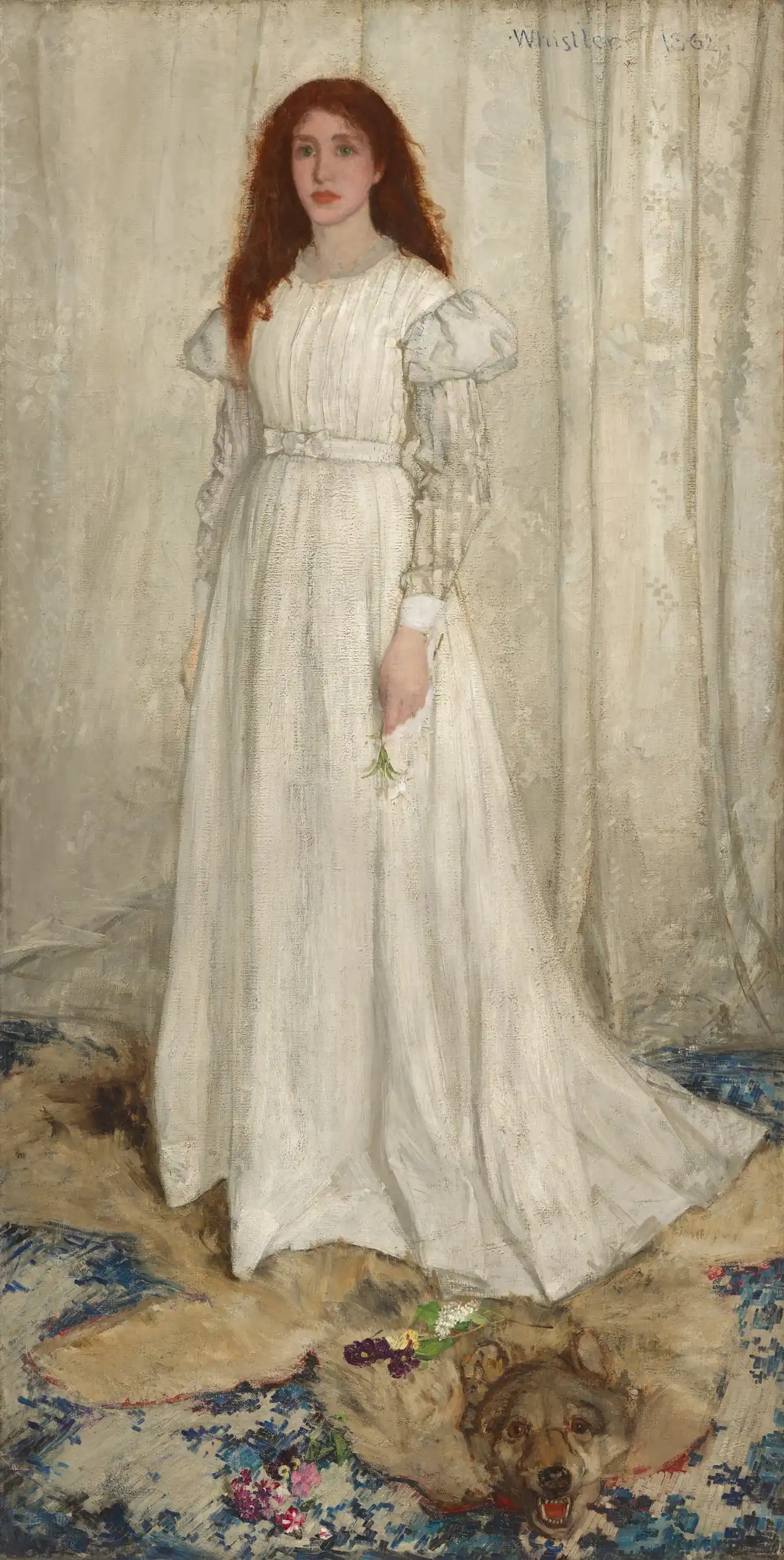
Both original canvases are more than two metres tall. The pictures here preserve their proportions rather than presenting the sitters at one exact shared scale. A full-length portrait of this size addresses a standing viewer very differently from a small head-and-shoulders photograph.
Sargent turns a pose into a social entrance
Follow Swinton’s arms first. One reaches towards the chair; the other bends at her waist. Those two gestures open the figure in different directions. The fabric spreading towards the lower right extends that movement beyond her body.
The chair matters even though she does not sit in it. Its curved back, warm pink upholstery and patterned surface give the pale dress something to stand against. They also make the setting feel occupied rather than empty: this is a person positioned within an elegant interior.
Now compare her face with the broad strokes in the material at her shoulder. The face is more contained; the fabric lets paint announce itself. The Art Institute’s entry emphasises this contrast between a convincing likeness and conspicuous, lively handling. The picture can read as a person from across a room and as an energetic painted surface when approached.
Whistler slows the picture down
Hiffernan’s arms remain closer to her body. The long dress descends towards the floor while the curtain repeats its upright direction. Without Sargent’s strongly projecting furniture, the figure seems to occupy a shallower space.
The largest interruption comes from her reddish hair. It encloses the face and separates the upper body from the pale curtain. Lower down, flowers and the animal pelt introduce small areas of colour and sharper shapes. Your attention can move between those distant points instead of following a large sweep of fabric sideways.
Notice that quiet does not mean empty. The pelt’s open mouth is conspicuous near the bottom. Its presence prevents the painting from becoming a perfectly polite study of a dress. What it means is not settled simply by identifying it; an image can provoke a story without providing one authorised explanation.
White is a relationship, not one colour
In both works, try to identify the brightest small passage and compare it with a nearby shadow. The surrounding whites are not identical. Cream, grey and cooler touches make fabric fold, turn and separate from the background.
Sargent often makes those differences arrive as abrupt flashes. A bright stroke lies next to a darker area and suddenly reads as a fold catching light. In this portrait, the white costume is also interrupted by the chair’s warmth and the grey-green surroundings.
Whistler lets the dress and curtain remain closer in tone. Their separation depends on edges, small value changes and texture rather than a large colour contrast. “Value” here means how light or dark an area appears. A white dress against a white curtain can therefore remain visible without outlining every fold in black.
The comparison is useful whenever a reproduction looks dull on a screen. A picture built on close values may depend on distinctions that an overbright display washes away. More saturation would not necessarily make it more faithful.
The women are not interchangeable
Elizabeth Swinton was a musician, known as Elsie. At the time of Sargent’s painting she was an amateur singer; the Art Institute notes that professional performances followed in the next decade. Her identity is more than a convenient example of an expensive dress.
Joanna Hiffernan was an Irish model and collaborator with Whistler. The National Gallery’s exhibition devoted to her places their long personal and professional connection at the centre of the story. Calling her an anonymous “girl in white” repeats a title without fully identifying the person.
Neither pose supplies a reliable personality test. Swinton’s assertive-looking stance does not summarise her private character; Hiffernan’s stillness does not make her passive. The painted presentation and the life of the sitter are related, but they are not the same thing.
Musical titles change the question
Whistler eventually grouped three paintings of Hiffernan under the title Symphony in White. The National Gallery’s object entry explains his stated emphasis on abstract relationships of line and colour, comparable to music rather than a narrated incident.
You do not need to accept that the picture contains no possible story. Instead, try the kind of looking the title invites: compare repeated pale areas, the spacing around the figure, and the balance between the head and the darker floor. A musical title can redirect attention without making the sitter disappear.
Sargent’s title directs us towards a named individual. Yet his portrait also depends on rhythm and colour. The labels reveal different emphases, not a clean division between human interest and visual design.
Neither artist has only one style
Sargent’s training under Carolus-Duran encouraged broad handling and a sense of freshness in finished pictures, as the Met’s account of his career explains. Apparent ease is therefore not evidence that this large portrait required no preparation or revision.
Nor should the two white dresses become a complete account of either artist. Sargent made landscapes, watercolours and murals as well as portraits. Whistler’s career includes prints and landscapes whose problems differ from those of this standing figure. A successful comparison gives you a way into their work without turning one pair into an inflexible identification rule.
What the pair teaches us about portraits
On your next look, compare only the hands, then only the space beside each body. Sargent’s outspread arrangement makes Swinton appear actively situated in a room. Whistler’s closer vertical arrangement makes Hiffernan’s relation to the surrounding whites unusually important.
Then return to the faces. Both remain present, even when we have spent time discussing paint. That is the balance worth keeping: portraits are arrangements of colour and shape, but they also represent particular people. For another way to test that balance, see Vermeer vs Rembrandt.
Editorial record
About this article
- Author
- Publisher
- GeMarkt
- Published
- Reviewed
- Internal source & rights check. Conducted by GeMarkt Research Review. This is an internal editorial check—not independent peer review.
- Source standard
- Art history source standardPrioritises object records and research sources, distinguishes evidence from interpretation, and states material uncertainty.
Found a claim that needs checking? Report a factual error.