GeMarkt Blog · Essay
Rococo: Fragonard and the Art of Pleasure
Recognise Rococo through eight paintings and objects: Fragonard’s flirtation, Watteau’s theatre, Carriera’s pastel and curves that escape the frame.

In Fragonard’s paintings, a dress can seem to move like foliage, a curtain like a wave, and a glance like an invitation. Rococo often makes the eye wander before it asks us to settle on a story. Its pleasures are tactile as well as narrative: satin, powdered colour, twisting ornament and brushwork that leaves a surface lively.
Yet “pretty eighteenth-century art” is not a useful enough definition. Watteau can be wistful; Venetian pastel has a different presence from French oil painting; a gilt-bronze candlestick can explain the style as clearly as a scene of lovers.
The eight works below introduce seven artists and designers. They include a deliberate counter-example by Chardin, because recognising a style also means noticing what nearby art does differently. This is a selected route, not a complete map of European Rococo.
How to recognise Rococo without reducing it to pink
The V&A’s introduction to Rococo places its development in French decorative arts of the 1720s and 1730s. The word is associated with rocaille, shell-like and rock-like ornament. Look for asymmetry, curling C and S shapes, foliage and forms that seem to grow into their surroundings.
In paintings, related effects include diagonal movement, fluid poses, animated surfaces and spaces arranged for sociability, theatre or pleasure. Pale colours can help, but they are not compulsory. Neither a pink dress nor a mythological nude is enough to establish the category.
The style travelled through objects, designs and makers; it did not acquire the same appearance or purpose everywhere. English decorative uses and Venetian painting complicate any exclusively French court story. Rococo also overlaps with later Baroque traditions. Treat these names as ways to ask better questions, not impermeable boxes.
A useful test is to follow one curve. Does it stop at the figure, or continue through furniture, fabric, branches and the shape of the composition?
Fragonard: The Love Letter
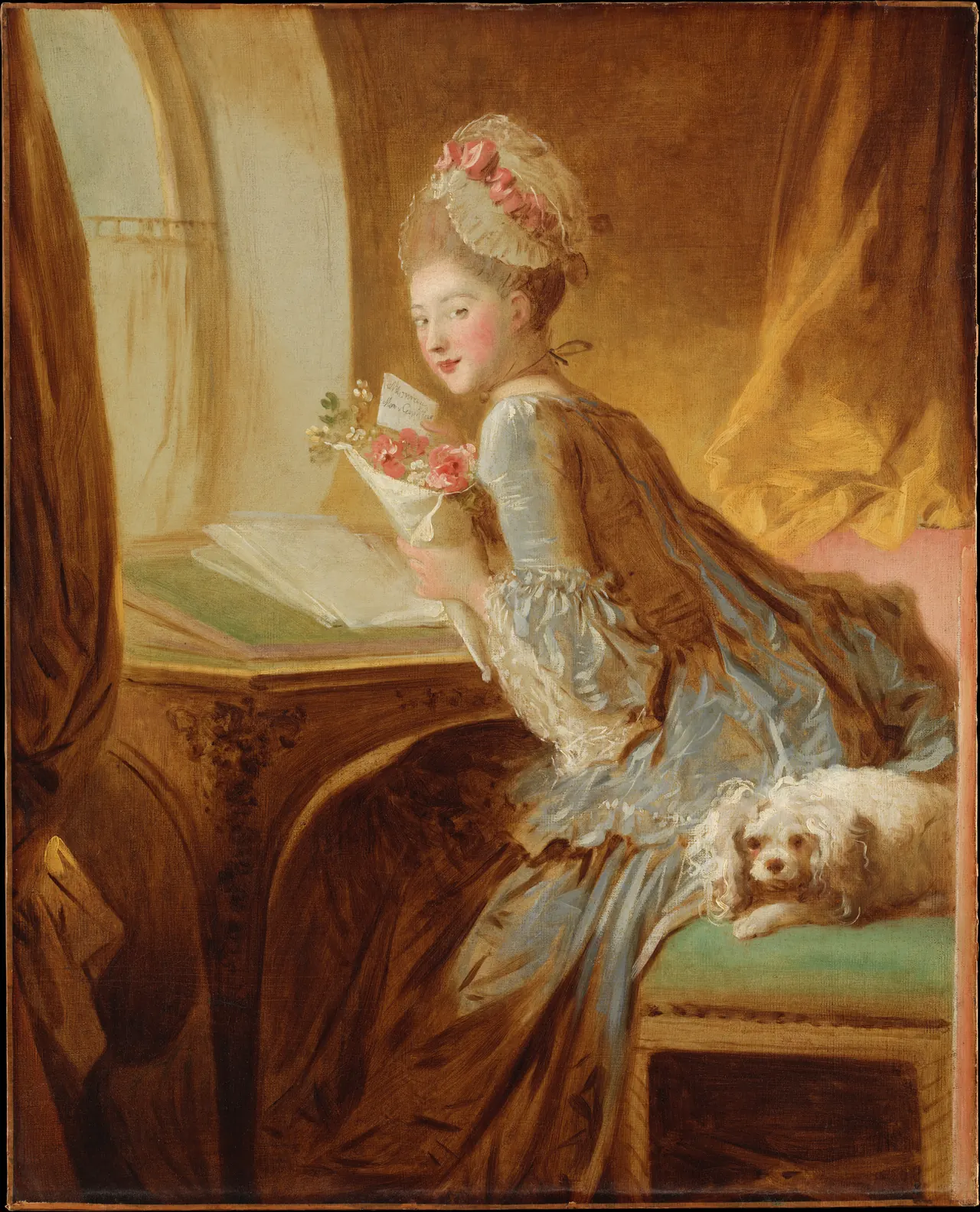
The woman has turned toward us while holding a letter and flowers. She is not visibly writing. Her glance interrupts the arrangement of desk, papers and curtain, giving a furnished room the energy of an encounter.
Notice the difference between the face and the skirt. The face remains readable, while the clothing loosens into sweeping marks. The curtain carries that movement upward; the curve of the desk carries it sideways.
The Met treats this as a genre scene rather than a securely identified portrait. That leaves room for suggestion without requiring us to invent a named lover or reconstruct the letter’s message. Its intimacy is a pictorial effect. We seem to have arrived at a meaningful moment, but the painting does not tell us everything about it.
Fragonard: The Swing
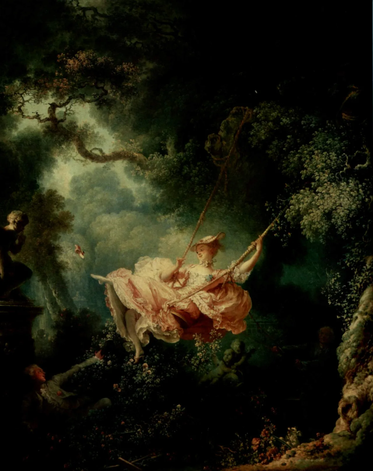
The dress is the bright centre of a much darker garden. Its expanding shape answers the spray of leaves around it, while the ropes lead our eye up and out of the visible scene. The airborne shoe adds another small trajectory.
The Wallace Collection reads the picture as an erotic scenario involving a concealed lover and a man moving the swing. That helps explain the sightlines, but the pleasure of looking is not exhausted by decoding the plot. Fragonard choreographs who can see what.
Our image is an older reproduction, not a photograph of the painting after its 2021 conservation. Use it to follow the composition rather than as a colour standard. Even here, the dark enclosure and sudden illumination make the garden feel deliberately staged.
Watteau: Mezzetin
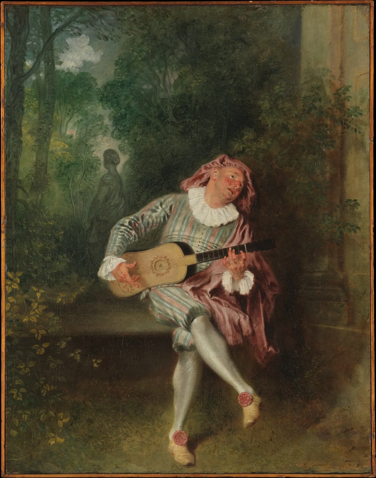
Mezzetin is a character from Italian comic theatre, not simply an unnamed man playing outdoors. The striped costume and theatrical attitude turn the garden into a kind of stage. His face tilts upward while the statue behind him looks away.
The Met’s Watteau essay describes the artist’s fêtes galantes: imagined gatherings in which sociability and performance become subjects. His importance to Rococo includes this uncertainty of mood, not just elegantly dressed people.
Look at the crossed legs and angle of the guitar. They create a looping rhythm, yet the figure remains isolated. Pleasure can contain longing. Placed beside Fragonard’s later garden, Watteau’s scene makes the broad family resemblance visible without making the two artists emotionally interchangeable.
Boucher: The Toilette of Venus
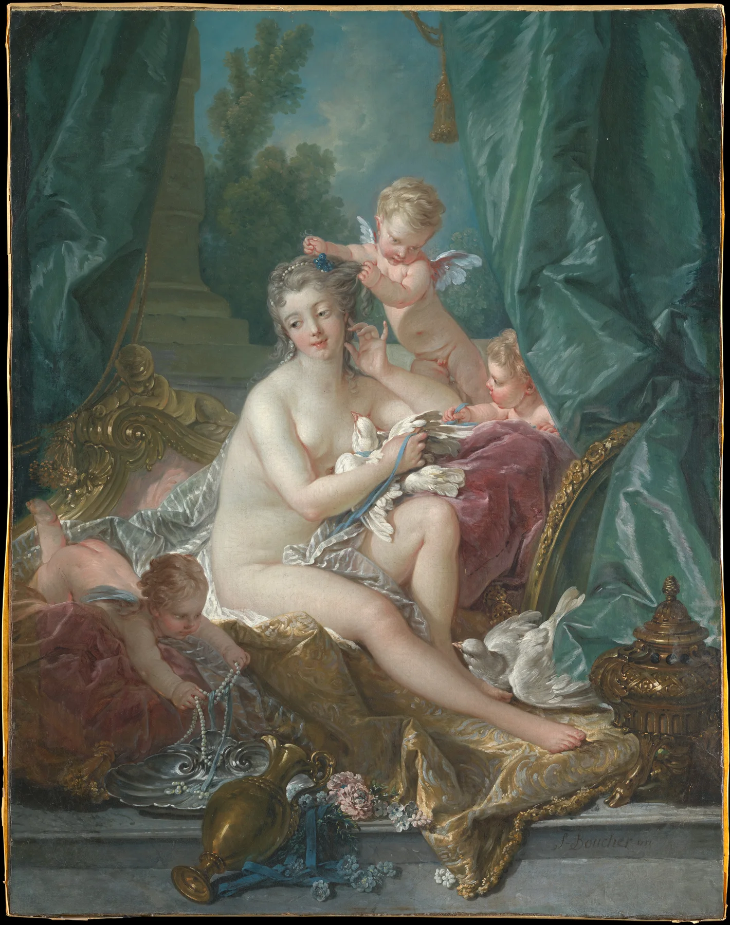
This painting was made for Madame de Pompadour’s Château de Bellevue. Its decorative setting matters: it belonged to an interior, not to an imaginary museum wall where each picture stands alone.
Venus supplies a mythological subject, but the composition also invites attention to soft fabric, polished surfaces and the meeting of pale flesh with cool blue. The winged children keep the eye circling. Nearly every edge finds another curve to continue it.
Compare it with The Love Letter. Both make surroundings participate in the figure’s movement. Boucher does so through a profusion of attendants and luxurious things; Fragonard can achieve a related flow with a curtain and a rapidly painted skirt. Rococo is partly a relationship between figure and environment, not merely a choice of subject.
Carriera: Allegory of Painting
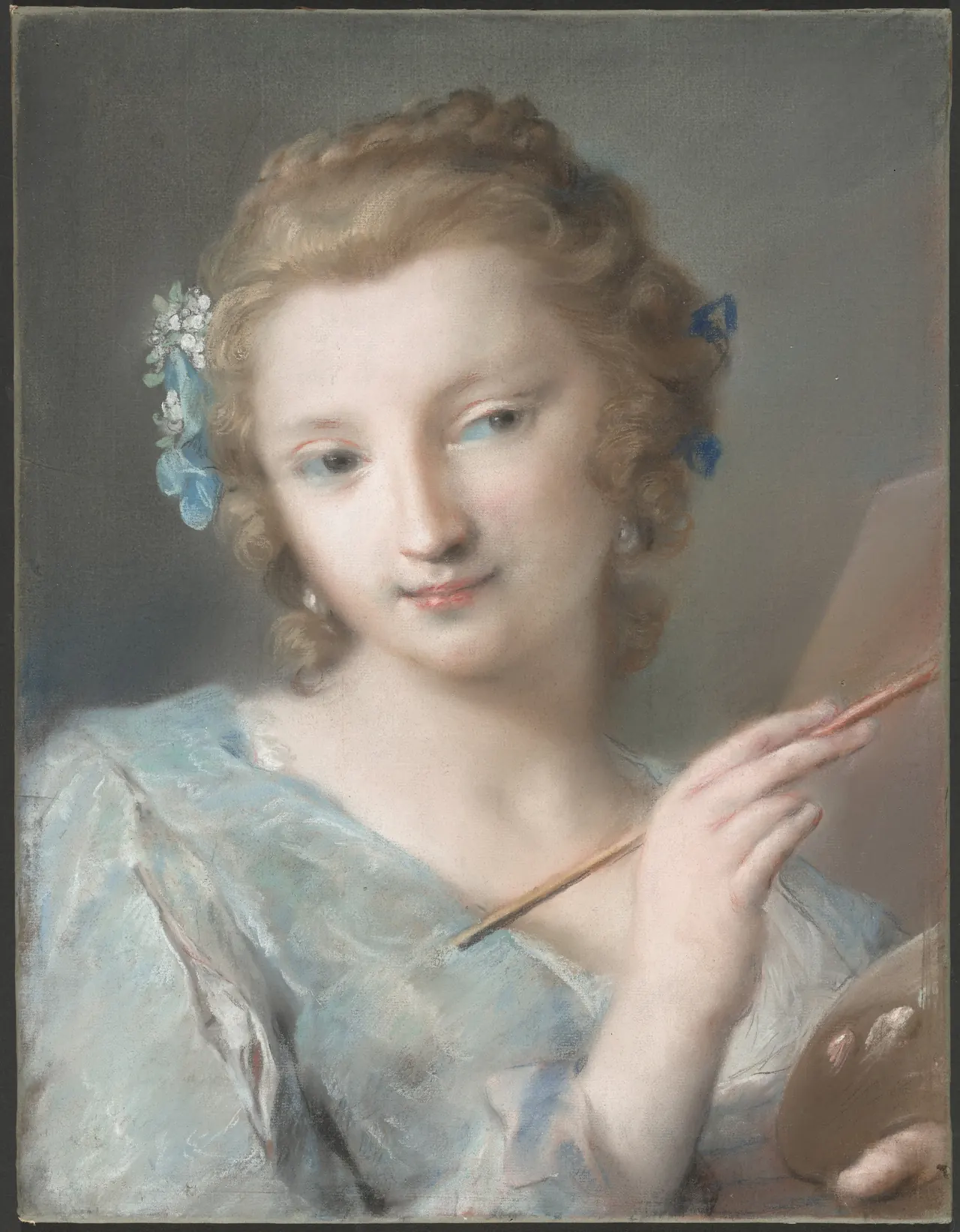
Carriera, a Venetian artist, gives Painting a human form with a brush and palette. This is an allegory: the figure personifies an activity. It should not automatically be treated as a literal self-portrait.
The medium changes how the light appears. Pastel produces a soft, granular surface rather than Boucher’s oily folds or Fragonard’s flowing strokes. The eyes and brush remain clear enough to direct attention, while hair, fabric and background pass into one another gently.
Try looking at the edge of the sleeve. Its apparent softness is built from marks, not from a photograph put out of focus. Carriera’s inclusion broadens Rococo beyond French oil painting and makes a woman artist central to its refinement, rather than placing women only among the people being represented.
Giovanni Domenico Tiepolo: Europe
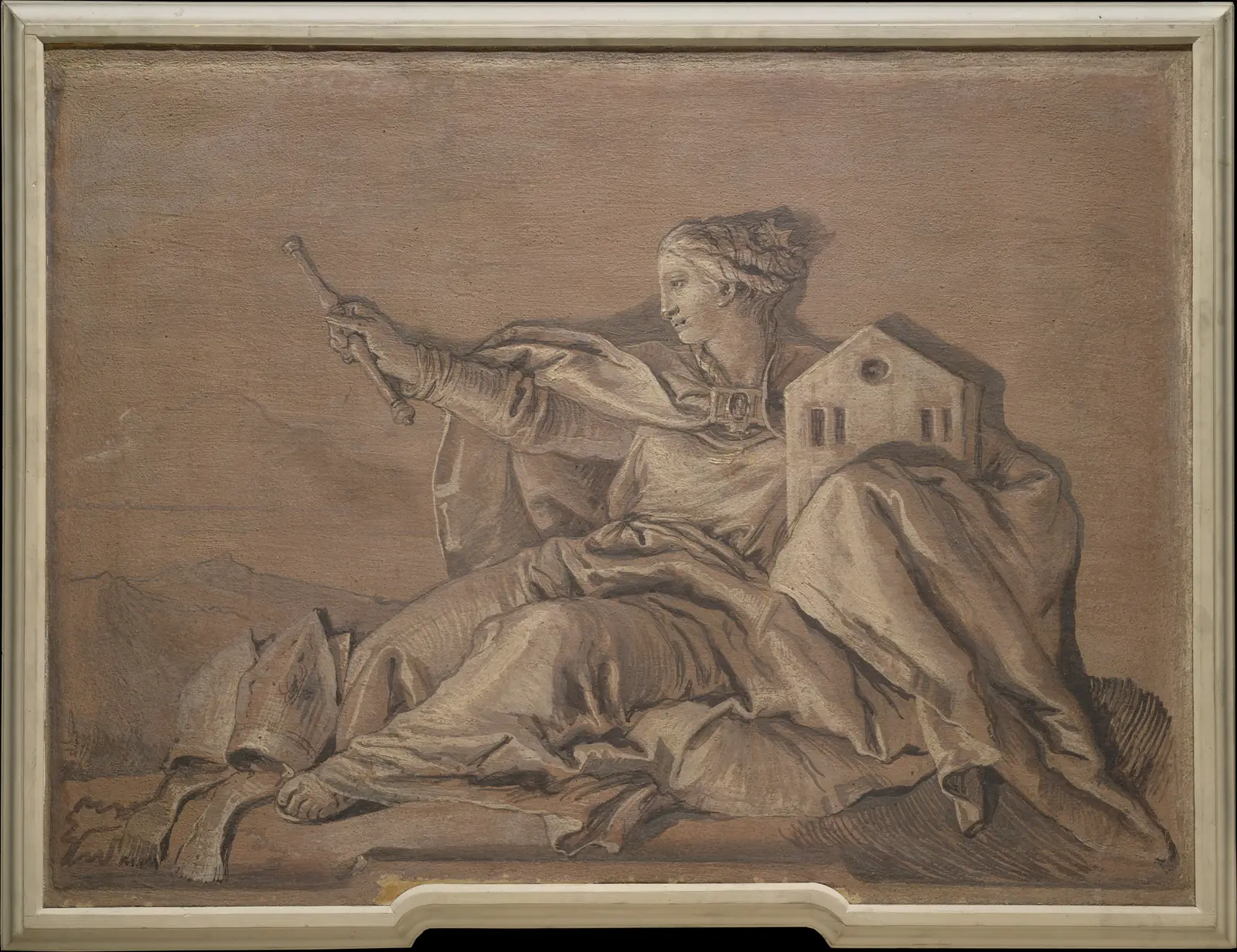
This work once occupied an overdoor position in a palace in Vicenza. It is by Giovanni Domenico Tiepolo, not his father Giovanni Battista, and it is a transferred fresco rather than a small oil painting made for an easel.
The figure fits the architecture: her arm stretches across the shallow space while her drapery fills its lower corners. The narrow range of tones gives a very different effect from the familiar pastel-pink stereotype.
The church and sceptre are attributes of the personification. Such continental allegories also carried claims about power and cultural hierarchy; the Met notes their role in racial stereotyping. Decorative ease is not political innocence. This Venetian example belongs to an eighteenth-century world in which Rococo and Baroque visual languages overlap.
After Meissonnier: a candlestick that will not stand still
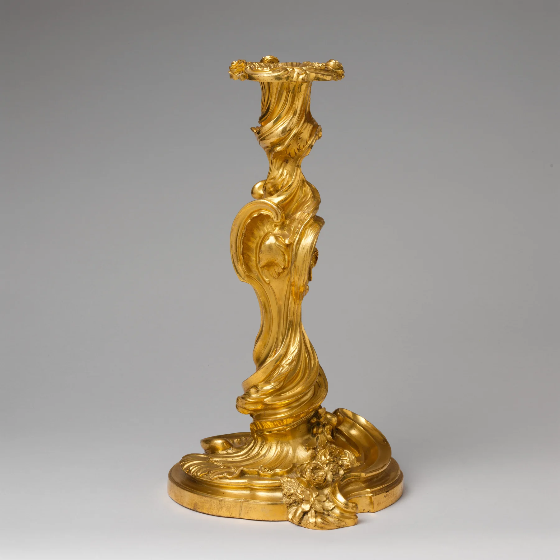
The candlestick is structurally upright, but its surface refuses a straight journey from base to top. Ridges twist around the stem; swelling forms interrupt it; the base spreads unevenly. This is a useful object for recognising asymmetry without confusing it with instability.
The attribution is after designs by Meissonnier. It is not evidence that he personally cast this particular bronze. Design, manufacture and the surviving object are related but different things.
Notice how the photographed light catches a series of edges. In use, an object like this would also belong to a room’s changing light. Ornament is not just a pattern viewed head-on: it occupies space. That helps explain why Rococo cannot be understood through paintings alone.
Chardin: The Ray, a contemporary contrast
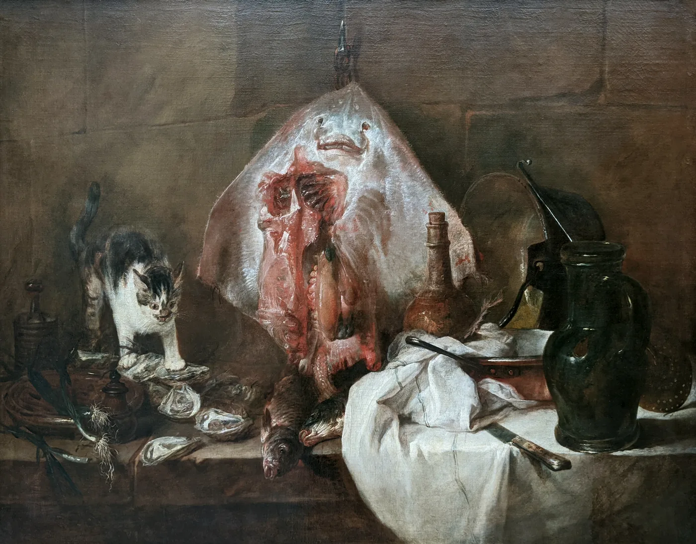
Chardin’s painting is here as a contrast, not a claim that every French artist of the period painted in the same Rococo manner. The Louvre records it as one of his reception works for the Royal Academy in 1728.
Its objects have a stubborn weight. The hanging ray opens the centre with exposed flesh; the cloth drops over the ledge; the vessels gather on the right. A cat brings alert movement to the otherwise heavy arrangement.
Compare the white fabric here with Boucher’s fabrics. Chardin’s cloth belongs among kitchen things rather than extending a goddess’s elegant pose. Both paintings make materials absorbing to look at, but their invitation is different. Sharing a century, a city or skilled brushwork does not erase that distinction.
Pleasure is a subject, not a complete explanation
Across these works, pleasure takes several forms: flirtation, performance, touch, display and the satisfaction of following an elaborate shape. None requires us to pretend the eighteenth century was carefree. Nor does acknowledging privilege mean ignoring the extraordinary handling of paint, pastel and metal.
The most useful way to recognise Rococo is to look at relationships. Does a gesture continue into a curtain? Does ornament dissolve a rigid outline? Does a scene draw us into intimate company, or keep us uncertain about our place in it?
For one artist in more depth, continue with our Fragonard guide. Then return to Watteau, Carriera and the candlestick. If all three still look meaningfully different, the category is helping you see rather than persuading you to overlook what is there.
Editorial record
About this article
- Author
- Publisher
- GeMarkt
- Published
- Reviewed
- Internal source & rights check. Conducted by GeMarkt Research Review. This is an internal editorial check—not independent peer review.
- Source standard
- Art history source standardPrioritises object records and research sources, distinguishes evidence from interpretation, and states material uncertainty.
Found a claim that needs checking? Report a factual error.