GeMarkt Blog · Essay
Renaissance vs Baroque
Compare a Florentine Adoration with Rubens's Raising of the Cross. See how space, light, gesture and setting complicate the usual calm-versus-drama rule.


Renaissance art is often introduced as balanced and calm; Baroque art as dramatic and full of movement. That can be a useful first impression. It becomes a problem when a crowded Renaissance procession appears, or when you notice just how carefully a dramatic Baroque painting is organised.
A better comparison asks how a picture directs you: through space, towards light, around bodies and into a story. The two religious paintings below make those choices visible. One gathers a long procession around an infant. The other concentrates effort around the lifting of a cross.
Two labels with flexible boundaries
The National Gallery’s Renaissance introduction describes renewed engagement with classical art and learning, alongside developing ways to represent the visible world. It uses a broad span from the early fourteenth to the mid-sixteenth century. This is a historical framework, not a claim that every European place changed at once.
The V&A places Baroque art and design principally in the seventeenth and first half of the eighteenth century. It emphasises movement, persuasive display and the combination of painting, sculpture and architecture. Those tendencies can help us look, provided we do not turn them into mandatory ingredients of every work made during those years.
Here the scope is deliberately narrower: two examples of European religious painting. They cannot stand for all sculpture, architecture or artistic traditions within either period.
Start with two busy religious paintings
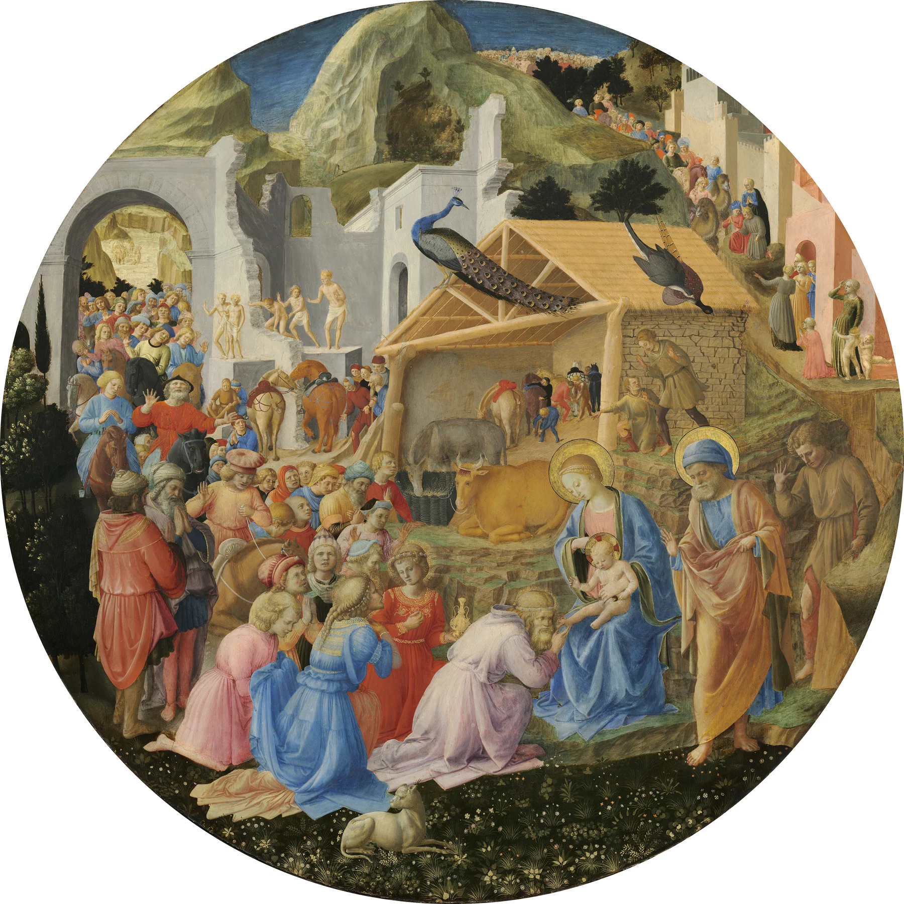
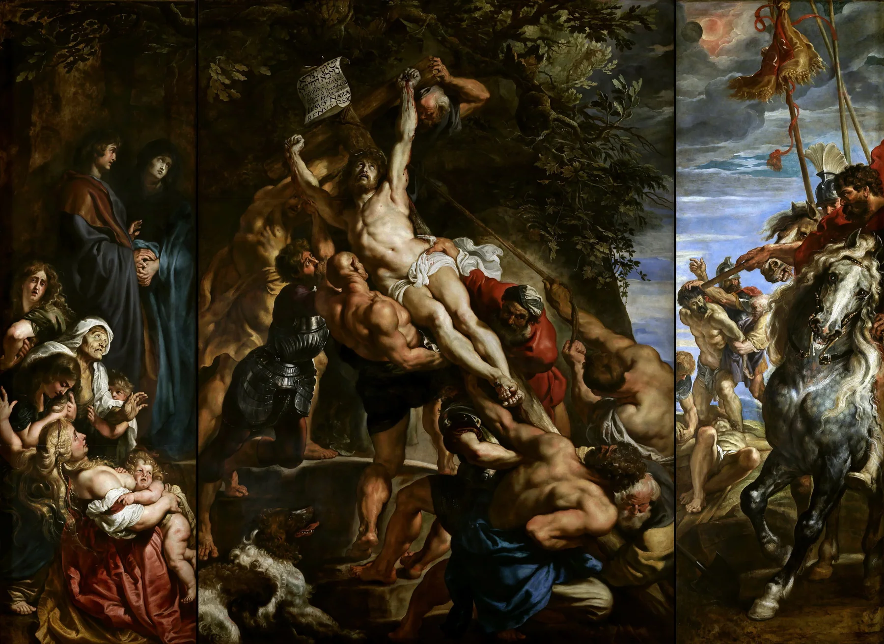
The first painting is a tondo: a round picture. The second is a triptych: three connected panels. Neither format automatically belongs to one period. Here, however, their shapes strongly affect how the stories unfold.
Follow a route or feel a lift
In the Adoration, try starting with the small travellers near the top. Their path carries your eye down through the scene. An arch, a cluster of horses, the stable and the richly dressed foreground visitors offer successive places to stop. The picture makes room for arrival as well as the central act of homage.
Mary and the infant sit towards the lower right, not at the geometric centre. A kneeling visitor bends towards the child; other figures turn, talk or wait. This is not a static arrangement merely because it is Renaissance painting. Its movement is distributed across a crowd and a route.
Rubens makes the central action harder to escape. The cross cuts diagonally through the middle panel. Arms, backs and bent knees connect around its weight. Instead of discovering the main event at the end of a winding procession, you meet it as a force dominating the image.
The side panels are not disposable extras. They extend the event from physical labour to watching, mourning and command. Looking only at the central panel would make the painting’s world considerably smaller.
Light decides where you pause
In the Adoration, colourful clothes remain legible in many parts of the scene. A red garment on one side can answer a blue garment on the other. The eye has several invitations, even though the sacred encounter remains the narrative focus.
Rubens sets the pale body on the cross against a much darker area. Other lit forms pick up that contrast without receiving the same prominence. At a glance, before identifying every person, you can already sense a hierarchy of attention.
This is a difference in how light is organised, not the invention of shading. The National Gallery’s explanation of chiaroscuro identifies light and dark as means of modelling forms and creating expressive effects; it discusses Leonardo as well as later artists. Strong tonal organisation does not begin at a neat Renaissance–Baroque boundary.
Bodies tell the story
Compare the foreground gestures. In the Adoration, kneeling and bowing bring attention down towards the child. Figures retain individual postures within a larger gathering. Even a visitor who is not looking directly at the infant contributes to the sense of a social world assembling around the event.
In Rubens, look at the broad back low in the central panel. Its bent position connects to the men above through a chain of exertion. The action reads across bodies rather than residing only in a facial expression. A single dark silhouette would not explain the weight as effectively as these overlapping limbs and torsos.
Both pictures use human action to make religious narrative accessible. The distinction is not belief on one side and theatrical emptiness on the other. It is a difference in how gesture distributes a viewer’s attention.
Format and location change the experience
The National Gallery of Art identifies the tondo as a work begun by Fra Angelico and completed by Lippi. It also treats a Medici commission as probable, not certain. That qualification matters: the painting has a history of attribution and ownership, not just a convenient period label.
Rubens’s work was made for the high altar of Antwerp’s former St Walburga’s Church, according to the local cathedral heritage account. Its central panel is about 4.6 metres high. The bodily action had to register as part of a large church interior, not just at the scale of this screen.
The online pair gives each work comparable visual space. That helps comparison but conceals a major physical difference. Before judging which seems more imposing, remember what the viewer would actually have stood in front of.
What the simple opposition misses
Renaissance painters could make crowded, emotional scenes. Baroque painters could organise those scenes with exceptional precision. Rubens’s diagonal does not cancel structure; it is structure. The tondo’s varied gestures do not cancel order; they work within its circular boundary.
Nor do these labels replace subject, commission or place. A devotional scene, a domestic portrait and a civic group portrait make different demands even when painted in the same decade. Our Vermeer and Rembrandt comparison offers another route into seventeenth-century painting, beyond the spectacular altarpiece.
Four questions for your next gallery visit
Ask where your eye goes first, what carries it to a second place, how bodies relate to the frame, and what the original setting adds. These questions reveal a picture’s decisions before you try to classify it.
For this pair, remember a procession that unfolds around a circular world and a lifting action that concentrates a much larger scene. That distinction is specific enough to see—and flexible enough to survive the next painting that surprises you.
Editorial record
About this article
- Author
- Publisher
- GeMarkt
- Published
- Reviewed
- Internal source & rights check. Conducted by GeMarkt Research Review. This is an internal editorial check—not independent peer review.
- Source standard
- Art history source standardPrioritises object records and research sources, distinguishes evidence from interpretation, and states material uncertainty.
Found a claim that needs checking? Report a factual error.