GeMarkt Blog · Practical guide
Night Scenes and Moonlit Paintings
Choose a night-scene print that stays interesting in your room. Compare moonlit interiors, figures and seascapes, then test dark detail, framing and lighting.

A good night-scene print needs more than a moon and a dark palette. Look for an image whose quieter details still interest you, and make sure you can see them under the lighting you normally use. A picture that is beautiful on a bright phone screen may be difficult to enjoy in a dim corner.
Moonlit art can be blue, brown, grey or violet. It can show an empty room, a walk with company or a vessel offshore. Those differences help you choose a picture with a particular atmosphere rather than treating every night scene as interchangeable bedroom decoration.
Decide what you like about night
Ask whether you want stillness, mystery, company or activity. An unoccupied interior gives you no figure to follow; a group of people gives the darkness a human relationship. Lights on water can suggest distance. None of these has the same meaning for everyone.
If you are buying for a shared room, show the entire image to the people who use it. A scene that one person finds quiet may feel lonely or unsettling to another. You do not need a theory about colour psychology to resolve this: compare their responses to the actual pictures.
Also decide how much you want to discover slowly. Some night images have a strong silhouette that works from across a room. Others depend on slight differences between neighbouring shadows. The latter may suit a close view beside a reading chair better than a distant wall, although the print, lighting and your own eyesight all affect that choice.
Hammershøi brings moonlight indoors
Vilhelm Hammershøi’s Moonlight, Strandgade 30, 1900–1906, depicts a room in his Copenhagen apartment. The Met identifies deep lavender hues within its restrained palette. The moon is not visible: we see its effect through the window and on the floor.
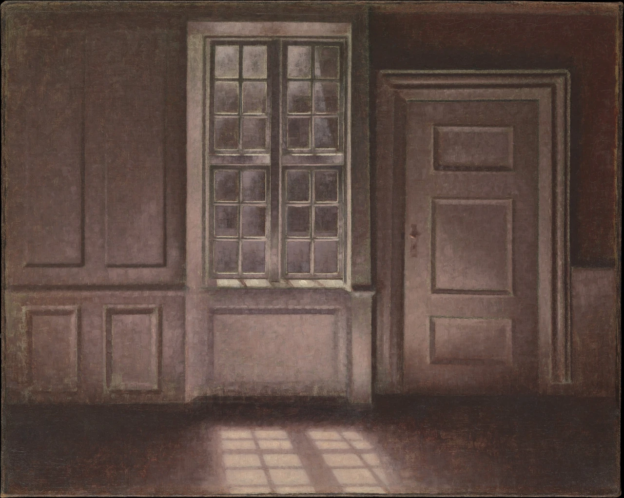
Look at the relationship between the upright window and its angled light on the floor. Those shapes give you a route through a picture with no person and almost no furniture. The door panels repeat the rectangles without becoming identical to them.
This could work near actual panelling or simple cabinetry, but an exact architectural match is unnecessary. I would test it where the pale floor shapes remain visible from a chair. If the lower image disappears behind a vase, the most important light is partly lost.
Choose a reproduction that retains differences within the dark wall and door. Making all of those areas nearly black would leave the brightest window but flatten much of the room. Conversely, a version made very pale may no longer resemble the nocturnal image you chose. Compare the complete reproduction with the museum’s example, not only the thumbnail in a furnished mockup.
Friedrich gives the view two companions
The Met’s Two Men Contemplating the Moon, about 1825–30, is one particular version of Caspar David Friedrich’s composition. Two figures seen from behind stand beside a rough path, looking towards a small crescent moon.
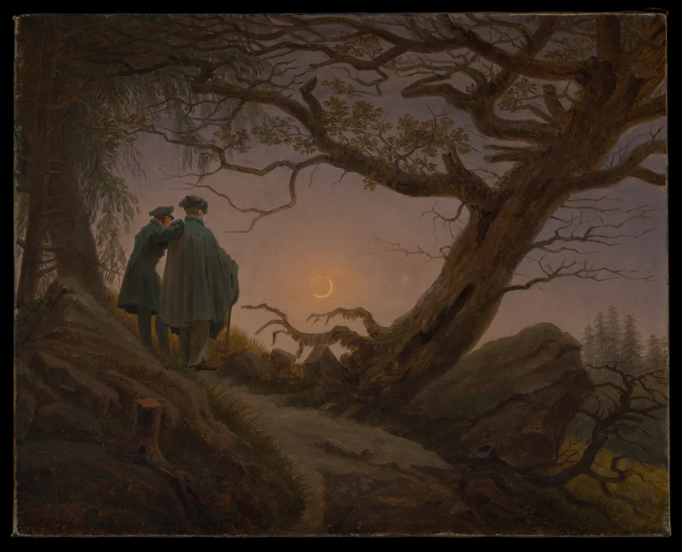
Here the warm brown ground and pale sky matter as much as the moon. The large tree crosses above and beside the figures, and the uneven path holds the foreground. A tight crop around the crescent would lose the sense of two people standing in a landscape together.
If you want moonlit art but dislike a room full of blue, this offers a different palette. Compare a muted wood frame with a dark one rather than assuming that night always requires black. Either could work; the useful question is whether the figures and path remain the focus.
The people are small but not incidental. Test whether you can distinguish the pair at your intended size and distance. If they merge into an unreadable patch, move the picture closer or choose a different size. Do not simply enlarge until it dominates a wall that was meant to feel relatively open.
Aivazovsky keeps a light over the water
Ivan Aivazovsky’s Ship by Moonlight places a steamship beneath a pale moon, with small figures along the near shore. The Met’s current catalogue does not supply a creation date. Its title and accession, 1975.280.2, identify the image more reliably than an invented year.
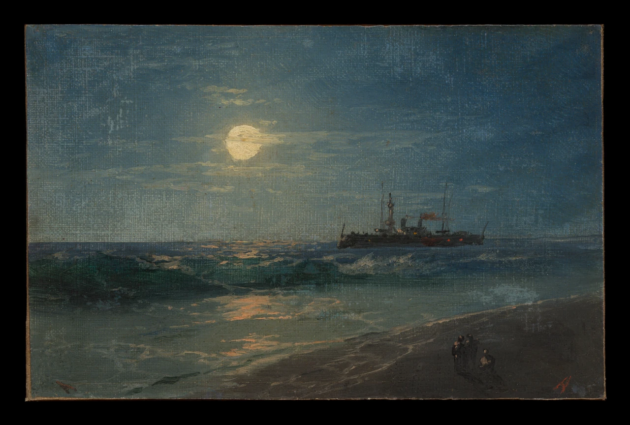
The bright moon is not the only point to notice. A broken reflection carries light across the water, and small warmer marks appear near the vessel. The shore remains much darker. That contrast makes the image useful for judging whether a print preserves subtle dark areas rather than treating them as empty background.
I would try it where you can approach occasionally, not only above a tall cabinet. The small ship and shore figures reward closer looking. The black surround visible here belongs to the institutional photograph; it is not a frame supplied with a print. Check how any reproduction handles that perimeter before ordering.
Test dark detail before choosing a large print
Start with a full image preview and, if available, a physical paper sample or sample print from the intended supplier. A digital preview helps you check composition, but your screen is not proof of the final dark tones, paper surface or room lighting.
Choose two or three details you would be disappointed to lose. In Hammershøi, these could be the door panels and the floor light. In Friedrich, the two figures and path. In Aivazovsky, the ship against the water. Use the same details when comparing alternative reproductions so that the brightest moon does not make every version look equally convincing.
Do not add a powerful spotlight merely to rescue an unsuitable position. Try another wall first. If dedicated lighting is needed for valuable art, discuss the object and installation with appropriate professionals. A replaceable modern print and an original painting call for different levels of care, and neither needs to sit in direct sun.
Choose a surround that does not overwhelm the light
A white mat around a dark image introduces a substantial bright border. You may like that crisp separation, or find that it competes with the small light inside the picture. Compare an off-white or muted surround before committing.
A dark frame does not require a dark mat as well. Changing one component at a time makes it easier to understand the result. If everything becomes dark at once, you may lose a useful distinction between wall, frame and image.
Keep the actual image size separate from the outside frame. A hypothetical 30 × 40 cm image with a 5 cm visible mat border all round occupies 40 × 50 cm before adding the frame moulding. Those measurements are an example, not a stock size or installation instruction. A paper template of the final outside dimensions is the useful thing to place on the wall.
Give the picture a place you actually use
Check the proposed position when your evening lamps are on, not only during a bright daytime viewing. Sit where you normally sit. Reflections, nearby screens and furniture can change what you notice without altering the print itself.
Night scenes need not be confined to bedrooms. A hallway, sitting room or study can give them an attentive setting. What matters is whether the subject feels right to you and whether its particular light remains visible. Our guide to dark walls can help you compare the surround; the painting itself should still be the reason you want to stop and look.
Editorial record
About this article
- Author
- Publisher
- GeMarkt
- Published
- Reviewed
- Internal source & rights check. Conducted by GeMarkt Research Review. This is an internal editorial check—not independent peer review.
- Source standard
- Buying guide source standardSeparates measured or first-hand evidence from general guidance and keeps practical limits visible.
Found a claim that needs checking? Report a factual error.