GeMarkt Blog · Practical guide
Mediterranean and Rustic Interiors
Choose wall art for Mediterranean-inspired and rustic rooms through specific places, restrained colour, natural textures and three paintings worth looking at.

For a Mediterranean-inspired or rustic room, start with one painting that relates to the materials already there: a landscape beside timber, an architectural view against a plain wall, or a still life near a dining table. You do not need a sea view, distressed frame and terracotta accessory in every corner.
The useful distinction is between a picture you want to live with and a picture chosen only to certify a decorating theme. These three examples offer different starting points, not a formula or a claim that every work is available in our shop.
Start with your room, not a postcard
“Mediterranean” covers many places and histories; it is not one interchangeable national style. “Rustic” describes a different idea, often involving visibly worked materials and an informal setting. A room can suggest one without the other. A clean, modern apartment can hold a painting of Provence, while a timber-filled cottage need not pretend to be beside the sea.
Before browsing art, note three things you will keep: perhaps a reddish floor, dark dining table and cream curtains. Those are more useful constraints than a mood-board label. Decide whether the painting should repeat one of those colours or introduce a contrast.
If a place matters to you, name it. Look for a particular coast, city or landscape rather than treating any arch, olive tree or blue door as evidence of the same culture. A personal connection is a better reason to choose an image than a checklist of regional motifs.
A landscape with a specific address
Cézanne’s Mont Sainte-Victoire and the Viaduct of the Arc River Valley is an 1882–85 view near Aix-en-Provence. The Met identifies the viewpoint near his sister’s property at Montbriand. The distant arches belong to a railway viaduct, not an ancient Roman aqueduct. The Met’s object record.
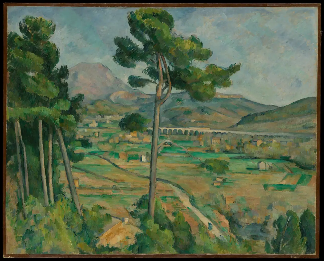
Notice the green fields, pale sky and strong central tree. This is a landscape with structure, not an uninterrupted blue horizon. I would try it beside plain upholstery or a timber sideboard, where the picture can carry the busier pattern.
You could repeat its subdued green in one cushion without matching every painted colour. If the room already has a patterned rug and exposed masonry, first test whether another detailed surface feels welcome. An appealing subject can still be the wrong amount of visual activity for a particular wall.
Architecture without the theme park
Sorolla’s Hall of the Ambassadors, Alhambra, Granada dates to 1909. His painting sets pink walls and repeated arches above reflected shapes in water. The Getty identifies the location and describes his interest in changing light. Getty collection record.
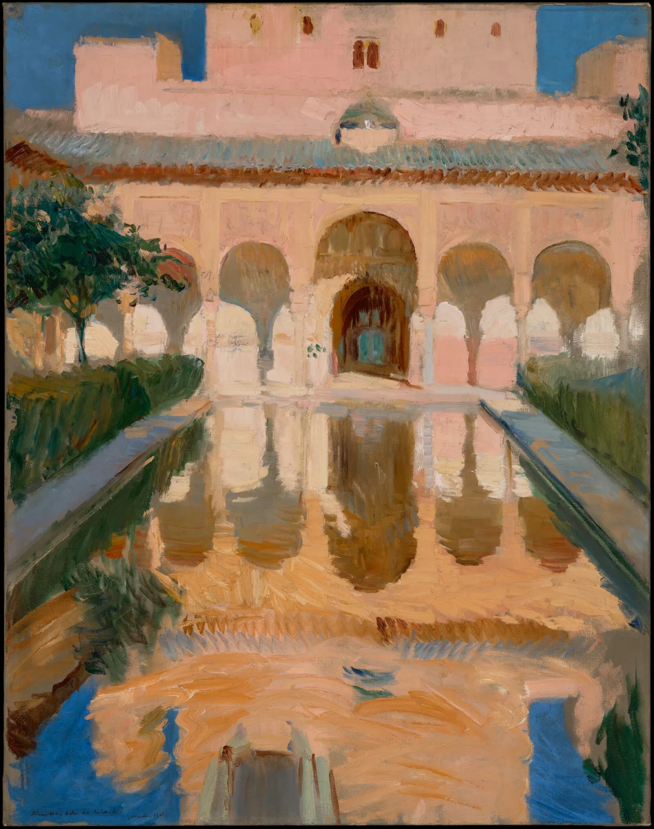
The Alhambra belongs to a specific history of Islamic Spain and Nasrid architecture, not a generic “exotic” backdrop. UNESCO’s account is a useful introduction to the place represented here.
For a contemporary room, borrow a colour relationship rather than attempting to recreate a palace. A pale pink wall, dark green plant and otherwise simple furnishings could converse with this image. You do not need imitation architectural details around it.
The upright composition is also worth keeping intact. A wide crop would change the relationship between the building and its reflection. Look at the actual print preview, not just a room mockup, before choosing an elongated format.
A still life for everyday materials
A rustic setting need not contain a rural view. Cézanne’s Still Life with Apples and a Pot of Primroses, about 1890, gives attention to fruit, a cloth, a plant and a table. The Met records this exact canvas as 51.112.1. Collection record.
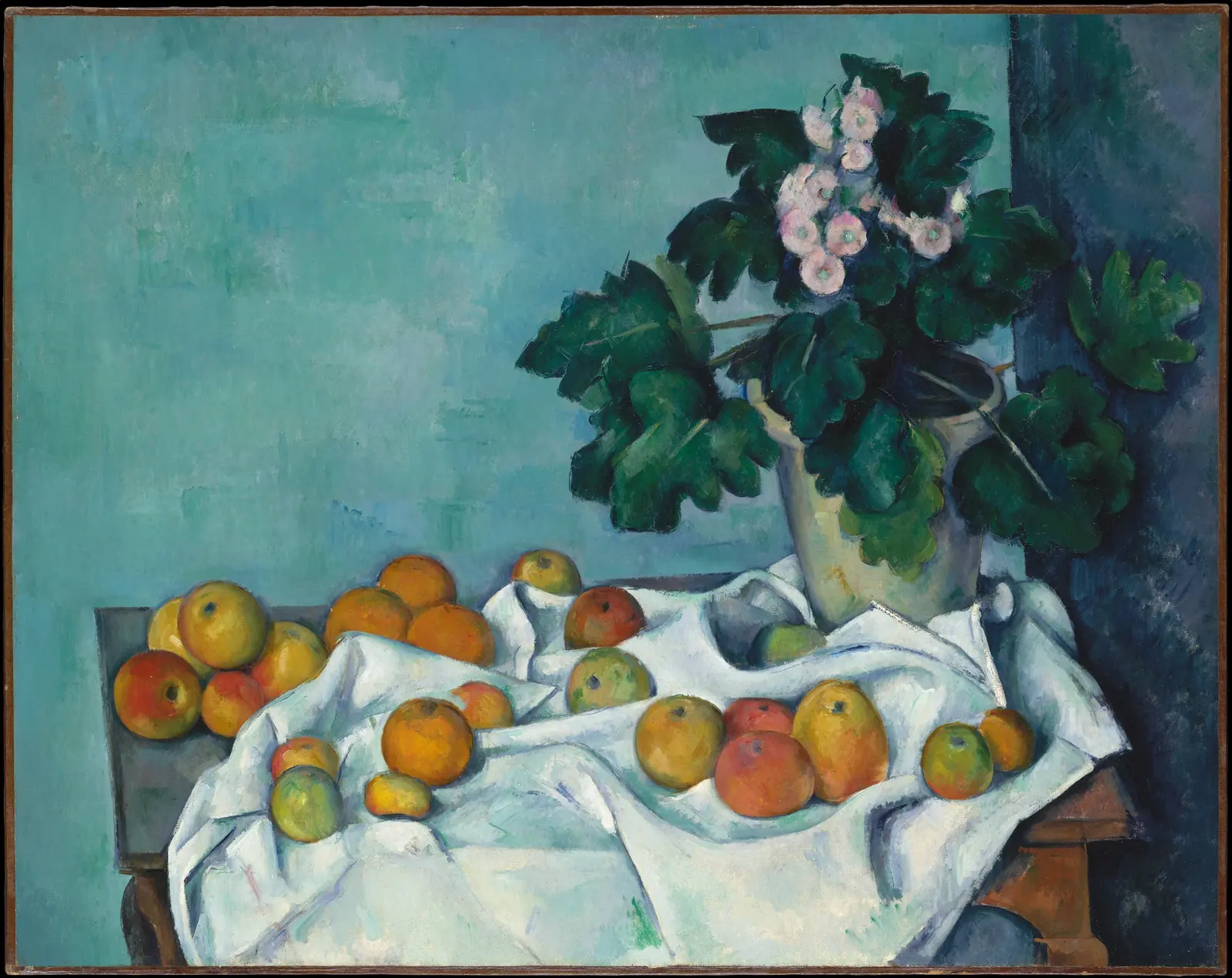
Here the cool wall and white cloth prevent the warm fruit from becoming an all-brown arrangement. That is a useful visual prompt for a room with a lot of wood: try one cooler note rather than adding more orange and tan.
I would consider this above a sideboard or on a dining-room wall visible from the table. That is a decorating suggestion, not evidence that the painting was designed for either location. For more subject choices, see food and still life art for the kitchen.
Choose colours from what you already own
Take your shortlist into the actual room. A phone screen can help compare compositions, but it cannot promise a match between a reproduction and a wall-paint sample. Look at physical frame and paper samples where available before committing to a close colour match.
One practical approach is to choose a dominant relationship rather than a complete palette. Beside reddish flooring, try a painting with green and cream. Against a pale wall, try an image with a darker edge. With strongly patterned tiles, begin with one picture rather than a cluster of small ones.
These are options to test, not rules about what a Mediterranean home must contain. You can keep a bright blue painting simply because you enjoy it; the room does not need another blue object to justify that choice.
Work out size before ordering
Use the finished frame’s outside dimensions when testing wall space. An image measurement alone leaves out any printed border, mount and frame moulding. Draw or tape a paper outline safely on a testable surface, then look from the doorway and your usual seat.
For an illustrative calculation, two frames each 40 cm wide with a 6 cm gap occupy 86 cm in total: 40 + 6 + 40. Over a 140 cm sideboard, centring that group leaves 27 cm on either side. This explains the geometry; it does not make those dimensions the right answer for every room.
A narrow wall beside a door may suit the upright Sorolla better than a broad landscape. Above a long sofa, compare one larger landscape with two smaller works. Our wall-art size guide helps you test the alternatives before buying.
Let the frame do one job
Choose whether the frame should blend into the room or define a firm edge around the image. A plain wood finish can relate to furniture; a dark, narrow frame can separate a pale picture from a pale wall. Neither choice needs artificial scuffs to qualify as rustic.
Do not assume a decorative border shown inside an artwork file is a supplied physical frame. Likewise, painted texture reproduced on paper is not raised brushwork. Check the listing’s material and what is actually included; our print-format guide separates the main options.
Sunlit-looking art does not need a sunny mounting position. The Library of Congress recommends limiting light exposure for works on paper, especially direct sunlight. Choose a display location for the print’s care, not to imitate the weather in the scene. Paper care guidance.
Make a small and specific choice
For a quiet room, start with the Cézanne landscape and let its green valley provide the movement. For a plain wall that needs an upright focal point, test Sorolla’s architecture. For a room organised around meals and everyday objects, consider the still life.
You need not hang all three or turn their colours into a shopping list. Choose one image, settle its size and frame, then live with it before adding another. The result can feel connected to a place or to familiar materials without turning your home into a stage set.
Editorial record
About this article
- Author
- Publisher
- GeMarkt
- Published
- Reviewed
- Internal source & rights check. Conducted by GeMarkt Research Review. This is an internal editorial check—not independent peer review.
- Source standard
- Buying guide source standardSeparates measured or first-hand evidence from general guidance and keeps practical limits visible.
Found a claim that needs checking? Report a factual error.