GeMarkt Blog · Practical guide
Landscape Paintings for Calm Rooms
Compare Shishkin’s forest, Monet’s garden and Friedrich’s moonlit scene, then choose a landscape print by space, detail, light and personal preference.

Choose a landscape you want to return to, not one sold with a promise to calm you. An open field, a dense forest and a moonlit path can all suit a quieter room, but they give you different things to look at. The best choice depends on your response to the scene and how it sits among the room’s other objects.
Here, “calm” describes a decorating aim: a wall that feels comfortable to you and is not crowded with competing focal points. It is not a medical effect of a particular colour or subject. These three paintings help you compare different kinds of landscape before choosing a modern print.
Decide what a quieter picture means to you
Some people prefer a broad sky and few small details. Others enjoy the intricacy of bark, leaves and reflections. Neither preference is more correct. Start by noticing whether you want a picture that reads simply from a distance or one that holds your attention as you move closer.
Look for the scene’s strongest contrasts. A bright patch surrounded by dark trees may be the first thing you notice; an even spread of similar greens may need closer viewing. A landscape with dramatic clouds, broken branches or figures in difficulty may not suit your idea of quiet, however beautiful its colours.
Memory matters too. A forest might recall a favourite walk or feel enclosing. An empty shore might seem peaceful or lonely. Choose the place and atmosphere you enjoy rather than trying to decode a universal formula from the amount of blue or green.
Shishkin offers a place to look into
Shishkin’s Mast-Tree Grove is an 1898 oil painting in the State Russian Museum. The tall pines fill much of the view, but the stream and sunlit ground create an opening at the front.
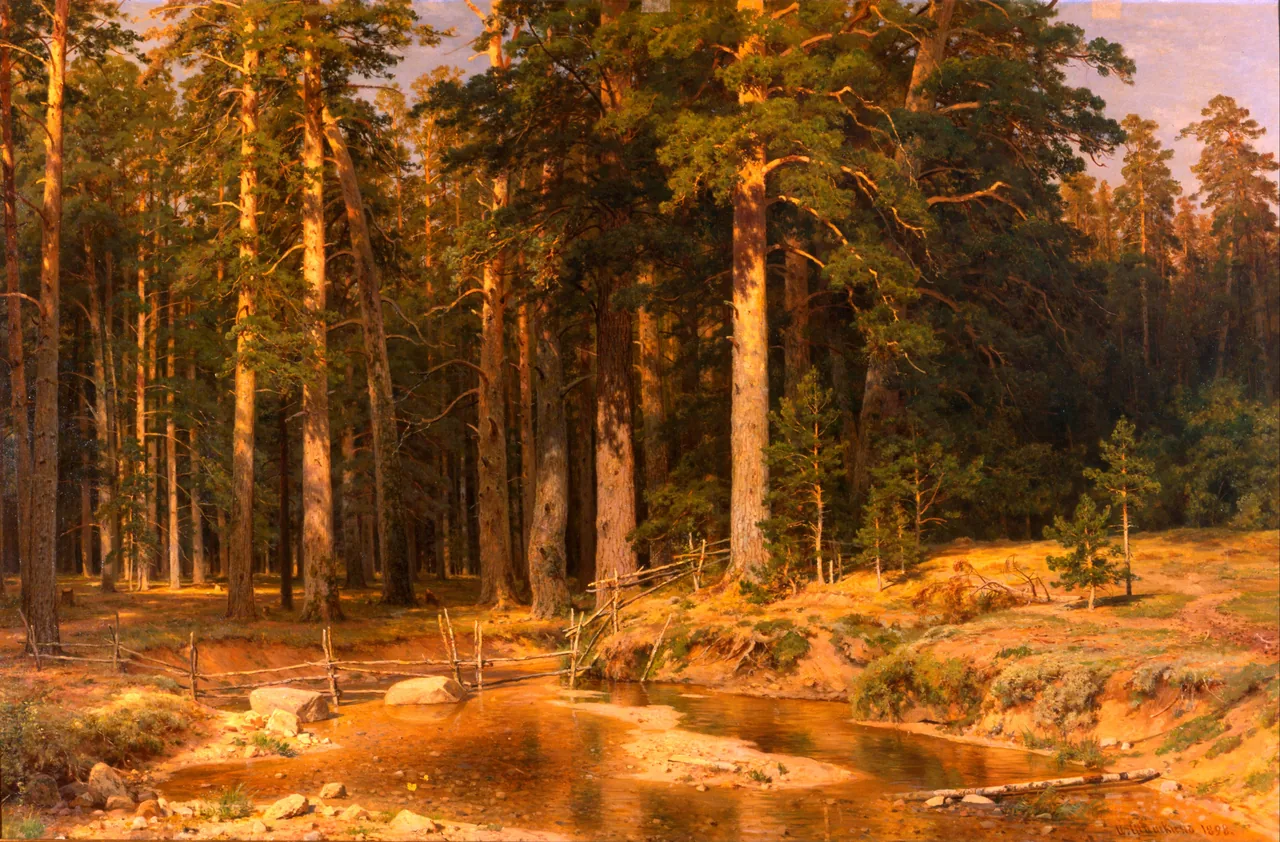

The repeated trunks give the dense image a structure you can follow. Lower down, the stream changes direction, and the fence provides a small human trace without filling the scene with people. There is plenty to inspect, but the picture does not require you to find one tiny incident before it makes sense.
Try this kind of landscape where a horizontal image has room to spread. A plain wall above a low cabinet could work, especially if the cabinet top is not already crowded. In a heavily patterned room, compare it with a simpler composition before deciding; the tree canopy contains a lot of texture of its own.
Monet’s bridge organises a dense garden
The NGA’s The Japanese Footbridge, 1899, shows Monet’s garden at Giverny. It is one particular painting in the National Gallery of Art, not a generic image representing every work called Water Lilies.
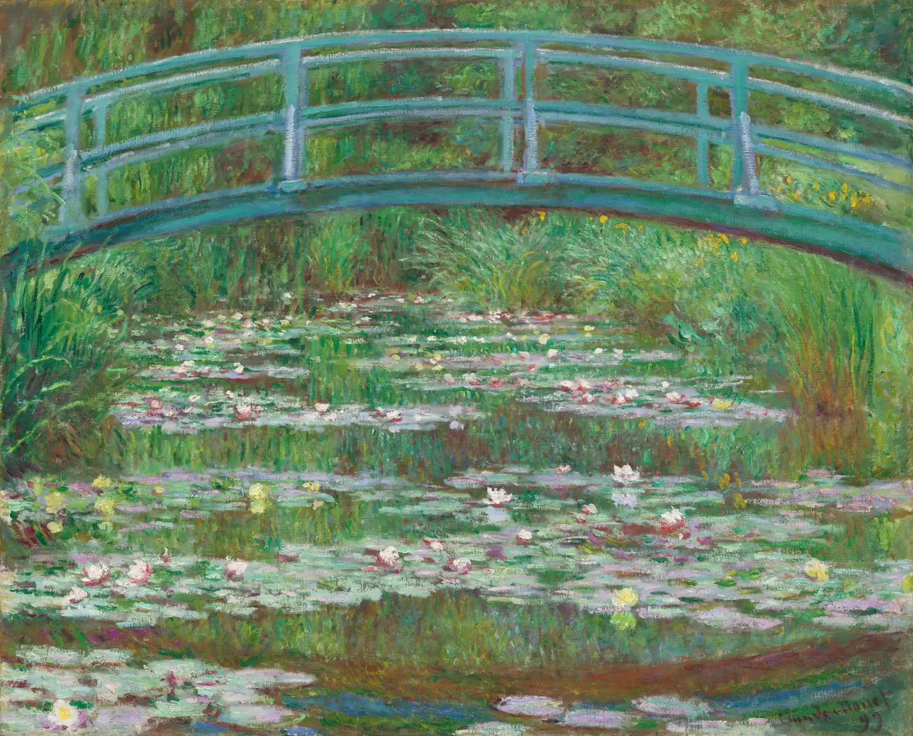
The arch gives the eye a clear route across the upper picture. Below it, small patches of reflected colour and flowers spread over the water. There is little open sky, so the image feels enclosed by greenery rather than extended towards a far horizon.
That distinction can help you choose. If you want a distant view, this may not be it. If you enjoy a garden held close around a pond, its density may be exactly the attraction. A pale surround can separate the picture from a dark wall without changing the colours inside it.
Avoid selecting it solely because your room has green furnishings. Compare the bridge’s curve with the furniture’s shapes and notice whether the lively surface still appeals from your normal seat. A painting can suit a quiet room without itself being visually empty.
Friedrich keeps company in a dark landscape
In Two Men Contemplating the Moon, two figures pause beneath trees, turned away from us towards a small crescent. The Met dates this oil painting to about 1825–30. Its warm darkness is a different option from both Shishkin’s sunlit grove and Monet’s green pond.
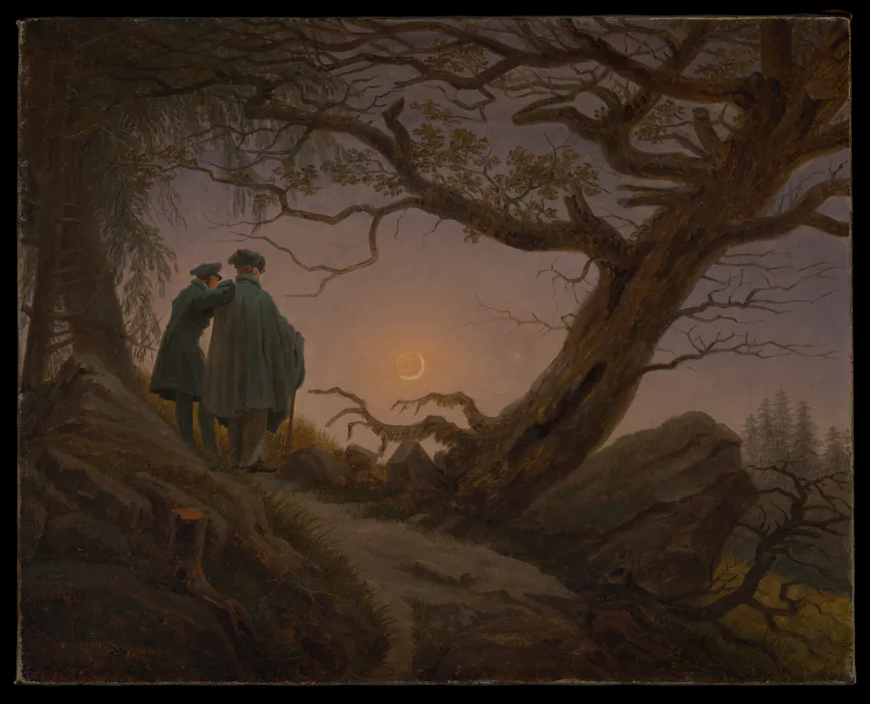
The figures can make the scene feel companionable, but the bent tree and exposed roots also introduce tension. Decide whether that combination suits your room. It is not necessary to call every moonlit picture peaceful.
A dark reproduction needs particular attention to the viewing conditions. In a dim corner, the figures and branches may become difficult to separate. Test the intended position with ordinary evening lighting instead of relying on a bright screen. If the details disappear, a different wall or picture may be a better solution than making the print artificially lighter.
Choose scale without losing the scene
Identify what you want to see before choosing a size. In Shishkin, it may be the overall forest opening. In Friedrich, it may be the relationship between the two people and the moon. That second choice depends on comparatively small elements staying visible.
A large print is not automatically better. Enlarging a detailed image can make every branch more insistent, while a small reproduction can turn the same scene into a distant view. Compare both at the intended position using a complete image preview, not only a frame outline.
Do not stretch the landscape to fit a wide space. A crop may remove the sky, foreground or edge that makes the scene work. A narrower print with a border can preserve the composition. Check the visible image dimensions separately from the paper and outside frame measurements; our print-size guide explains those distinctions.
Let the frame and neighbours leave some space
The surrounding wall matters as much as adding another picture. If you want one landscape to be the main view, try it alone before building a group. A shelf of objects directly underneath may compete with the foreground; moving a few objects can be more useful than buying a larger print.
A frame can link the art to the room without matching every colour. A restrained wood finish might connect to a cabinet, while a dark perimeter might relate to a chair or lamp. The guide to mixing frame colours and styles offers ways to make that connection without requiring an identical frame on every wall.
When pairing landscapes, look for a shared scale or atmosphere rather than merely two green images. One dense forest and one wide horizon can be a deliberate contrast. Keep each work’s original orientation; reversing a landscape to make paths point towards each other changes the artwork.
Test the view you will actually have
Choose two or three candidates, then imagine each in one specific place. Look from the doorway, your usual seat and the nearest passing route. Check whether the scene is obscured by furniture or caught behind a reflection. You should not need to stand in one awkward position to enjoy it.
Try the arrangement with the room as you normally use it, including evening lamps and everyday belongings. A staged empty wall can conceal problems that are obvious beside a television, a bookcase or a plant. For valuable art, seek appropriate framing and conservation advice rather than experimenting with exposure or materials.
Finally, give the subject some time. If you continue to enjoy the particular trees, water or moonlit figures after the first colour match has worn off, you have a stronger reason to choose that landscape. A quieter room is a setting for looking, not a promise a picture must fulfil on demand.
Editorial record
About this article
- Author
- Publisher
- GeMarkt
- Published
- Reviewed
- Internal source & rights check. Conducted by GeMarkt Research Review. This is an internal editorial check—not independent peer review.
- Source standard
- Buying guide source standardSeparates measured or first-hand evidence from general guidance and keeps practical limits visible.
Found a claim that needs checking? Report a factual error.