GeMarkt Blog · Essay
Klimt vs Schiele
Compare Klimt's The Kiss with Schiele's Girl: pattern, gesture, empty space and the surprising connections between two Viennese artists.

The easiest way to separate Gustav Klimt from Egon Schiele is also the least reliable: gold and beauty on one side, sharp lines and anxiety on the other. It works for a few famous pictures, then starts getting in the way. Schiele could draw a remarkably quiet figure. Klimt could make an embrace feel precarious.
A more useful distinction is what each picture asks a line to do. In Klimt’s The Kiss, outlines help merge two people into a patterned enclosure. In Schiele’s Girl, a few contours make a body present against nearly empty paper. Neither artist simply copies a body as a camera might record it.
A shared city, not a simple opposition
Klimt was born in 1862; Schiele in 1890. They belonged to different generations of Viennese art, but not sealed-off worlds. The Leopold Museum’s Klimt account traces his move from established decorative commissions to the Vienna Secession, the artists’ association he helped found in 1897 and first led.
The Secession offered an alternative to the city’s established exhibition structures. Schiele’s own break with academic training came later: the Leopold Museum’s Schiele introduction records the formation of his Neukunstgruppe in 1909. That name means a new-art group, not a claim that its members had invented art from nothing.
Their work belongs to this changing environment of exhibitions, patrons and competing ideas about the figure. You do not need a story of an obedient pupil overthrowing a master to see their connection. Curving contours, deliberately arranged bodies and a willingness to depart from everyday appearances are already common ground.
Start with these two figures
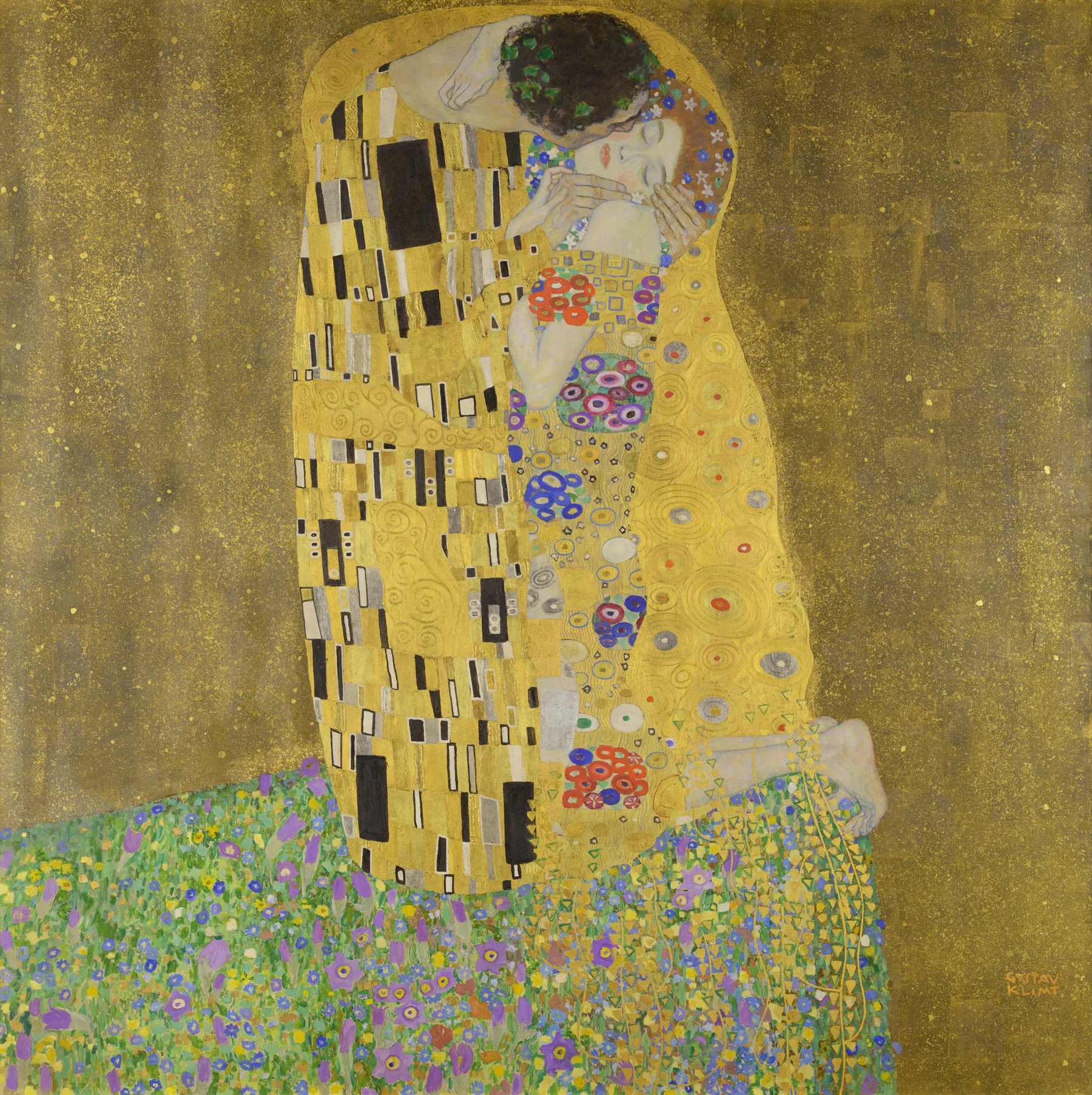

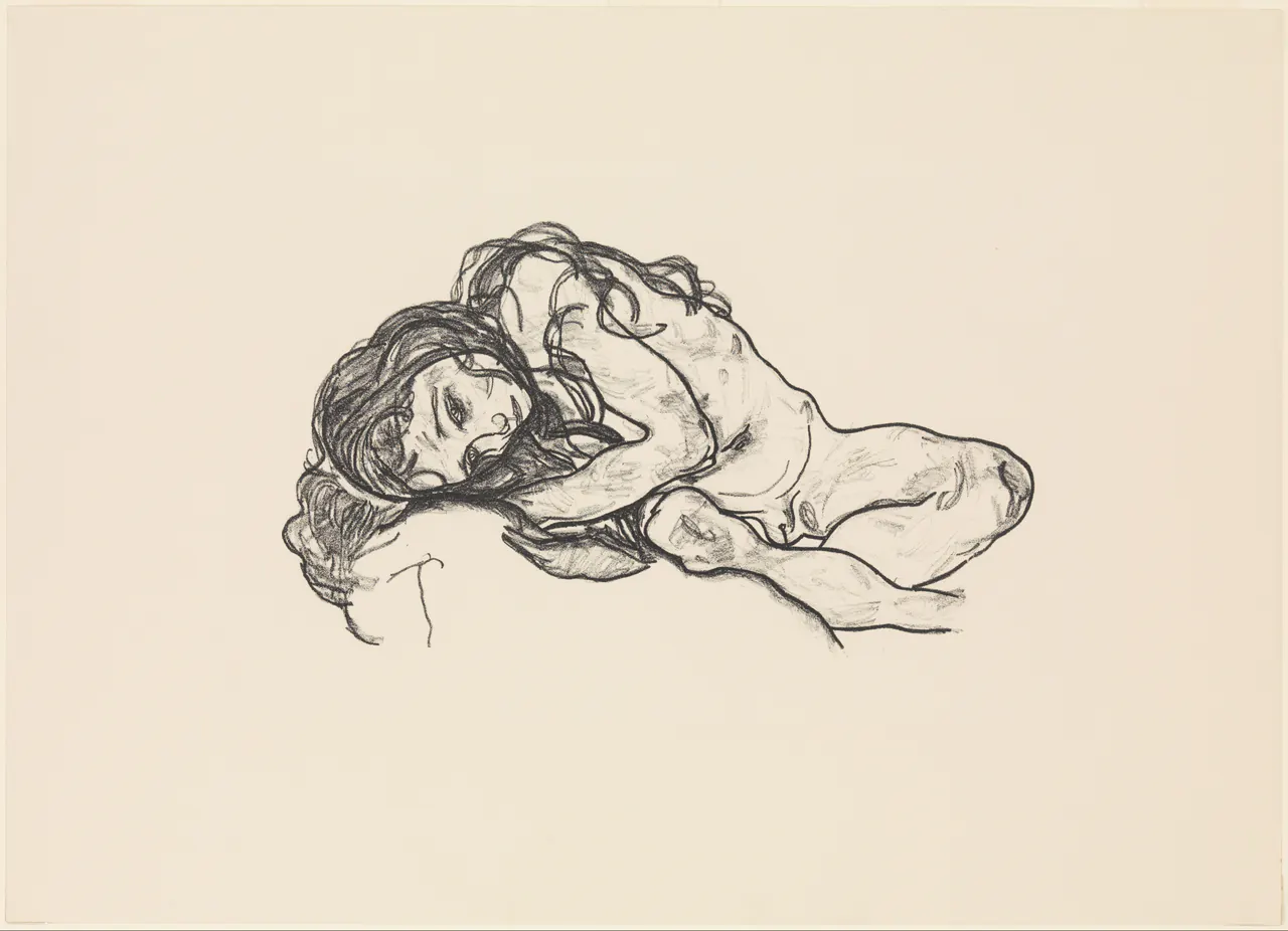
These are deliberately different objects: a large, richly worked painting and a much smaller printed image. The comparison reveals choices about representation, not a controlled experiment in which only the artist changes. Keep the materials and dimensions in mind as you look.
Follow the outline
Begin at the outside edge of Klimt’s couple. A rounded gold boundary carries the eye over their heads and down around the embrace. Inside that shape, the robes contain sharply contrasting motifs: dark, upright blocks on one side; rounded, colourful forms on the other. Those patterns help distinguish the bodies even where ordinary anatomical boundaries become difficult to follow.
Now trace Schiele’s bent arm. A contour can describe its direction without filling every part with shading. A turn at the elbow, the tilt of the face and the curve of the back are enough to suggest a pose. The lines do not need to become a complete shaded shell.
This is not simply curved Klimt versus angular Schiele. Both pictures use curves. The difference here is how much surrounds the contour. Klimt keeps offering another pattern to enter; Schiele leaves you to complete some of the body’s volume yourself.
Look at what surrounds the body
Klimt gives the lovers a flowered ledge and a broad field of gold rather than a clearly measurable room. The woman’s feet reach towards its edge. Without inventing a narrative about danger, notice the visual uncertainty: the richly decorated enclosure feels secure, but the ground beneath it is surprisingly limited.
Schiele’s paper supplies no comparable meadow, furniture or horizon. That absence directs attention towards the figure. Try looking past the dark marks rather than following them: the open area around the head and torso becomes an active part of the arrangement, giving each small change of direction room to register.
Empty space is not unfinished space by definition. Nor does Klimt’s dense surface mean that every square centimetre carries a secret symbol. In both images, the distribution of detail controls where you pause. One picture gathers attention through abundance; the other makes a small number of marks carry more of the burden.
Hands and faces change the mood
In The Kiss, the most immediately readable flesh is concentrated in faces, hands and feet. The man’s head bends down. The woman’s face turns sideways, and her eyes are closed. Their hands provide points of contact within robes that otherwise merge into a larger form.
Schiele’s lowered eyelids and inclined head also interrupt any neat claim that his figures are always confrontational. This figure does not stare out to challenge the viewer. The dark hair anchors the face while the folded arm leads away from it.
You might read intimacy, withdrawal, tenderness or tension in these poses. Those are responses to visible arrangements, not access to the sitters’ thoughts. A good comparison can describe where a hand rests and how an eyelid is drawn without turning either detail into a psychological diagnosis.
A painting is not a lithograph
The Belvedere’s record identifies real gold, silver and platinum among The Kiss’s materials. A screen image gives us colour relationships, but cannot reproduce the full experience of light meeting metal. The work is also 180 centimetres square: it occupies a very different physical space from the Schiele print.
The Met’s catalogue dates Girl’s design to 1918 and identifies the displayed sheet with a portfolio issued in 1922. Calling this simply a 1918 drawing would lose both its printing process and its later publication context. A lithograph can preserve the character of drawn marks while existing in multiple impressions; our lithography guide explains that distinction.
Neither artist fits one formula
For a useful counterexample to gold-equals-Klimt, open the Met’s portrait of Serena Pulitzer Lederer, painted in 1899. Its tall white dress and soft, flowing brushwork create a different encounter from The Kiss. The sitter’s family became important patrons; this was a portrait with a particular social setting, not another version of the embracing couple.
Schiele’s range also extends beyond the isolated figure. The Leopold Museum includes landscapes, cityscapes and self-portraits in its account of his interests. Choosing one work is a starting point for looking, not permission to label everything else an exception.
A better way to remember the difference
When the two names blur together, ask three questions. Does pattern bind the figure into its surroundings or does open space separate it? Is the body built through a dense painted surface or a few exposed contours? Where do the hands and face interrupt the overall design?
For this pair, the answers point towards Klimt’s enveloping pattern and Schiele’s economical line. That is more useful than ranking one as beautiful and the other as troubled. Return to the story of The Kiss for the painting’s wider history, then let a different Schiele work challenge the distinction you have just learned.
Editorial record
About this article
- Author
- Publisher
- GeMarkt
- Published
- Reviewed
- Internal source & rights check. Conducted by GeMarkt Research Review. This is an internal editorial check—not independent peer review.
- Source standard
- Art history source standardPrioritises object records and research sources, distinguishes evidence from interpretation, and states material uncertainty.
Found a claim that needs checking? Report a factual error.