GeMarkt Blog · Practical guide
Bird Art Prints: Audubon and Beyond
Compare Audubon’s flamingo and catbirds with Manet’s raven, then choose bird art by silhouette, paper margins, viewing distance and room.

Choose bird art by the picture’s silhouette and setting, not only by the species. A flamingo filling its page can be a strong focal point. Two small birds on a branch invite a closer look. A black raven’s head belongs to a different visual world altogether, even though all three choices are bird prints.
That variety makes birds useful when you want a recognisable subject without committing the whole room to a decorative theme. You can choose one image you genuinely like, give it an appropriate place, and stop there. Here are three contrasting historical examples, followed by the layout checks that matter when buying a modern reproduction.
Choose a bird picture not a theme for everything
First ask what draws you to birds. It might be a familiar garden visitor, the shape of a wing, an unusual colour or a literary association. That helps narrow the choice more usefully than searching for a picture that matches every furnishing.
Next, decide whether the image should be noticed from the doorway or discovered from a nearby seat. A large dark shape on pale paper can remain legible across a room. Fine feathers, small labels and pale branches need more attention. An image can offer both, but it helps to know which matters most in its intended position.
There is no need to add bird cushions, ornaments and curtains to make the print belong. A repeated curve, a related wood finish or one colour already in the room may be enough. Keeping the rest of the arrangement fairly ordinary can make the particular bird more interesting, not less.
The flamingo makes a clear colour statement
The National Gallery of Art’s American Flamingo is an 1838 print by Robert Havell Jr. after John James Audubon, plate 431 of The Birds of America. It is a hand-coloured engraving and aquatint, not a modern wildlife photograph.
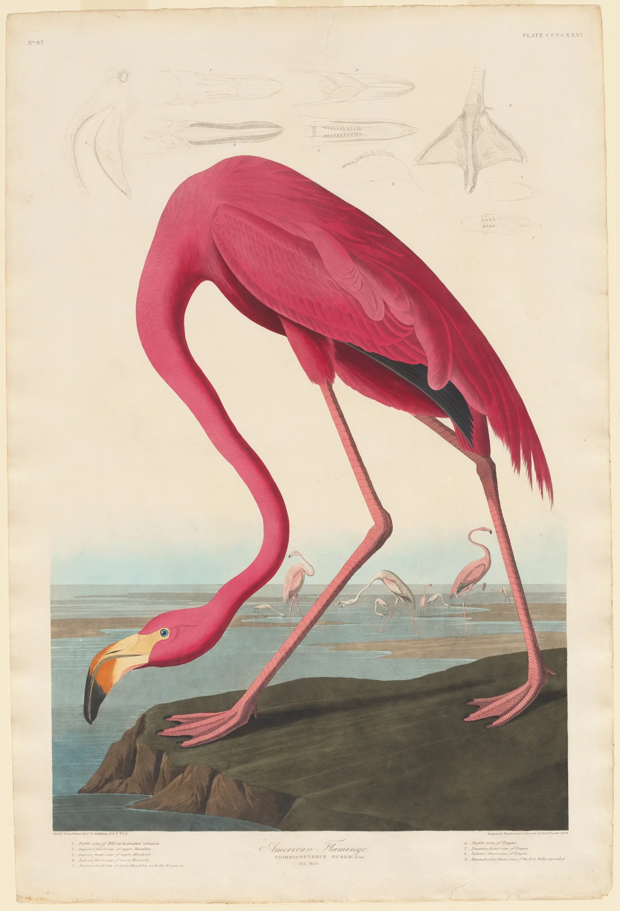
The bent neck makes a long loop, while the legs form another strong set of lines. Pink occupies a substantial part of the sheet. This is not a small accent that will disappear among other pictures.
Try it on a wall with enough uninterrupted height to show the complete composition. A narrow space beside a cabinet may be more suitable than a low strip above it. Judge the whole sheet, including the pale studies at the top and the title below. A reproduction showing only the central bird will have a different balance.
I would begin with a simple frame and let the pink carry the emphasis. You can introduce a related colour elsewhere if you want, but the flamingo does not need a tropical-themed room to make sense.
Catbirds reward a closer view
In the Met’s Cat Bird plate, two birds share blackberry branches. Robert Havell Jr. etched, aquatinted and printed the image after Audubon; the museum dates this impression to 1827–38. The large pale margins are part of the particular sheet shown here.
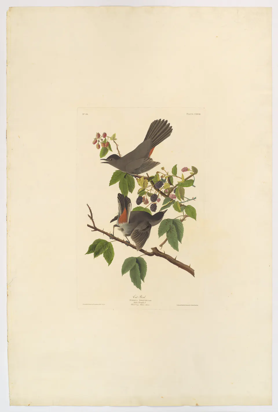
The birds occupy much less of the full sheet than the flamingo does. In equal-sized reproductions, this picture will not have the same presence from across the room. That is not a fault: the open paper can be appealing beside a desk or reading chair where the branch remains easy to inspect.
Notice the raised tails and the way the two heads turn in different directions. These gestures keep the small group active without a dramatic landscape behind it. A view that looks restrained in a thumbnail can offer plenty at close range.
If that quiet scale is what you like, preserve it. Enlarging the birds until they fill the frame may solve one layout problem while removing the very quality that attracted you.
Manet’s raven takes the room in another direction
Manet’s Raven’s Head in Profile is an 1875 lithograph associated with Stéphane Mallarmé’s French translation of Poe’s The Raven. The Cleveland Museum of Art’s record identifies the book connection and the print’s distinct medium. Its expressive black marks are a very different proposition from an illustrated species plate.
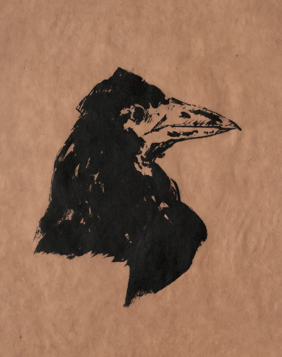
Consider it near books or alongside another monochrome print, where the dense head can act as a strong anchor. The warm paper and irregular edge of the ink prevent it from looking like a flat modern logo. A heavy black frame might reinforce that weight; a slimmer wood frame may leave the printed head more dominant.
The literary subject matters too. If you want cheerful garden birds, this is probably the wrong choice despite its simple palette. If you enjoy the poem or the stark drawing, there is no reason to dilute it with unrelated colourful birds just to make a set.
Judge the bird inside the sheet
Product dimensions alone do not tell you how large the bird will look. A 30 × 40 cm sheet might show a nearly full-page figure, a small image surrounded by historical margins, or an image with an added white border. Ask for the actual layout.
For example, a 20 × 30 cm visible opening with a 4 cm mat border on each side measures 28 × 38 cm before the frame moulding. Those are hypothetical dimensions, not sizes promised for the illustrated works. The bird itself may occupy only part of that opening.
Avoid cropping away feet, tail feathers or a plant to fill a standard frame. Choose another size, accept a border or use a clearly identified detail reproduction. The guide to portrait and landscape formats explains why the original proportions should be considered before the wall is filled.
Pair directions without mirroring the original
A pair can work because the birds face towards each other, because both perch on branches, or because their pale sheets look compatible. You do not need all three connections. Compare the sizes of the actual birds as well as the frames; equal frames can contain very unequal subjects.
Try switching the left and right positions before changing anything else. That can turn two outward-looking birds into an inward-looking pair without altering either artwork. Do not digitally flip a historical print just to make it face the preferred way: signatures, lettering and the composition would reverse too.
When the subjects are very different, a shared frame finish can provide continuity. Manet’s raven and the catbirds could coexist on a larger personal wall, but I would not force them into a supposedly matching natural-history set. Their differences are part of the interest.
Make the last check in the room
Use paper templates for the outside frame dimensions, then view them from your normal seat and the entrance. Check that nearby shelves or lamps will not obscure the part of the bird you most want to see. Keep the final decision about the actual image, not just the rectangle.
For paper reproductions, avoid placing them in direct intense light or beside heat sources; the Library of Congress’s paper-care guidance supports those precautions. Use the print and frame maker’s instructions for the particular materials. An antique print needs a different level of care from a replaceable modern reproduction.
Finally, confirm which sheet is reproduced and whether its borders and lettering are retained. Bird art is most satisfying when the posture, setting and story remain visible, rather than being reduced to a generic motif.
Editorial record
About this article
- Author
- Publisher
- GeMarkt
- Published
- Reviewed
- Internal source & rights check. Conducted by GeMarkt Research Review. This is an internal editorial check—not independent peer review.
- Source standard
- Buying guide source standardSeparates measured or first-hand evidence from general guidance and keeps practical limits visible.
Found a claim that needs checking? Report a factual error.