GeMarkt Blog · Practical guide
Art for Halloween: Goya, Doré and Gothic Prints
Choose Halloween wall art with more than a spooky thumbnail: compare Goya’s monsters, Doré’s broken ice and Dürer’s rider, with display and framing advice.

For Halloween art, choose the degree of unease you actually want to live with. Monsters, threatening landscapes and reminders of mortality create very different displays. Goya, Doré and Dürer offer more to look at than an anonymous skull graphic, provided the picture’s original subject is not lost beneath the seasonal styling.
Here, “gothic” describes a possible decorating mood, not a claim that these three works belong to one historical art movement. None was made as modern Halloween merchandise. Their variety is useful: you can choose something mysterious or strange without filling every wall with violent imagery.
Decide how unsettling you want the room to be
Consider who uses the space. A print beside your own desk is a different choice from one facing a child’s bed or dominating a shared dining table. Ask the people who live there rather than assuming everyone finds the same creatures amusing. An unexpected image can be interesting without being a test of anyone’s tolerance.
Start with the actual subject. Do you like the animals and lines, the story behind them, or simply a dark rectangle in a light room? If it is only the last, a night landscape may work better than a disturbing scene you would otherwise avoid.
Choose one main image before buying accessories. A room with several skulls, cobwebs and patterned fabrics may leave little space to notice a detailed print. One artwork with clear wall around it can give the seasonal display a centre. It also makes it easier to keep the work’s identity visible instead of treating it as generic background scenery.
Goya’s monsters come with a question
Francisco Goya’s The Sleep of Reason Produces Monsters, dated 1797/99 by the Art Institute of Chicago, is plate 43 of Los Caprichos. The museum describes that series as satire of Spanish society. This image is more than a collection of spooky flying animals.
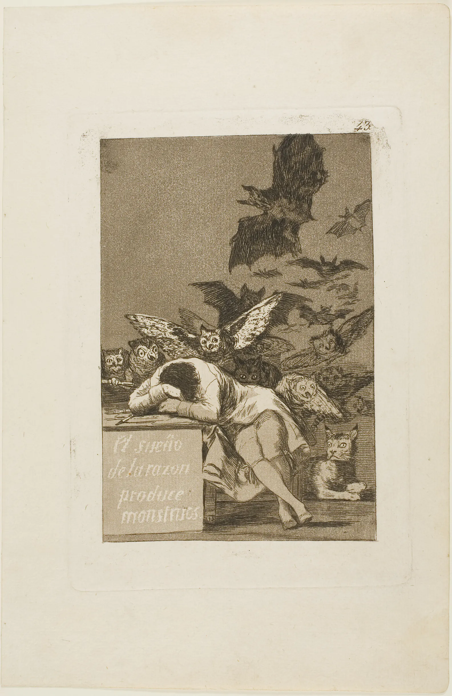
Look at the desk and sleeping figure before the bats. Their position makes the creatures behind them feel connected to a human situation rather than scattered ornament. The lettering is part of the print’s argument. A reproduction that removes the desk to enlarge the animals loses something important.
For a study or reading corner, that combination of sleep, reason and imagination can remain interesting long after October. It does not need an added quotation in a decorative typeface. If you want to explain the picture to a visitor, keep the artist and title nearby rather than supplying a made-up supernatural story.
Check that the lower inscription and the pale surrounding paper remain visible in the proposed print. A wide black mat may be a striking choice, but it should not conceal the image’s own boundary or make the fine lettering too small to read.
Doré finds unease in a landscape
Gustave Doré’s The Breaking of the Ice: A Souvenir of Norway, dated to the late 1800s by the Cleveland Museum of Art, is a lithograph. It is not a wood engraving from Dante or an illustration of The Raven. Naming the actual work matters, especially when an image is offered online simply as “gothic Doré art.”
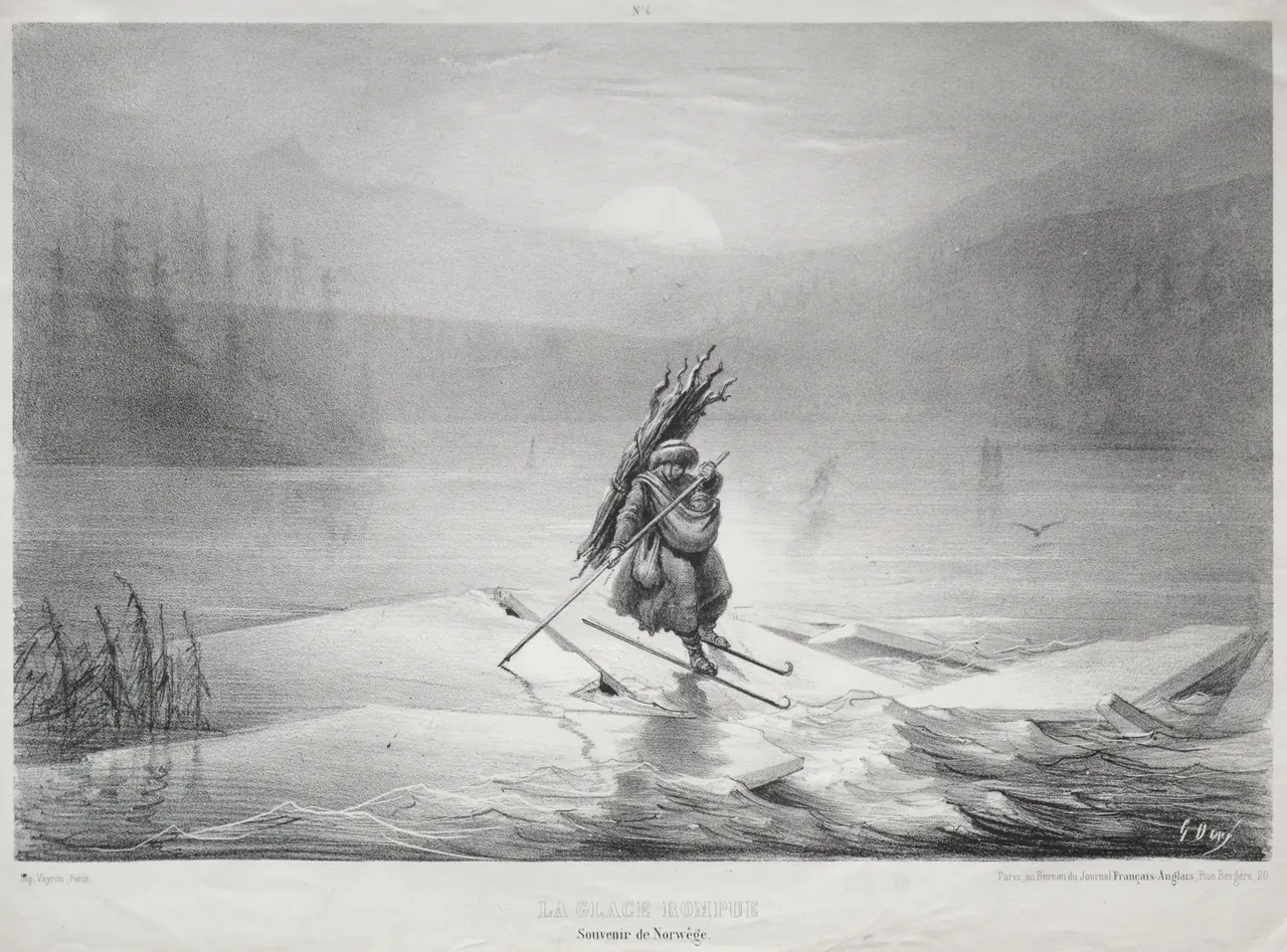
The figure is small against the landscape. Broken ice spreads across the foreground while the pale sun is barely distinct from the haze. This offers unease through the setting rather than through a monster’s face. It could suit someone who enjoys atmospheric landscapes but does not want grotesque figures in the room.
Do not darken the file simply because the display is for Halloween. The pale areas are doing much of the work: they let the ice and distance feel uncertain. A heavily contrasted reproduction can turn that gradual change into blunt black and white.
A horizontal position where you can see the foreground is preferable to a high narrow gap. Preserve the printed title below the scene when choosing the reproduction. Its presence is a reminder that this is a particular historical print, not an invented illustration of a modern horror story.
Dürer’s rider is not a Halloween character
Albrecht Dürer’s Knight, Death, and the Devil, 1513, is an engraving. A mounted knight moves through a crowded landscape beside disturbing figures. The hourglass and skull belong to its treatment of mortality; this is Renaissance printmaking, not a medieval Halloween poster.
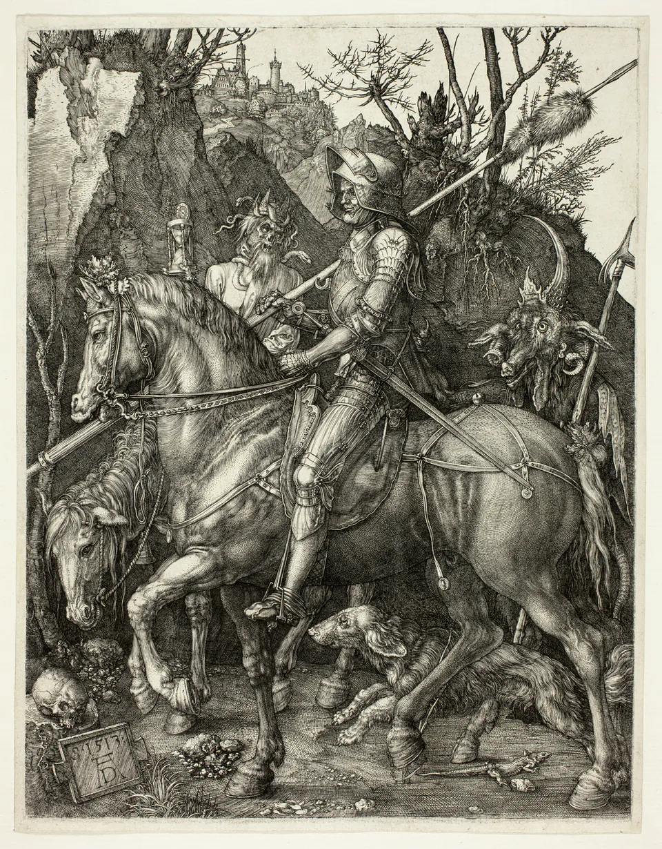
The engraving is dense with textures: armour, hair, bark and rock. That makes it a good candidate for a place where you can stop and look, rather than a tiny framed reproduction beyond reach. The horse and rider remain strong shapes at a distance, but the smaller figures need enough image area to be understood.
If you choose it for a seasonal display, avoid inventing a connection between its devil and a specific modern celebration. The historical title supplies enough drama. You can enjoy the image’s unsettling details while recognising that its meanings extend beyond Halloween.
Frame the actual print not the thumbnail
These reproductions include pale paper around the printed image. That means the full sheet and the central picture have different proportions. A product photograph showing only the dark printed area may give a misleading impression of how large the scene will be once the whole sheet is included.
For example, a 30-centimetre-wide sheet containing a 20-centimetre-wide image has 10 centimetres of unprinted width in total. If centred, that is 5 centimetres on each side before adding any new mat or frame. Ask which measurement is being advertised; do not assume “30 centimetres wide” describes the illustrated scene.
A plain black frame is one option, not a requirement. Dark wood can pick up the paper’s warm tone, while a lighter mat can separate a fine-lined image from a dark wall. Compare samples with the actual reproduction rather than making every component black because of the season.
Let people see the details
A dark atmosphere and an unreadable picture are not the same thing. Check the image under the lighting you normally use in the evening. If reflections obscure the sleeping figure or the horse’s head, changing the position of a nearby lamp may help more than buying a larger print.
Keep candles, heaters and temporary decorations away from the artwork. Do not fasten cobweb material or adhesive decorations to the frame or glazing. Follow the frame and wall-fixing instructions even for a temporary display; a Halloween arrangement should not introduce a new obstacle in a doorway or narrow route through the room.
For more on preserving fine lines, see our black-and-white art print guide. These images are not necessarily pure black on bright white: the tone of the surviving paper and the chosen reproduction both affect what you see.
Choose what stays after October
Imagine the picture without seasonal props. Would you still want to look at Goya’s animals, Doré’s uncertain landscape or Dürer’s extraordinary lines? If so, the print may belong in the room permanently. If not, plan a safe place to keep it rather than squeezing it into a box of textured decorations.
Use the exact image’s source and reuse statement when selecting a download. The museum files illustrated here are identified in their captions; an unidentified version from a “free vintage” site may have different cropping, alterations or terms. Keep the source with your print records so that the artist and work do not become detached from the image.
Halloween can be a good occasion to try a stranger picture. The best choice is one that rewards curiosity, respects the people sharing the room and remains more interesting than the label “spooky art.”
Editorial record
About this article
- Author
- Publisher
- GeMarkt
- Published
- Reviewed
- Internal source & rights check. Conducted by GeMarkt Research Review. This is an internal editorial check—not independent peer review.
- Source standard
- Buying guide source standardSeparates measured or first-hand evidence from general guidance and keeps practical limits visible.
Found a claim that needs checking? Report a factual error.