GeMarkt Blog · Practical guide
Gold in Art: Klimt and Beyond
Explore gold in Klimt, Duccio and Petrus Christus, then choose a print with clear expectations about colour, metallic finishes, framing and light.

Gold in a painting and “gold” in a print description are not necessarily the same thing. A picture can contain real metal, represent metal in paint, or simply use warm yellow and brown. A reproduction can show all three as printed colour without containing a trace of gold leaf.
For your wall, choose the image first, then verify the material you are buying. The distinction matters more than whether the room has matching brass handles. Klimt, Duccio and Petrus Christus offer three very different ways to think about golden colour and surfaces.
First ask what gold means
Separate the original artwork’s medium from the reproduction’s specification. “Oil and gold leaf on canvas” in a museum catalogue describes the historical object. It is not a description of every poster made from its photograph.
A standard colour reproduction represents the photographed surface through printed tones. Real gold leaf, foil, metallic ink and a glossy coating are different treatments; none should be inferred from the image’s appearance on a screen. Even “gold finish” needs clarification about which part of the object has that finish.
If you want a reflective surface, ask the seller what produces it. If you simply love a golden composition, ordinary printed colour may be exactly what you want. These examples explain the artworks; they do not advertise a metallic GeMarkt product or promise a particular finish in our catalogue.
Klimt: more than yellow paint
The Belvedere dates The Kiss (Lovers) to about 1907–1909. Its technical record lists gold, silver and platinum leaf in the figures, with brass-based imitation gold in the background, alongside paint. The original is 180 × 180 cm. Those are documented materials and dimensions, not qualities that can be established from a small reproduction alone. Belvedere collection record.
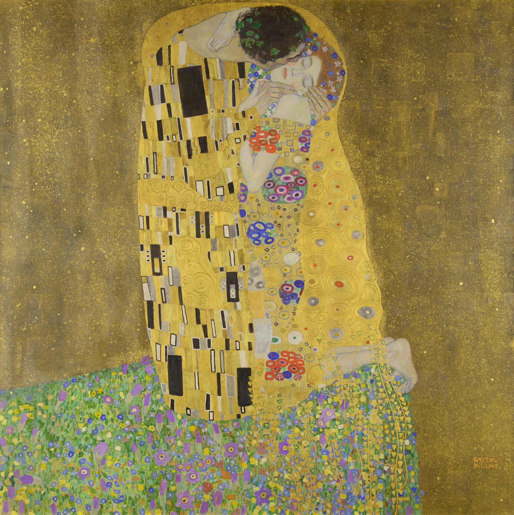

The dark rectangles, circles and flowered ground make this more than a sheet of golden colour. At a distance the couple forms a single strong shape; close up, smaller patterns take over. In a room already full of patterned upholstery, I would give this image an otherwise quiet stretch of wall.
A crop can remove the ground beneath the figures or make their faces disproportionately important. Compare the full composition with the exact print preview rather than assuming that any rectangular version preserves the same effect. Our close-looking guide to The Kiss follows those details more closely.
Duccio: gold with a different purpose
Duccio’s Madonna and Child, about 1290–1300, is tempera and gold on wood. The Met describes it as a work for private devotion, and records an overall size of only 27.9 × 21 cm with its original frame. Its golden setting belongs to a religious image, not an early version of a luxury interiors trend. The Met’s record.
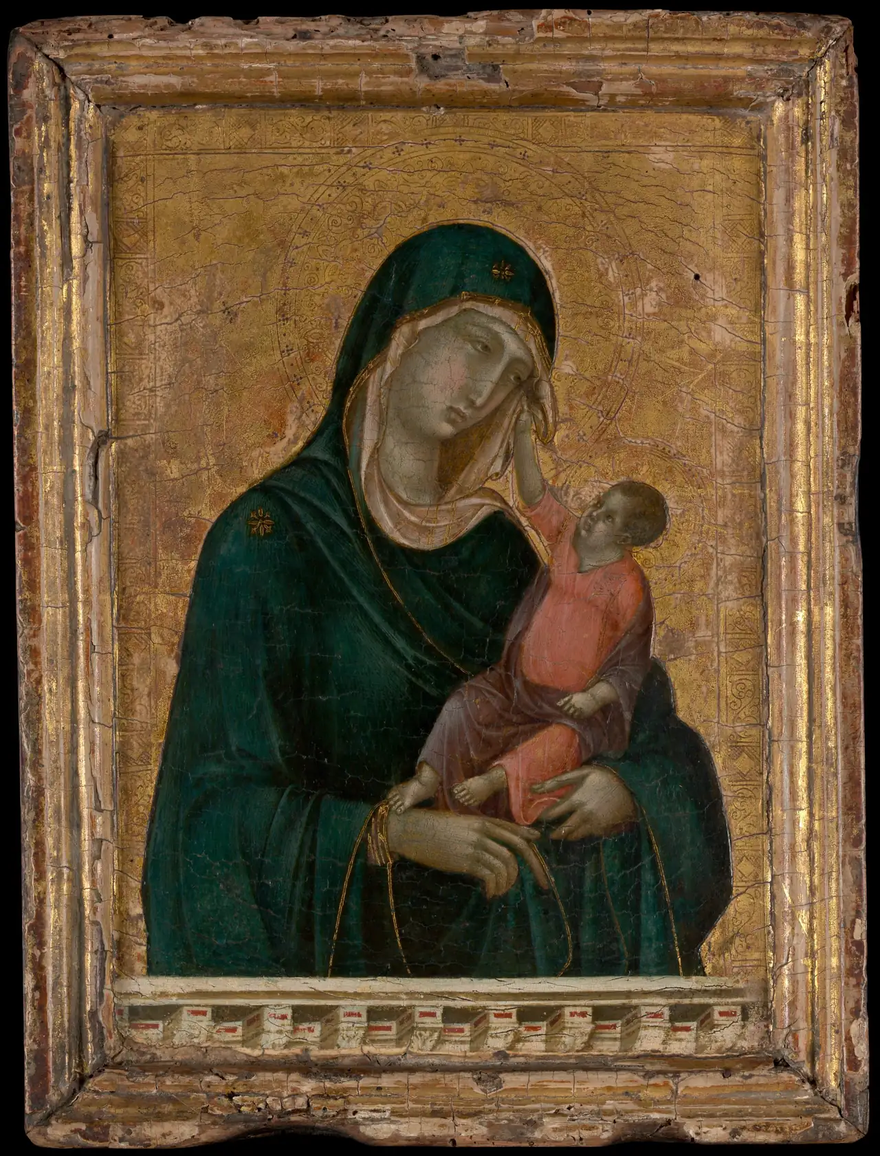
Look at how the large dark cloak interrupts the gold. If you are attracted to the palette, there is more deep blue-green and shadow here than a thumbnail labelled “gold art” might suggest. Its intimate subject also deserves consideration before it becomes merely a colour choice.
For a smaller reading corner, I would test a modest reproduction you can approach rather than automatically enlarging it to fill a whole wall. That is a preference about viewing, not a prohibition on large prints. Keep the pictured frame in mind: adding another ornate physical frame would create two decorative borders.
Painted metal without a gold background
Petrus Christus’s A Goldsmith in his Shop, dated 1449, offers another route. The Met catalogues the painting as oil on oak panel and draws attention to its rendering of jewellery, glass and metal. Goldsmithing is the subject; the museum does not describe a gold-leaf ground. Collection record.

Small bright details sit among brown, green and the goldsmith’s strong red clothing. This is worth considering if a room needs a narrative painting rather than a broad golden surface. Its attraction may be the busy shelf or reflective objects, not the amount of yellow in the image.
In a dining area with dark wood, I would compare this with a simpler still life. Both can reward close viewing, but the figures and packed interior ask for more attention. Choose that complexity deliberately rather than expecting every gold-related work to feel equally serene.
Choose how much gold the room needs
Begin with what is already conspicuous: a brass lamp, a patterned rug, warm wood or a large mirror. The painting does not have to repeat all of it. One broad golden image can be the main warm note; a darker painting can let existing metal objects keep that role.
For a pale, sparsely furnished wall, try the full Klimt image at two sizes before deciding. For a richly furnished room, compare it with the Duccio or Christus at a smaller scale. Neither is guaranteed to be subtler: subject, contrast and framing matter alongside colour.
Do not choose an exact shade match from a phone alone. Place physical samples beside the wall if the seller offers them. If samples are unavailable, allow some tolerance rather than ordering a frame or fabric whose success depends on an identical yellow.
Compare colour and finish separately
A glossy surface is not evidence of metallic printing. Nor does a matte paper make the colour less faithful by definition. Ask what the material is, then decide whether you prefer that surface in the intended position. Our print-format guide explains the differences between paper and canvas formats.
Check a physical sample, where possible, in the daylight and evening light you normally use. A bright reflection can obscure detail from one seat even if it looks attractive from another. Do not assess a finish only beneath a shop’s display lights.
Keep preservation separate from the desire for shine. The Library of Congress advises limiting light exposure for works on paper, especially direct sunlight. A golden picture does not need direct sun to justify its place in the room. Paper care guidance.
A frame is another material decision
A plain dark frame can provide an edge around a complex golden image; wood can relate it to furniture. A gold-coloured frame can also work, but compare its tone and surface with the print before committing. “Antique gold,” bright yellow metal and muted brass-like finishes are not interchangeable appearances.
Include the frame and any mount when measuring the wall. A hypothetical 40 cm square image with a 5 cm mount on every side already occupies 50 × 50 cm before the outer frame is added. The artwork’s named size is not necessarily the finished object’s size.
What to check before buying
Ask for four clear answers: the exact artwork and crop, the printed image and finished dimensions, the actual printing material, and whether a physical frame is included. If metallic decoration is essential, add a fifth: what material creates that effect, and where is it applied?
None of those questions makes a conventional reproduction inferior. It makes the purchase intelligible. Choose Klimt for the composition you love, Duccio with awareness of its devotional subject, or Christus for the small material stories inside his shop. The best choice is the one whose picture and physical form both meet your expectations.
Editorial record
About this article
- Author
- Publisher
- GeMarkt
- Published
- Reviewed
- Internal source & rights check. Conducted by GeMarkt Research Review. This is an internal editorial check—not independent peer review.
- Source standard
- Buying guide source standardSeparates measured or first-hand evidence from general guidance and keeps practical limits visible.
Found a claim that needs checking? Report a factual error.