GeMarkt Blog · Practical guide
Floral Paintings for Every Room
Choose floral art by composition, scale and where you will see it, with Van Gogh’s Irises and Almond Blossom and Caillebotte’s chrysanthemums.

Floral art does not have to mean a small pastel bouquet. A garden close-up can be dense and energetic; a flowering branch can spread across open colour; a tall mass of chrysanthemums can fill a narrow wall. Choose the composition before deciding which room it belongs in.
The three paintings below offer different starting points for modern reproductions. Their flowers do not guarantee a relaxing bedroom or a welcoming hallway. What matters is whether you enjoy the particular picture, can see its important details and have a suitable place for the print. Room names are helpful prompts, not rules assigning every flower a permanent address.
Start with the whole composition
Before choosing by flower or colour, look for the broadest shapes. Is there a vase that gives the image a clear centre? Do plants fill every edge? Is there open sky between branches? These differences survive a quick glance from across a room, long before you notice individual petals.
Also decide whether you want the picture to join an existing pattern or stand apart from it. A floral curtain and a floral painting are not automatically too much together, but two equally busy surfaces can make each harder to appreciate. Compare their scale: a small repeating fabric motif behaves differently from one large painted bloom.
Use the unchanged artwork for this comparison. Turning down its colour to match a wall may make a mock-up look convenient, but it will no longer show the painting or the print you are considering.
Irises for a wide and lively picture
Van Gogh’s Irises at the Getty dates to 1889. The museum’s study of the painting identifies it as oil on canvas and discusses changes in its original colours. The familiar blue appearance of the flowers is not a timeless colour specification for every reproduction.
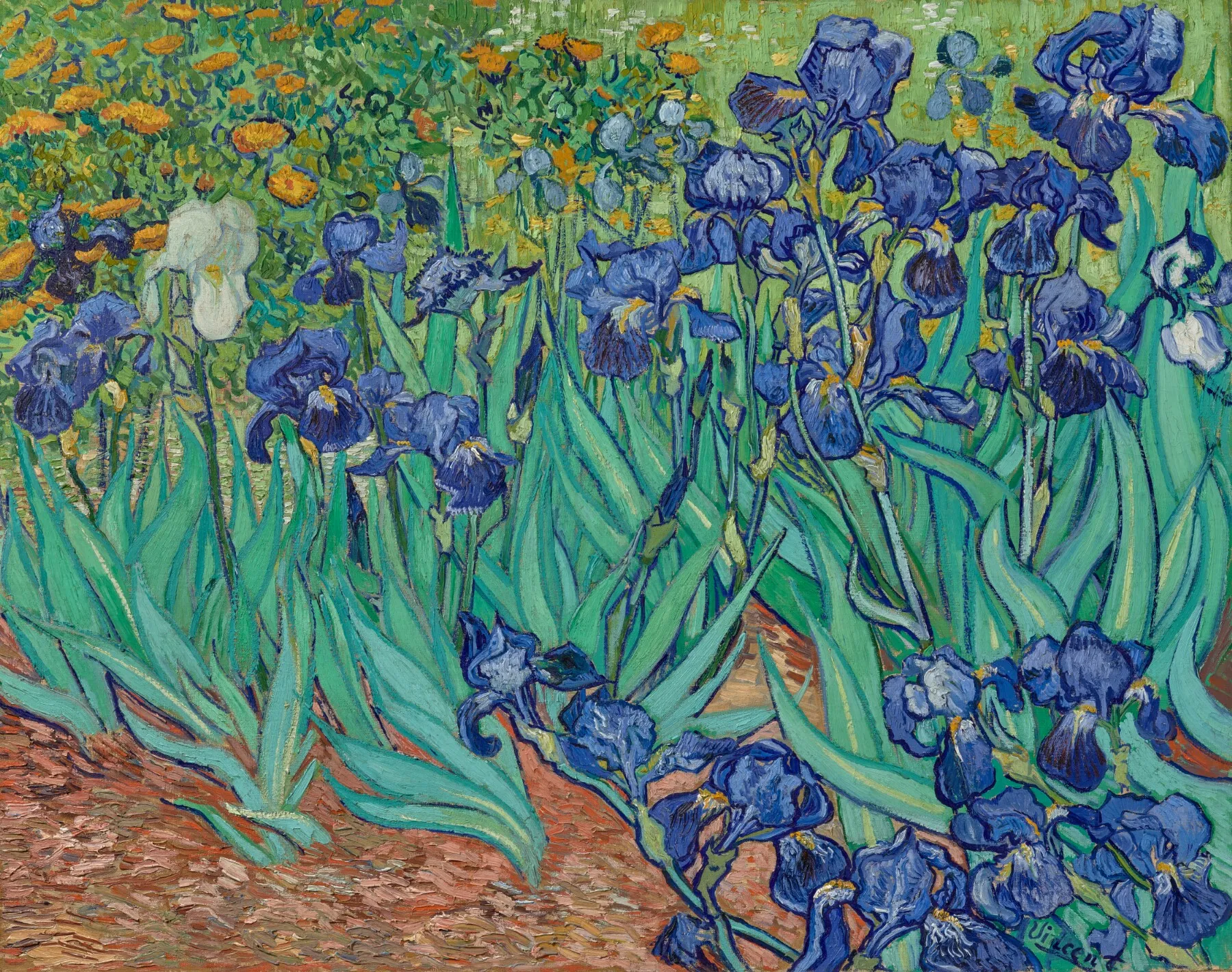
The leaves sweep upwards and sideways, and the flowers form uneven groups rather than a neat row. This is a busy garden picture with a strong horizontal spread. Try it over a sideboard or in a living area where that movement can be seen without a cluster of smaller pictures immediately beside it.
The pale iris on the left is one reason to preserve the full composition. A central crop chosen merely to fit a frame could remove it and alter the balance. If you prefer a detail, choose it deliberately and make sure the reproduction is described as a detail.
Chrysanthemums for a tall wall
Caillebotte’s 1893 Chrysanthemums in the Garden at Petit-Gennevilliers is a tall oil painting of closely packed flowers. The Met’s object record relates this unusual view to his interest in plant imagery for dining-room decoration. That historical connection is interesting, but it does not restrict a reproduction to a dining room.
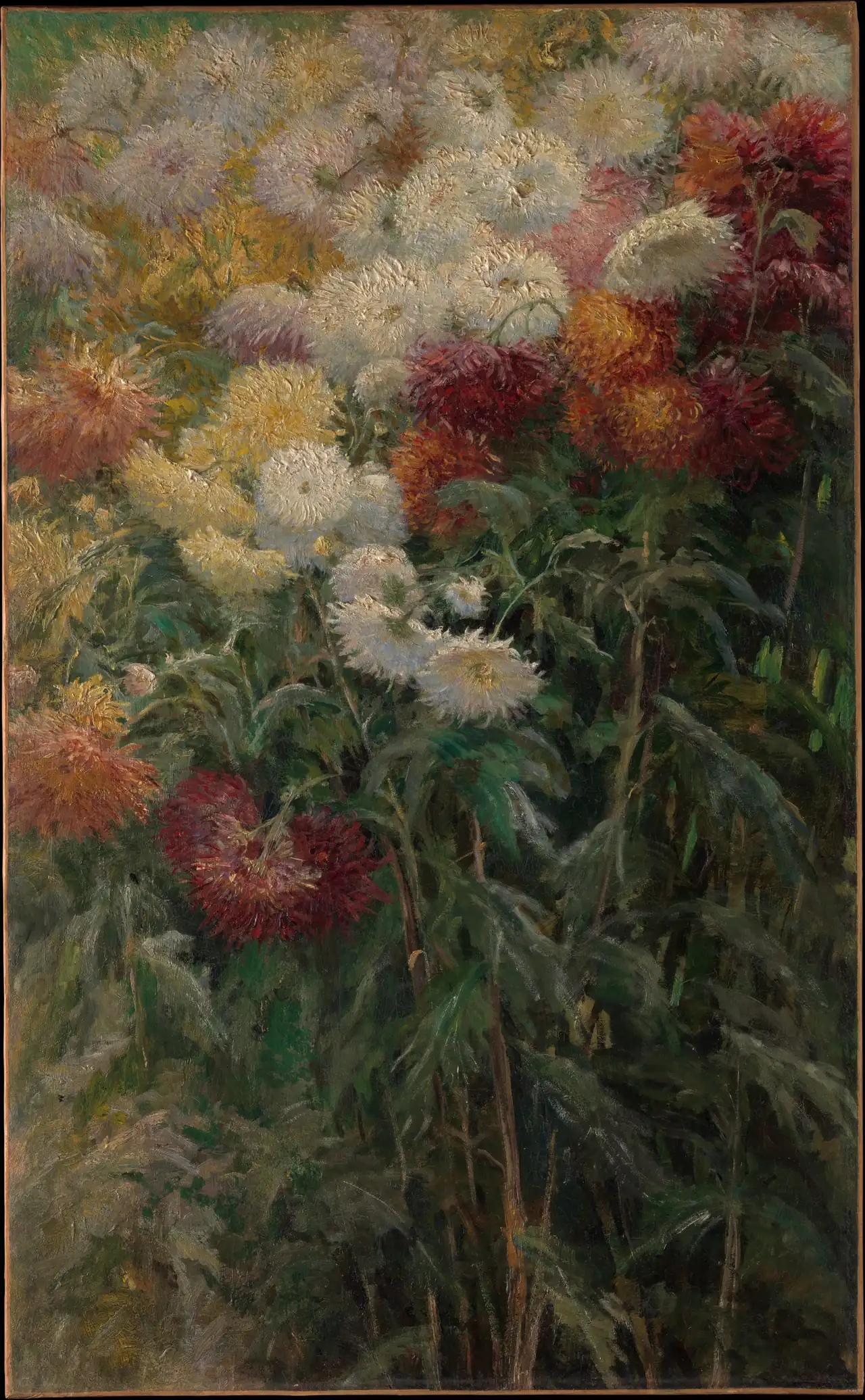
The lower foliage is as important as the bright flowers above it. It gives the image a long downward movement that a crop of the blossoms alone would lose. Consider it for a vertical area beside a doorway or cabinet, provided the passage allows the frame to sit safely without being knocked.
Its dark greens and burgundy flowers can hold their own against pale furnishings. Do not assume that “floral” means delicate or unobtrusive. Test whether that dense lower half remains appealing under the lighting you normally use.
Almond Blossom for branches against open colour
Van Gogh’s Almond Blossom, 1890, in the Van Gogh Museum’s collection, gives the flowers a quite different setting. Branches cross a blue field; there is no ground, vase or room to place them in.
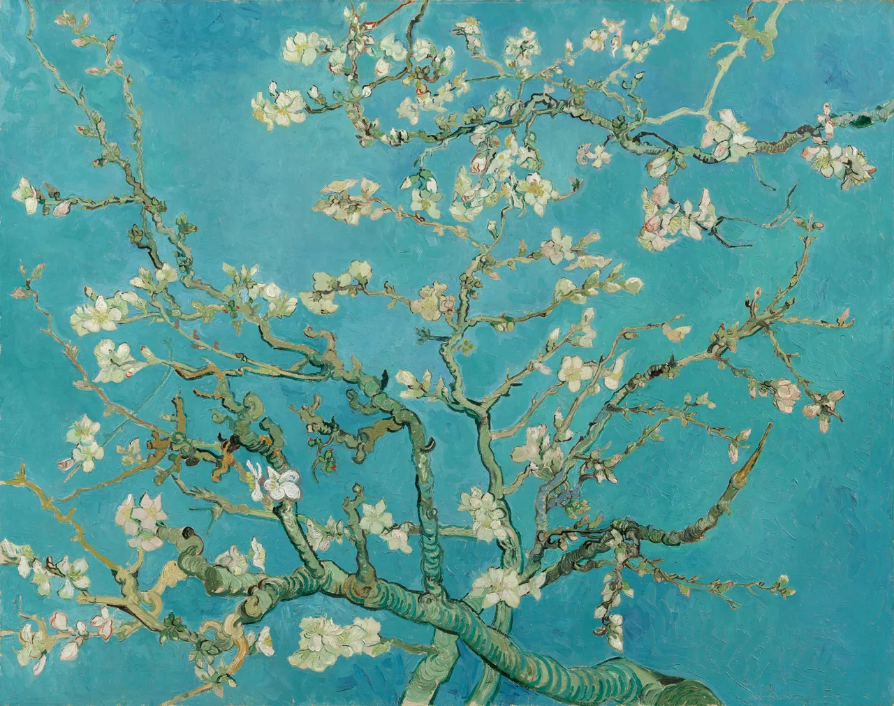

This is useful to compare with Irises if you like flowers but do not want every part of the image filled with leaves. The blue reaches between the branches and gives their pale outlines room to show. The heavy branch entering from below still gives the picture direction and weight.
It could work in a bedroom, living room or work area with relatively plain furnishings. Choose it because you like the branching composition, not because blue is supposed to make a particular room calmer. A dark or pale frame will change the perimeter; neither requires altering the painting’s colours.
Living and dining rooms need a clear placement
Identify the furniture the picture will relate to, then check the actual wall available above or beside it. The usable area may be smaller than it first appears because of a lamp, shelves or an opening door. A flowering composition should not have its most interesting corner permanently hidden behind a tall object.
For a wide piece of furniture, compare one horizontal picture with a pair of vertical ones. A pair is not automatically better balanced. Two frames each 40 cm wide, separated by 10 cm, use 90 cm across; a single 90 cm frame occupies the same width but creates a very different arrangement. These are outer-frame examples, not recommended product sizes.
Keep the surrounding objects in the trial. A real vase of flowers can be a lovely neighbour, but it may cover the lower painting or make a dense composition harder to read. You can change the vase position without changing the art.
Bedrooms and hallways reward a personal choice
In a bedroom, consider the view from where you actually rest or dress. A picture behind the headboard is largely invisible from the bed. An opposite or adjacent wall may let you enjoy it more often, depending on the room. Secure hanging remains essential wherever a frame goes, especially above furniture people use.
In a hallway, you often meet the picture while moving rather than sitting. A clear silhouette can register quickly; a detailed floral scene may work better at a natural stopping point. Leave practical clearance for doors, bags and coats.
There is no requirement to use softer colours in either space. If you prefer dark, crowded flowers, try them. The useful test is whether you like that exact image repeatedly, including under evening light, not whether it fits a generic bedroom palette.
Kitchens and bathrooms need a material check
A flower subject does not make a print suitable for steam, splashes or grease. Keep ordinary paper art out of wet or hot positions and check the maker’s care instructions for the complete print-and-frame assembly. A glazed frame should not be assumed waterproof.
The Library of Congress advises stable conditions, protection from intense light and distance from heat sources for works on paper. That principle is more useful here than guessing a universal safe distance from every hob or shower. If the only available spot is exposed, use a different wall or a display material explicitly intended for those conditions.
An inexpensive reproduction may be replaceable, but that is a purchasing decision, not a claim that humidity cannot damage it. Keep valuable originals out of these experiments.
Choose the reproduction not just the painting
Before ordering, compare the complete artwork with the proposed print layout. Check for cropped petals, changed proportions, added borders and colour edits. The original painting’s dimensions do not tell you the size of the paper or the outside of the frame being sold.
Ask for the visible image size and the outer framed size, and use our paper, image and frame size guide if those terms are unclear. A floral painting becomes a good room choice when its composition survives the reproduction and you can actually enjoy it from the place where it hangs.
Editorial record
About this article
- Author
- Publisher
- GeMarkt
- Published
- Reviewed
- Internal source & rights check. Conducted by GeMarkt Research Review. This is an internal editorial check—not independent peer review.
- Source standard
- Buying guide source standardSeparates measured or first-hand evidence from general guidance and keeps practical limits visible.
Found a claim that needs checking? Report a factual error.