Art History · Learning chapter
Methods · 2 of 6
How to compare two artworks without writing two separate descriptions
Learn how to build a comparative art-history argument in which every paragraph analyses both works, using Hokusai and Hiroshige as a worked example.

What we’ll look at
How can two artworks answer one shared question?
Most weak comparison essays are not really comparisons. They are two short essays standing beside each other: three paragraphs about artwork A, three paragraphs about artwork B, and a conclusion announcing that the works are “similar yet different.”
The facts may be correct. The structure still avoids the intellectual work of comparison.
A comparative essay should explain a relationship. It asks how two works approach the same problem, why their choices converge or diverge, and what becomes visible only when they are placed together. The basic unit is therefore not artwork A or artwork B. It is a claim that needs evidence from both.
If you have not yet practised turning visible detail into a claim, begin with our guide to analysing one work of art. Comparison extends that method:
Observation A ↔ Observation B → Relationship → Significance
The double arrow matters. Your attention must keep moving between the works.
Begin with a shared question
“Compare these two artworks” is an instruction, not a research question. Before taking notes, decide what relationship the pair might help you investigate.
Useful questions are specific enough to guide looking but open enough to permit disagreement:
- How does each work organise the viewer’s movement through space?
- How does material turn a similar subject into a different experience?
- What kind of authority does each portrait construct, and for whom?
- How do two objects made for different sites manage visibility, access, or ritual use?
- How does each image turn weather, labour, memory, devotion, or conflict into form?
“Which work is better?” usually produces taste disguised as analysis. “How are they alike and different?” produces an inventory. A shared question gives the differences a purpose.
If your instructor chose the pair, do not assume the reason is obvious. The works may share a subject but differ in function; share a medium but address different audiences; or look unrelated until scale, route, patronage, or display reveals a connection. Your first task is to identify the productive pressure between them.
Check that the comparison is fair
Any two things can be compared, but not every comparison is illuminating. A useful pair needs at least one meaningful point of contact and enough difference to make the relationship arguable.
Record the same object-level facts for both works:
- maker and the certainty of the attribution;
- full title, including series or portfolio;
- date and place of production;
- material, technique, dimensions, and format;
- original function, site, audience, or market;
- present collection, accession number, image source, and rights statement.
The shared categories prevent an accidental mismatch. Comparing the dimensions of one physical object with the pixel dimensions of another reproduction tells you nothing. Nor should a photographed sculpture be discussed as though its single camera angle were the sculpture itself.
Fair does not mean pretending the objects are equivalent. If one is a unique painting and the other an editioned print, reproducibility is part of the comparison. If one survives in its intended site and the other was removed, that asymmetry may be the point.
Build rows, not columns
Students often divide a notebook page into “Artwork A” and “Artwork B.” That layout encourages two independent descriptions. Use rows organised by questions instead.
| Comparative question | Artwork A | Artwork B | Relationship |
|---|---|---|---|
| How is space organised? | Verifiable observation | Verifiable observation | Same effect, reversal, or different solution? |
| How does the body encounter it? | Scale, viewpoint, route | Scale, viewpoint, route | What changes for the viewer? |
| What does the material permit? | Process and surface | Process and surface | Why does the difference matter? |
| Who was it for? | Evidence of function or market | Evidence of function or market | What does audience explain? |
The fourth cell is the important one. Do not fill it with “different.” Name the relationship: reversal, intensification, compression, quotation, adaptation, continuity, refusal, change of function, or two solutions to a shared constraint.
You will not use every row. Circle the two or three relationships that best answer the question. Those become the architecture of the essay.
Compare effects, not just features
“Both works use blue” is a similarity. It becomes analysis when you ask what the blue does in each work and why the effects differ.
Try this sequence:
- Name the shared or contrasting feature precisely.
- Explain its effect in artwork A.
- Pivot to the corresponding evidence in artwork B.
- State what the relationship changes in your interpretation.
The pivot is not merely a transition word. “Similarly,” “whereas,” and “by contrast” cannot create comparison if the sentences on either side do not address the same question.
Compare at a consistent level. A formal observation in one work should first meet a formal observation in the other; a claim about patronage should meet evidence about the other work’s patronage or market. You can then explain how form and context interact. Pairing the colour of one work with the biography of the other produces a false contrast.
Write a thesis with a hinge
A comparative thesis needs a common ground, a decisive difference, and a consequence. A useful draft structure is:
Both works [shared operation], but while artwork A [specific mechanism], artwork B [specific mechanism]; this difference reveals [historical or interpretive consequence].
The word “but” is the hinge, not the argument. The argument lies in what the difference reveals. “Both show storms, but one is horizontal and the other vertical” stops before significance. Ask why those formats matter to time, movement, scale, function, or attention.
The best thesis is often asymmetric. The works do not need equal numbers of facts. They need equal analytical pressure: each must change what you can say about the other.
Worked comparison: Hokusai and Hiroshige
In brief: The first example compares two commercial woodblock prints from Edo-period Japan: Hokusai’s wave of 1830–32 and Hiroshige’s downpour of 1857. Both place human movement inside difficult weather, but they organise it differently.
The following pair shares a medium, broad period, commercial print culture, and interest in human movement under unstable weather. It also refuses a simple equation.
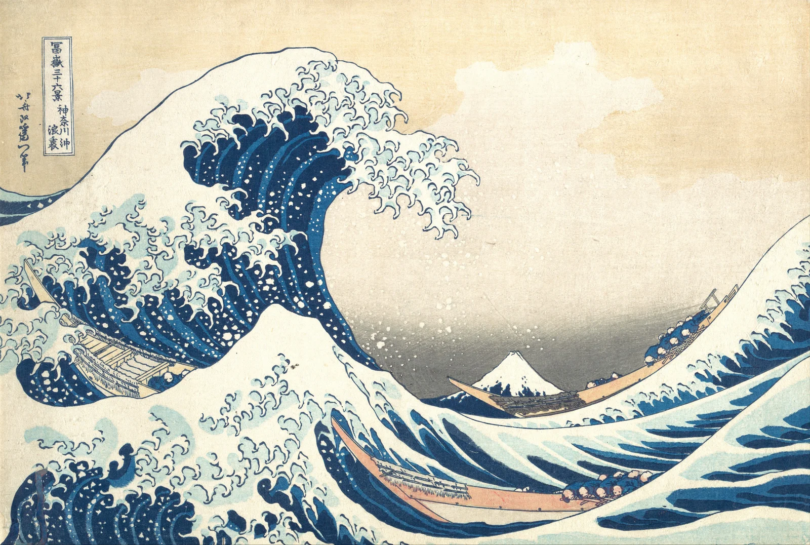
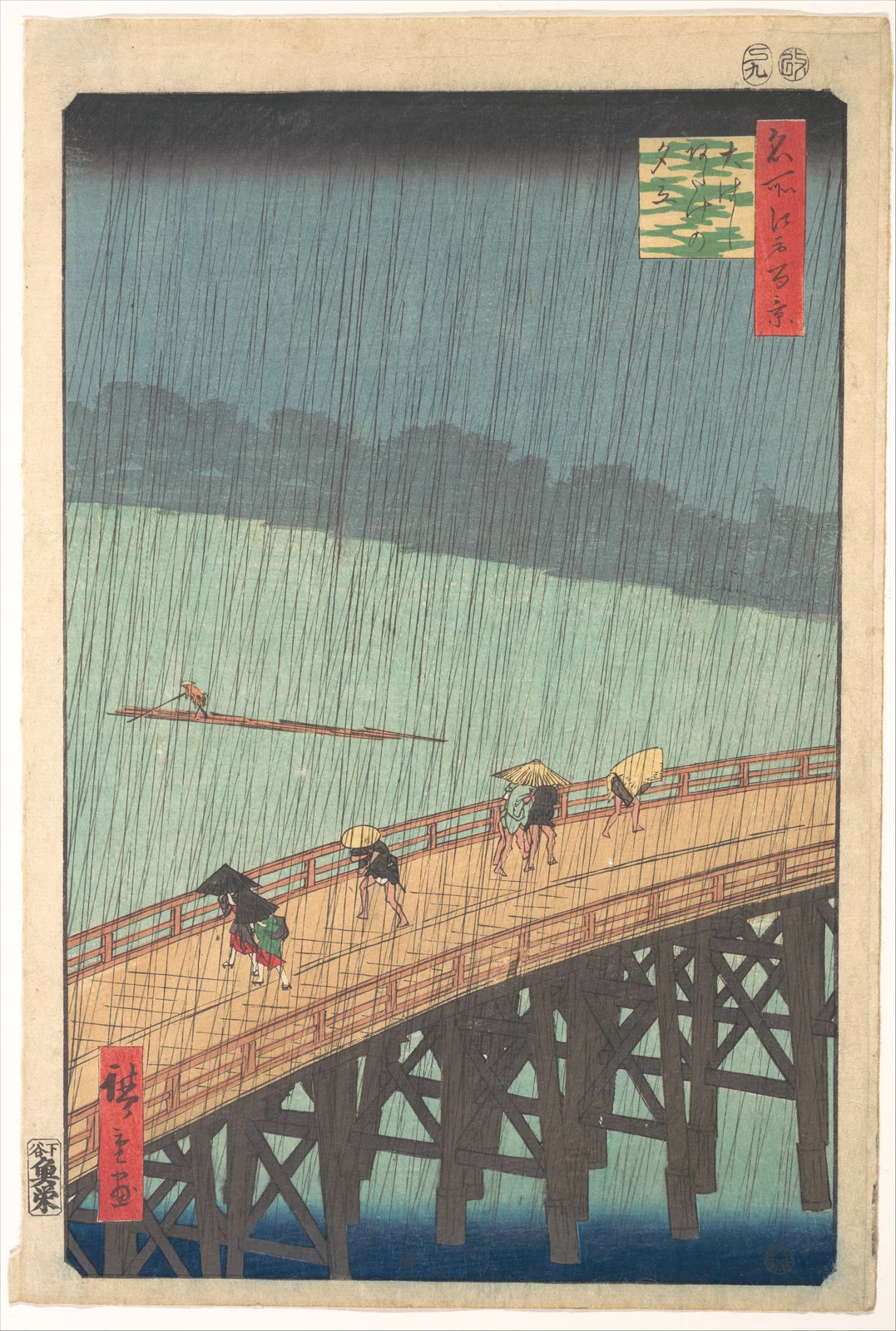
The Met dates Hokusai’s Under the Wave off Kanagawa, popularly called The Great Wave, to about 1830–32. The horizontal colour woodblock print belongs to the series Thirty-six Views of Mount Fuji. The Hiroshige print was made in 1857 for One Hundred Famous Views of Edo. Its vertical sheet shows people crossing Shin-Ōhashi Bridge as a sudden shower passes over the Sumida River near Atake.
Both are prints, not solitary paintings. The Met’s introduction to ukiyo-e woodblock printing describes a collaboration among designer, engraver, printer, and publisher. The British Museum’s account of the process explains that publishers could determine subject, colours, and edition size, while specialist cutters and printers translated the design into registered layers. “Hokusai” and “Hiroshige” remain useful names, but the physical impressions are workshop products.
Find the common problem
At first glance the shared subject is bad weather. A stronger question is: how does each print organise human movement under a natural force that exceeds the figures?
That question directs attention to scale, composition, format, time, and print technique. It also prevents a vague claim that both works show “the power of nature.”
Compare one relationship at a time
| Question | Hokusai | Hiroshige | Relationship |
|---|---|---|---|
| Where is danger located? | A curling wave rises over three low boats. | Rain covers the whole sheet while bridge users hurry across. | Concentrated threat versus distributed condition. |
| How is time constructed? | The crest appears suspended immediately before collapse. | Repeated rain lines and walking figures imply a shower moving through the city. | Arrested instant versus passing duration. |
| What anchors the space? | Small Mount Fuji remains fixed in the wave’s hollow. | The bridge cuts diagonally across river and dark sky; the view is strongly cropped. | Distant stable landmark versus traversed urban structure. |
| What does the format do? | The horizontal sheet stretches wave, boats, and horizon laterally. | The vertical sheet stacks sky, bridge, and river while rain drops through them. | Lateral enclosure versus downward pressure and crossing movement. |
Notice that each row contains both works. The relationship column does not simply rename a difference; it proposes what the difference does.
Let material complicate the looking
Hokusai’s wave is not blue by accident or by brush alone. The Met’s scientific study, The Great Wave: Anatomy of an Icon, connects the series to the newly available Prussian blue used by the Eijudō printing firm and shows how printers layered tones in early impressions. The crisp foam, deep hollow, and lighter bands are the result of carved and separately printed areas.
Hiroshige’s rain is likewise a technical construction. The fine slanting lines had to survive carving and registration, while the dark gradation at the top of the sky uses the hand-controlled printing technique known as bokashi. Another Met record for the same Hiroshige design calls the rain pattern a difficult woodblock effect. What looks spontaneous required coordinated labour.
This shared process makes the difference sharper. Hokusai uses the medium to harden spray into grasping contours and to hold the crest at maximum tension. Hiroshige uses it to repeat thin lines across figures, bridge, river, and sky, making a sudden event feel pervasive but temporary.
Draft the thesis
Here is a defensible comparative thesis:
Both prints use commercial woodblock landscape to place small human figures beneath forces larger than themselves. Hokusai curves sea and boats around a distant, stable Mount Fuji to suspend danger at a single crest, whereas Hiroshige cuts a bridge diagonally beneath repeated rain lines to make weather a passing interruption of urban movement. Seen together, the works replace a generic “humanity versus nature” theme with two different experiences of time: peril held still and routine briefly disrupted.
The thesis uses both similarity and difference, but neither is the destination. The conclusion concerns pictorial time.
Build a paragraph that cannot split in two
A paragraph might begin:
Both artists diminish the human figure, but scale produces a different relation to movement in each print.
It would then analyse the three boats compressed into Hokusai’s trough, pivot to the separated pedestrians and boatman crossing Hiroshige’s rain, and end by explaining the relationship: Hokusai binds people into one endangered rhythm, while Hiroshige distributes them across an urban system that continues functioning during the shower.
Remove either work and the paragraph should collapse. That is a useful test. If half of the paragraph survives unchanged, you may still be writing adjacent descriptions.
Organise the essay by claims
For the example above, a three-part essay could proceed through:
- Scale and human movement: collective enclosure in Hokusai; distributed circulation in Hiroshige.
- Format and pictorial time: a horizontal arrested crest; a vertical shower moving through stacked space.
- Printed weather: collaborative techniques turn foam and rain into different kinds of duration.
Do not use “Hokusai” and “Hiroshige” as your main section headings. Those headings announce the split structure you are trying to avoid. A reader should be able to see the argument simply by reading the paragraph openings.
Balance happens across the whole essay, not necessarily sentence by sentence. One paragraph may need more evidence from Hokusai because the wave’s construction is complex; another may linger on Hiroshige’s bridge and urban setting. Keep asking whether each work is still changing the interpretation of the other.
Common comparison failures
The two-monologue structure. Repair it by giving every body paragraph one relational claim and evidence from both works.
A catalogue of formal terms. Line, colour, space, and texture are not arguments. Select the features that answer your shared question.
Empty symmetry. Do not force five similarities and five differences. One consequential reversal may support a better essay than ten shallow matches.
Cultural shorthand. “Japanese artists respected nature” explains neither print and treats a changing society as a single personality. Use evidence about period, city, series, market, materials, workshop, and audience. Because these two works share much of that context, their differences are especially resistant to civilisational clichés.
Ignoring the particular impression. Woodblocks wear, colours fade, printers vary pressure and gradation, and museums hold different impressions. Identify the object number you actually studied.
Claiming direct influence without a route. Chronology alone does not prove that one maker saw or borrowed from another. Look for documents, circulation, workshop connections, or a specific formal quotation before using “influenced.”
Decorative transitions. “On the other hand” cannot rescue unrelated evidence. Make the second work answer the same analytical question as the first.
A 25-minute comparison exercise
Choose two museum objects and place the images side by side.
- Minutes 0–4: record the same identity, scale, material, function, and rights fields for both.
- Minutes 4–9: write one shared question; reject “how are they similar and different?”
- Minutes 9–15: create four rows of paired observations and name the relationship in each.
- Minutes 15–19: circle the two relationships with the largest interpretive consequence.
- Minutes 19–22: write a thesis with common ground, hinge, and significance.
- Minutes 22–25: draft one paragraph opening and list the exact evidence from both works it requires.
Then perform the removal test. Delete artwork B from the thesis. If the remaining sentence still expresses the main idea, the comparison is not yet doing enough work.
AI can challenge your criteria, propose counter-readings, or test whether a paragraph has become lopsided. It cannot supply an accountable encounter with the objects, and its citations must be checked against the museum, archive, or publication itself.
Comparison is not a demand to make two works equal. It is a method for making a relationship visible. When the relationship governs the question, thesis, and paragraphs, the essay stops shuttling between two descriptions and begins to produce knowledge that neither object could produce alone.
Sources and further study
- Hokusai, Under the Wave off Kanagawa, JP1847, The Metropolitan Museum of Art.
- Hiroshige, Sudden Shower over Shin-Ōhashi Bridge and Atake, JP644, The Metropolitan Museum of Art.
- Hiroshige, Sudden Shower, 30.1478.58, Brooklyn Museum; includes publisher and series metadata.
- The Great Wave: Anatomy of an Icon, The Met’s scientific study of pigment and printing.
- Woodblock Prints in the Ukiyo-e Style, The Met’s Heilbrunn Timeline of Art History.
- How to make a woodblock print like Hiroshige, British Museum.
- Introduction to art historical analysis, Smarthistory.
- The Met Open Access policy, including its CC0 image terms.
Editorial record
About this article
- Author
- Publisher
- GeMarkt
- Published
- Updated
- Reviewed
- Internal source & rights check. Conducted by GeMarkt Research Review. This is an internal editorial check—not independent peer review.
- Source standard
- Art history source standardPrioritises object records and research sources, distinguishes evidence from interpretation, and states material uncertainty.
Found a claim that needs checking? Report a factual error.