Art History · Learning chapter
Methods · 1 of 6
How to analyse a work of art: from observation to argument
A practical method for turning close observation into an art-historical argument, tested step by step on Vincent van Gogh’s The Bedroom.

What we’ll look at
How do you turn close looking into an evidence-based interpretation?
If your analysis would still make sense after replacing the title of the artwork with another one, it is probably not yet an analysis. “The colours are vivid,” “the composition is dynamic,” and “the artist creates emotion” sound plausible beside thousands of images. None tells a reader what this particular work does, how it does it, or why the claim should be believed.
Art-historical writing begins with a stricter bargain: every interpretation must leave a trail back to visible or documented evidence.
That does not make art history a laboratory science. Meanings are argued, not measured with a single instrument, and informed readers can disagree. Rigour comes from showing the path between the object, the source, and the conclusion—and from marking where observation ends and inference begins.
The method below is designed for a formal-analysis paper, an exhibition response, an object label, or the opening stage of a longer research essay. It has four moves:
Observation → Effect → Context → Argument
You will not use every formal term you know. You will select the few features that matter to a defensible answer.
First, establish which object you are studying
Before interpreting the work, make sure you know exactly which object you are looking at. Start with the museum or collection record and note:
- artist or maker, including uncertainty if the attribution is disputed;
- title and whether it was given by the maker or assigned later;
- date or date range;
- medium, support, technique, and dimensions;
- original location or function, if known;
- present collection and accession number;
- the source and rights statement for the image you are viewing.
These details change how you understand the work. A coin and a three-metre relief can look the same size on a laptop screen, even though meeting them in person would be completely different. Material tells you which techniques were possible. An altarpiece on a white museum wall is also far removed from the height, light, and religious setting for which it was made. Even the artist’s name and the date matter: if either is uncertain, some historical claims must remain uncertain too.
Start with the museum’s object record, but read it critically. Museum records are strong primary reference points, not infallible final verdicts; attributions, dates, titles, and provenance can change with new research.
Look before you search
Before reading the wall label or the artist’s biography, spend five minutes with the work itself. Write down only what another person could also point to: figures, objects, colours, shapes, surfaces, and where each one appears.
Begin with nouns and positions rather than moods. Instead of “a disturbing room,” write “the bed occupies most of the right half; its footboard cuts across the floor; the back wall narrows toward the left.” Instead of “beautiful colours,” identify the blue walls, yellow furniture, green window, red blanket, and the places where those colours meet.
This temporary separation matters. If you learn first that an artist was anxious, devout, revolutionary, or ill, you may begin using every line and shadow as confirmation. Looking first gives the object a chance to complicate the story.
Smarthistory’s introduction to visual analysis describes the core operation as moving from visual description to an account of effects. The terms are tools for precision, not boxes that every essay must tick.
Ask questions that fit the medium
For a painting, useful questions may include:
- Where does the eye arrive first, and what keeps redirecting it?
- Which forms overlap, repeat, or press against the edge?
- How are depth, scale, and viewpoint constructed—or refused?
- Where do hue, value, saturation, and temperature change?
- Is the surface smooth, layered, scraped, translucent, or visibly worked?
- What has been given detail, and what has been simplified?
A sculpture demands attention to weight, balance, changing viewpoints, the surrounding space, and the behaviour of its material. Architecture adds route, threshold, sound, light, use, and the body’s movement. A manuscript, textile, performance, film, or digital work requires a different vocabulary again. Do not force every object through a checklist invented for easel painting.
Build the evidence chain
An observation becomes analysis only when you explain its consequence. Try one sentence for each link:
- Observation: What exactly can another viewer verify?
- Effect: What does that choice do to attention, space, pace, hierarchy, or bodily response?
- Context: What reliable evidence changes or sharpens the reading?
- Argument: Why does this relationship matter to your answer?
Suppose a figure is unusually small inside a large architectural setting. “The figure is small” is description. “The surrounding structure reduces the figure’s visual authority” proposes an effect. If a contract, ritual text, site history, or comparison shows that the setting represented institutional power, the contextual evidence can strengthen—or overturn—that first reading. Your argument then explains why the mismatch between human scale and built scale matters.
Use modest verbs while the evidence is modest. A diagonal directs, a contrast emphasises, a repetition links, a surface withholds, a viewpoint places. “Proves,” “symbolises,” and “makes the viewer feel” usually require more support than a student gives them.
Add context to answer a visual question
Weak research papers often pause the analysis for a biography dump: birthplace, teachers, movements, illness, death. Context is useful only when it helps explain the object.
Ask narrower questions:
- Who commissioned, used, viewed, carried, wore, entered, or paid for this work?
- What did the material cost, and who performed the labour?
- Was the work made for a home, shrine, street, court, market, grave, screen, or museum?
- Did the maker write about this object, or are we borrowing a statement about a different work?
- Has the object been moved, restored, cropped, renamed, or reclassified?
- Which interpretation is established evidence, which is scholarly debate, and which is yours?
Artist intention is one source among several. A letter can tell us what an artist hoped to achieve. It cannot dictate what every viewer must experience, and it does not erase contradictions inside the work.
Write a thesis someone could disagree with
A thesis is not a topic (“This essay will discuss colour in Van Gogh”). It is not a verdict (“This is a masterpiece”). It is a compressed answer that identifies a visual mechanism and its significance.
A useful draft pattern is:
Although [reasonable first reading], the work uses [specific formal choices] to [effect], revealing [larger consequence].
The pattern is scaffolding, not prose you must keep. Its purpose is to prevent three failures: a claim with no tension, a list of features with no relationship, and a historical fact that never returns to the object.
Worked example: Van Gogh’s The Bedroom
In brief: The first example is Vincent van Gogh’s The Bedroom, painted at Saint-Rémy in 1889 and now in Chicago. It shows how close looking can be tested against the artist’s letters.
The Art Institute of Chicago identifies its The Bedroom as an oil painting made in 1889, measuring 73.6 by 92.3 centimetres. It is the second of three painted versions. Van Gogh made it in Saint-Rémy after the first version, painted in Arles in October 1888 and now in Amsterdam, had been damaged. The museum’s record designates the image reproduced here as CC0; its open-access policy permits unrestricted use of images carrying that label and requests an object caption.
Now ignore that history for a moment and look.
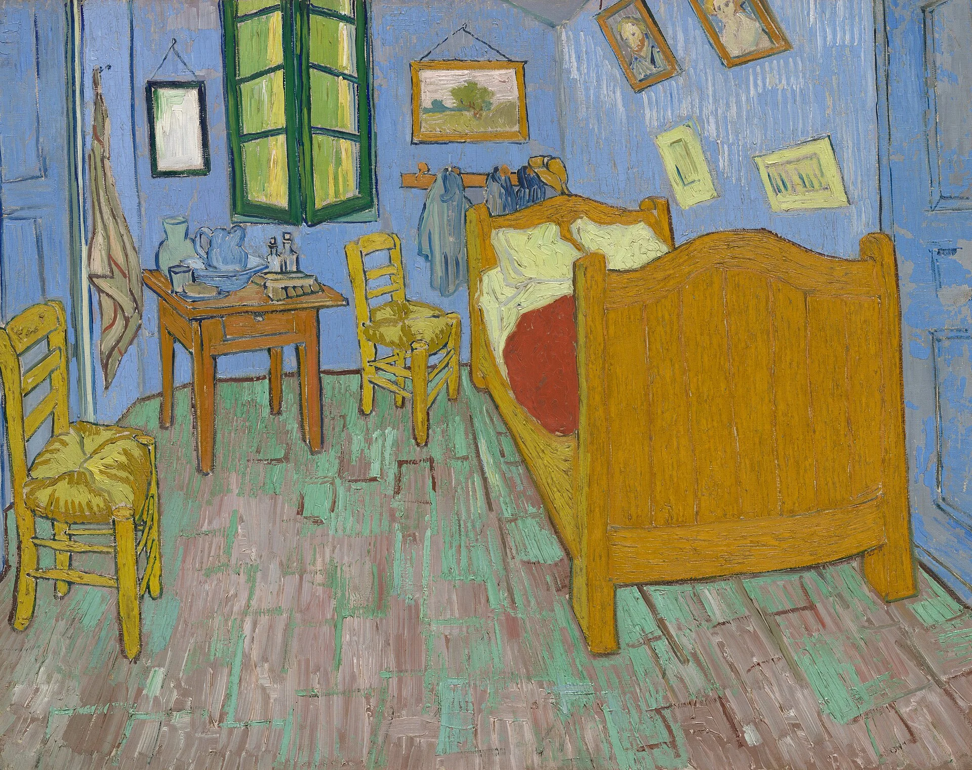
The bed does not merely sit in the room. Its high footboard occupies much of the right foreground and blocks our imaginary path inward. The two chairs repeat its yellow but do not stabilise the space: one is cropped at the left edge, while the other turns at an angle near the bed. Floorboards, furniture edges, and walls recede in several directions. The objects remain recognisable, yet the room resists a single, calm geometrical order.
Colour also carries more structural work than conventional light and shadow. Blue walls press against yellow-orange furniture; green appears in the window and floor; the red blanket forms a concentrated counterweight near the centre. Modelling is limited, but the brushwork is not invisible. Thick, directional marks keep walls, floor, and furniture active as painted surfaces.
The room is empty of a body but full of evidence of one: pillows, clothes, washing things, portraits, two chairs. Absence here is not blankness. It is organised through objects that imply habits and possible company.
Only now add the written evidence. In letter 705 to Theo, dated 16 October 1888, Van Gogh described the first version’s pale violet walls, red floor, yellow bed and chairs, and flat tints without cast shadows. He wanted looking at it to “rest the mind, or rather, the imagination.” The following day, in letter 706 to Paul Gauguin, he again said that the different tones were intended to express repose. In September 1889, he told Theo that he had redone the composition—the version now in Chicago.
Those letters make a reading of rest historically grounded. But they also create a productive question. Why might a room designed to signify repose appear spatially unsettled to many viewers? The answer should not diagnose Van Gogh from a slanting bed or turn mental illness into a formal shortcut. It should stay with the painting.
Here is one defensible thesis:
Although Van Gogh described the composition as an image of rest, The Bedroom makes repose feel deliberately built rather than naturally given: flat complementary colours suppress conventional modelling, while the crowding furniture and competing lines of recession hold the room between shelter and tension.
The thesis is not the truth hidden behind the painting. It is a claim that can be tested. A reader may argue that the repeated furniture creates order rather than tension, or that the tilted back wall reflects the actual shape of the room. The essay becomes stronger when it acknowledges such evidence and explains why its conclusion still holds—or changes the conclusion.
Turn the thesis into paragraphs
Do not organise the essay as “colour, line, texture” unless those categories form the argument. Organise it by claims:
- Rest is constructed through simplification. Use the flat colour zones, reduced shadows, broad furniture forms, and Van Gogh’s letters.
- The room does not fully settle. Analyse the footboard as barrier, the cropped chair, and the inconsistent recession without treating distortion as incompetence.
- Inhabitation appears through absence. Connect paired and personal objects to the empty room, while labelling any claim about companionship as an inference rather than a fact.
Each paragraph should contain the visible detail, its effect, the relevant context, and the reason it advances the thesis. If a paragraph contains only biography, it probably belongs in a source note. If it contains only description, ask “so what?”
Common mistakes—and how to repair them
Naming an element without analysing it. “The artist uses blue” is inventory. Identify which blue, where it sits, what it touches, and what relationship it produces.
Treating your response as universal. Replace “the viewer feels trapped” with “the footboard blocks the most direct imagined route into the room, which can make the foreground feel closed.” The second sentence shows its evidence and leaves room for disagreement.
Using biography as a master key. A work made by an artist who experienced illness is not automatically a symptom. Establish the visual problem first; use biographical evidence only when it is specific, sourced, and explanatory.
Inventing symbolism. A red object does not automatically mean passion or danger. Demonstrate a historically relevant convention, cite a primary or scholarly source, or label the reading as a tentative inference.
Trusting the first digital image. Check the collection record, version, crop, colour history, and rights. Van Gogh’s own colour descriptions are especially revealing because pigments and reproductions change; the blue walls we see now do not make his recorded “pale violet” meaningless.
Researching until your own looking disappears. Sources should sharpen a visual question, not replace the object with quotations from authorities.
A 20-minute practice
Choose one work from a museum collection with a high-resolution image and complete this sequence:
- Minutes 0–5: list twelve verifiable observations without consulting the label;
- Minutes 5–9: circle three details that seem to work together;
- Minutes 9–13: write an effect for each, using cautious causal language;
- Minutes 13–16: read the museum record and one relevant primary or scholarly source;
- Minutes 16–18: note one way the context changes your initial reading;
- Minutes 18–20: write a two-sentence thesis and name the strongest counter-reading.
Then test the result. Could a reader point to the evidence you used? Have you confused intention with effect? Does each source answer a real question? Could the thesis be challenged without becoming absurd?
AI can help you ask for counterarguments, expose vague verbs, or quiz you on terminology. It should not invent your encounter with the object, and it is not a source. Verify every factual claim and citation in the museum, archive, book, or article from which it actually comes.
The goal is not to sound certain about everything. It is to make the boundary between seeing, knowing, and proposing unusually clear. That boundary is where an art-history essay becomes an argument rather than an arrangement of elegant sentences.
Sources and further study
- The Bedroom, object record, Art Institute of Chicago.
- Van Gogh’s Bedrooms, Art Institute of Chicago exhibition overview of the three versions.
- Letter 705: Vincent van Gogh to Theo van Gogh, 16 October 1888, Vincent van Gogh: The Letters.
- Letter 706: Vincent van Gogh to Paul Gauguin, 17 October 1888, Vincent van Gogh: The Letters.
- Letter 800: Vincent van Gogh to Theo van Gogh, 5–6 September 1889, Vincent van Gogh: The Letters.
- How to do visual (formal) analysis, Smarthistory.
Editorial record
About this article
- Author
- Publisher
- GeMarkt
- Published
- Updated
- Reviewed
- Internal source & rights check. Conducted by GeMarkt Research Review. This is an internal editorial check—not independent peer review.
- Source standard
- Art history source standardPrioritises object records and research sources, distinguishes evidence from interpretation, and states material uncertainty.
Found a claim that needs checking? Report a factual error.